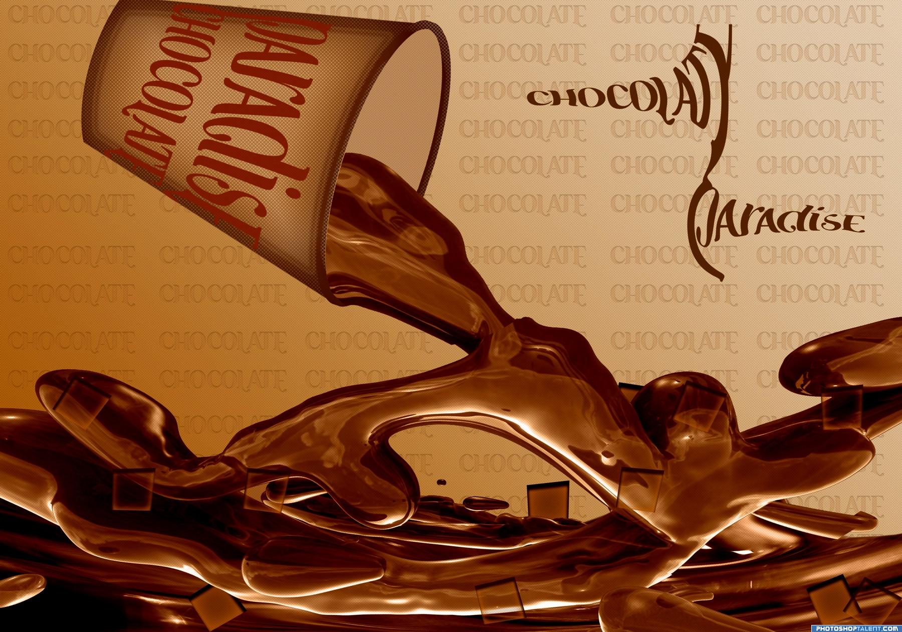
Just love chocolate. (5 years and 3614 days ago)
1 Source:
- 1: Water
Monsieur LeFrrrrog 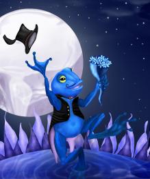 by ImmerVerloren 10000 views - final score: 63.5% | Space Monkey! 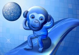 by chakra1985 8285 views - final score: 63.1% | organic men  by creativangle 10341 views - final score: 62.7% |
My Blue Friend 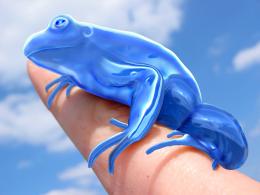 by DigitalDreamer 8568 views - final score: 60.6% | Blue Bird  by lahiripartha 7537 views - final score: 59.3% | Transparent Pegasus 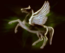 by nasirkhan 4407 views - final score: 59.2% |
Life Begins on Io  by spaceranger 4637 views - final score: 58.8% | Blue Surfer 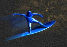 by Paulus62 5642 views - final score: 58.5% | Water Horse  by Akassa 4989 views - final score: 57.6% |
Lobster Tryst 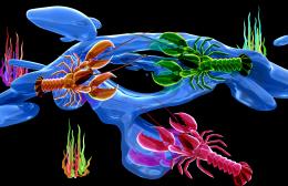 by GolemAura 6864 views - final score: 56.6% | Chocolate Splash 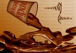 by Richirajd 14602 views - final score: 56.5% | Organic Dragon..... 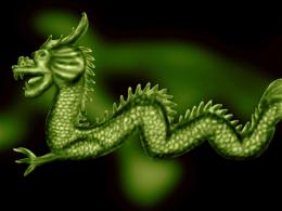 by nishagandhi 4576 views - final score: 53.6% |
SDUS  by GolemAura 3832 views - final score: 53.5% | Born of a Terminator 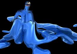 by burtzomega 15398 views - final score: 51.2% | playground for ice kids! 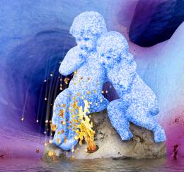 by gabriellax 7539 views - final score: 50.7% |
organic?  by mariosilva 4286 views - final score: 49.7% | Organic Race 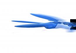 by RGB 5786 views - final score: 49.3% | Sun glass  by RGB 4380 views - final score: 47.6% |
Howdie Guest!
You need to be logged in to rate this entry and participate in the contests!
LOGIN HERE or REGISTER FOR FREE
Photography and photoshop contests
We are a community of people with
a passion for photography, graphics and art in general.
Every day new photoshop
and photography contests are posted to compete in. We also have one weekly drawing contest
and one weekly 3D contest!
Participation is 100% free!
Just
register and get
started!
Good luck!
© 2015 Pxleyes.com. All rights reserved.


yummy.... nice work.. gl
Over all image is fantastic but MAJOR ISSUES with the letter P in paradise.. it took me WAY to long to figure out it was a P... also the wrap of text around the cup should make the text more readible... (Only thinking if this was a business proposal, because it looks like an AD mock up).. good luck and High marks.. it's a very yummy image
nice work
brilliant! I really love this idea and your execution is sooooo close. I agree with GolemAura about the text on the cup and also the "strapline" needs cleaning up a bit but overall I really like, good luck
Sure does look delicious, maybe some steam to create warm drink appearance. The bottom of the cup must follow the curve of the top of the cup. Great idea
What's with the transparent floating squares? And "chocolaty paradise" has got to go...if you feel you need type there it should be a fat rounded font that you could make into chocolate bits.
Something tells me you like chocolate . Suggestion to wrap the text a bit differently around the cup. Right now it doest follow the 3D-shape from the cup enough. With warp you could fix it pretty well (give it more curve). Good luck!
very original good idea
nice work
Creative entry! Tasty hot chocolate
great
Howdie stranger!
If you want to rate this picture or participate in this contest, just:
LOGIN HERE or REGISTER FOR FREE