Photoshop Pictures: Worlds (page 3)


results 11 - 15 of 15

Two worlds kissing - created by siderismaris


Two worlds kissing
Favs: 7SBS: n/aHi-resRank: 2/24Score: 63.1% (30)29901 views

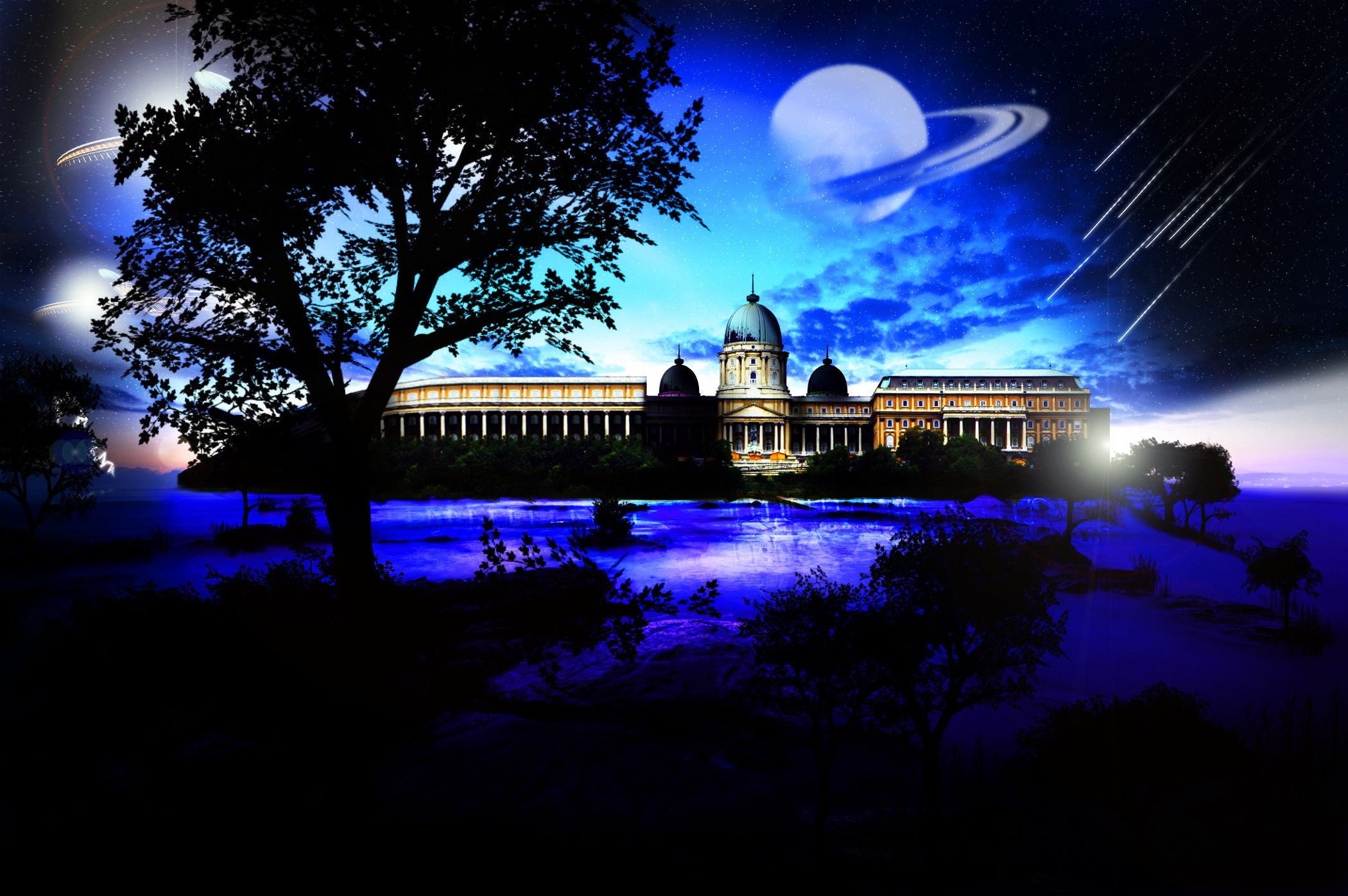
It's very possible to ask what I wanted to suggested..it's hard to define what happens to you when you feel artistic..it's just unexpeted. I love the surreal style and I think it defines my creative mood for the moment.
I modified the lips a little bit using the crop tool and the smooth selection option. Merged the two "worlds" using just the simple erase tool set on different opacity values so that to make the blending smoother. My favorite instrument, the image filter option was used for creating the color mood. The rest is simple, guess you can figure by yourself. Had a lot of patience with this piece here..lots of crops, transformation operations..but, I hope it's worth. Enjoy!
credits and thanks:
http://timewizardstock.deviantart.com
http://night-fate-stock.deviantart.com
http://gothika-stock.deviantart.com
http://annfrost-stock.deviantart.com
http://fairiegoodmother.deviantart.com
http://www.cgtextures.com (5 years and 3466 days ago)

7 Sources:

avatar ReapRevenge
ReapRevenge [banned] says:

Now this is setting the bar high!!!

avatar CMYK46
CMYK46 says:

Balloons again...yawn.
(Just to clarify, I gave you a good vote, but try to be more original).

author says:

what can i do...i addore hot air balloons....they hunt me in my artwork :P thx, CMYK46

avatar Chuck
Chuck says:

nice....I feal like I'm in oz...

no avatar

I would hang this On My Wall way Cool and Very Creative as well

avatar kayaklovergirl

this is soooooooooo good

avatar sparklen
sparklen says:

VVVEEERRRYYY nice Author, very nice.

no avatar

I love this - original style and execution of the prompt

avatar ponti55
ponti55 says:

Good one...!

no avatar
Keiley22 says:

i like these kids of images, they make no sense lol.... as for what you do when you feel artistic, i havent opened photoshop now in god knows how long. I have nooooo inspiration, ive always used lonley to help me, but damn it a man cmae along and he has ruined me lmao

avatar birdlady
birdlady says:

Awesome!

avatar CorneliaMladenova

Great surreal image!

avatar dustfinger

Interesting image. Looks very good. Blending is excellent.

no avatar

lovely image the ballooooons are great. the colour balance works well.

avatar RichieMB
RichieMB says:

Congratulations for 2nd, great pic

avatar Lelaina
Lelaina says:

Congrats for another great second place, Maria!

avatar nishagandhi

congrats

avatar refleksi
refleksi says:

congrat for second place

avatar chakra1985

Congrats

avatar pixelkid
pixelkid says:

Congrats! Way to go! Really nice work!

Howdie stranger!
If you want to rate this picture or participate in this contest, just:

LOGIN HERE or REGISTER FOR FREE


3 Worlds - created by Siminho90


3 Worlds
Favs: 1SBS: n/aHi-resRank: 11/24Score: 55.9% (0)6473 views

Fantasy image. Please view in High Res :)

Used Saturn and Trees Brushes:
http://www.brusheezy.com/brushes (5 years and 3497 days ago)

1 Source:

avatar CMYK46
CMYK46 says:

Try to fix the reflection of the building, & list sources for Saturn & trees...

avatar vladimir735

Amazing job! *favs it*

avatar gotmeamuse

well done

Howdie stranger!
If you want to rate this picture or participate in this contest, just:

LOGIN HERE or REGISTER FOR FREE


Boom - created by lilking92


Boom
Favs: 0SBS: n/aHi-resRank: 23/24Score: 44.1% (0)5337 views

(5 years and 3541 days ago)

1 Source:

avatar ponti55
ponti55 says:

i don't understand.. sorry!

avatar elficho
elficho says:

i disagree with the drop shadow.

avatar CMYK46
CMYK46 says:

You don't need a drop shadow, it makes things look flat. You also need to make the light bulb look round. Did you mean to enter this in the Creative Bulb contest?

author says:

srry this is the one i wanted here

avatar GolemAura
GolemAura says:

well now it makes perfect sense.. good luck author

avatar arkncheeze

big bang... hmmm

avatar OliviasArts

i hope this isnt what the earth will look like, im a winter person and wont be able to handle the heat lol

no avatar

just a personal thing, i think that ALL the stars over power your work. However if you were going for an abstract construction it is good. GL

avatar Tuckinator

the sky could use some work but its a cool image!

no avatar
jesus says:

the milkyway hasnt got enough stars the background has too many

Howdie stranger!
If you want to rate this picture or participate in this contest, just:

LOGIN HERE or REGISTER FOR FREE


Worlds Greatest.... - created by KatGV


Worlds Greatest....
Favs: 0SBS: 3Hi-resRank: 12/24Score: 52.3% (0)5119 views

Submitting prior entry only have sbs#'s 5,8,9.... used legs by scottsnyde @ stkexchg, no other sources used, used my own textures for curtian and stage, except used ribbon brush by aliira (5 years and 3590 days ago)

2 Sources:

avatar lchappell
lchappell says:

good stuff

avatar DanLundberg

Too much stuff in front of Mom IMO. She's the focal point. I appreciate that a little overlap adds depth, but I would emphasize 'little.' Her glow is creepy. [BTW I hope English is not your first language.]

avatar gopankarichal

good work

author says:

Sorry I guess I should use spell check more often.. 1 point off...

no avatar

lol liking this, gl

avatar shaiju1974

nice work and good luck

avatar LKY
LKY says:

nice work.....but outer glow on lady aren't working well....

avatar airdnaz
airdnaz says:

Very nice. cool idea. what is the glow around her head for it seems unatural.

Howdie stranger!
If you want to rate this picture or participate in this contest, just:

LOGIN HERE or REGISTER FOR FREE


two worlds apart - created by steff1993


two worlds apart
Favs: 0SBS: n/aHi-resRank: 24/24Score: 47.8% (0)14317 views

(5 years and 3599 days ago)

2 Sources:

avatar GolemAura
GolemAura says:

they're a bit stretchy.. remember to hold down the shift key when transforming so they don't lose their proportions... good luck!!

author says:

thanks for the tip

avatar airdnaz
airdnaz says:

the people are very blury. The light on the girl doesn't seem to match the picture well. Good job on placing them so they look like they are walking in the water.

avatar pixelkid
pixelkid says:

I like this concept! I think it would be even more effective if the woman was monochromatic like her surroundings. Good job!

avatar OliviasArts

those people look a tad bit distorted

avatar burtzomega

Interesting...

avatar elemare
elemare says:

First, author, both the image of the man and the woman are rights-managed. Do you have permission to use them? Rules are, you have to show proof of authorization or payment receipt in the SBS. Once you're over that potentially disqualifying hurdle, next, the concept is good, but to make it work successfully: 1. re-add the man and woman from the original source, making sure they are in correct proportion (they are too "tall" or "skinny"right now to be natural); desaturate the woman to make her grayscale like her background. There are also some light source/shadow issues. Good luck!

avatar Ory
Ory says:

good luck

avatar Christy
Christy says:

Good Luck

avatar gopankarichal

idea is good, but the picture is compressed

avatar wazowski
wazowski says:

Interesting concept, but fully agree with elemare. I'd go for some more higher quality images, keep them in the right proportions (press shift while scale images) and try to match the light from added images compared to the source image. Good luck!

avatar Steve1972
Steve1972 says:

The people are too stretched out, but the idea is good. Also she looks like she's walking on water, maybe because of the desaturation...

Howdie stranger!
If you want to rate this picture or participate in this contest, just:

LOGIN HERE or REGISTER FOR FREE