Photoshop Pictures: Were (page 2)


results 6 - 10 of 13

Wish you were here - created by rizazte


Wish you were here
Favs: 1SBS: 17Hi-resRank: 3/4Score: 60.7% (25)11322 views

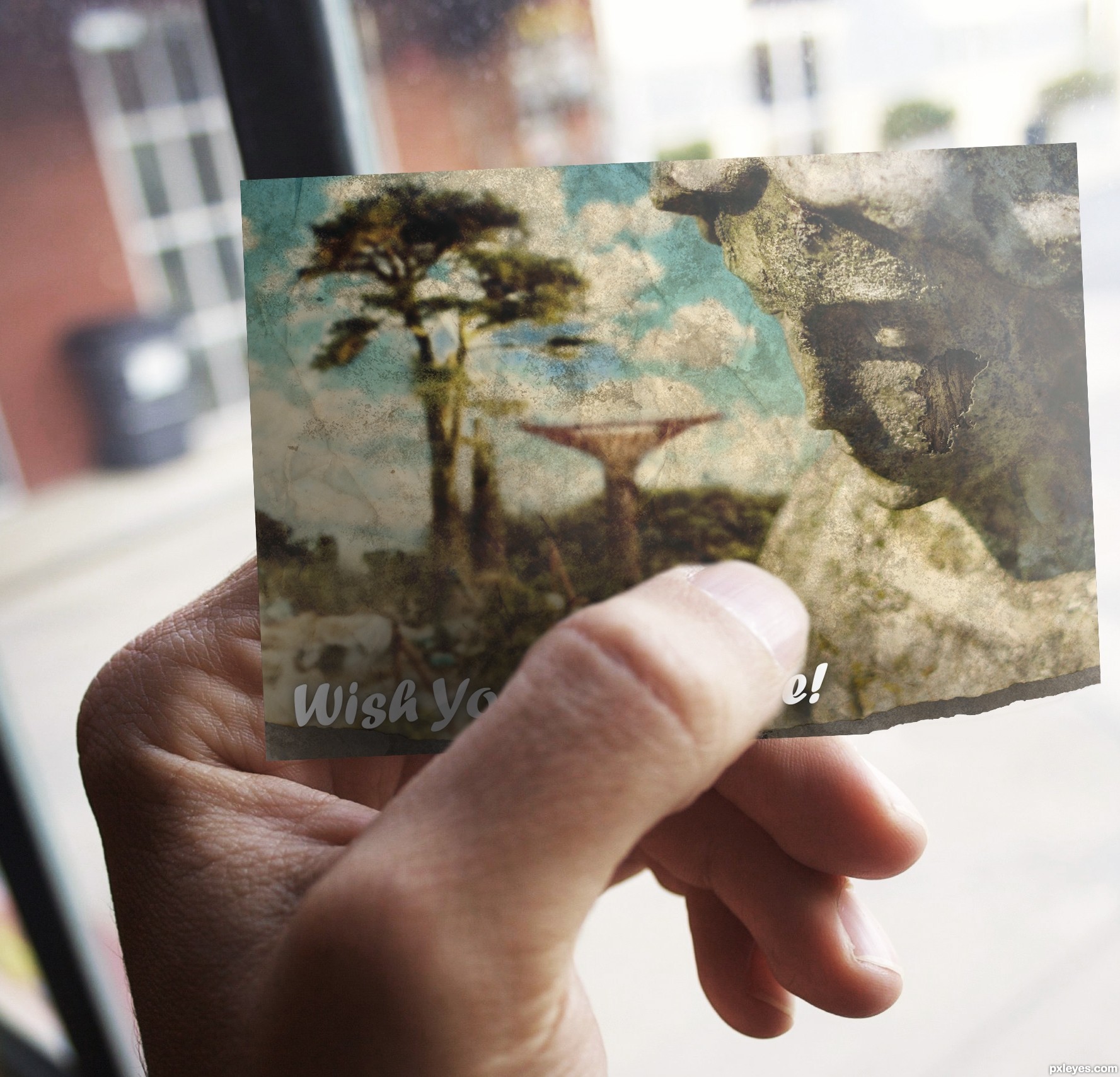
I manipulated the photograph as the background blur, you may be able to notice the constructions become trees, and that the statue's face is actually cracking away to reveal tree bark.

I then turned the image into an old vintage postcard that has been damaged.

Thanks for viewing! (5 years and 2798 days ago)

9 Sources:

avatar MossyB
MossyB says:

Very nice work, it makes a cool postcard!

author says:

Thanks! Thought it might look better as a postcard

avatar CMYK46
CMYK46 says:

Not much use of the source image.

avatar kushpatel
kushpatel says:

good blending author

author says:

Thanks kush,

Well I looked at a few entries for other contests which used less than 10% of the source image. If you view the SBS you can clearly see a large portion of the source image remains...

avatar MossyB
MossyB says:

The contest source is your main focal point, and hasn't been CBR'd (Chopped Beyond Recognition) into some bird, or flower, or other object totally unrelated to what it was. You've kept it intact and enhanced it. That is an accomplishment in itself. That you did so in a believable manner makes it a good manipulation in my book...

author says:

Thanks MossyB

avatar mounirupa
mounirupa says:

nice thaught author & good blendingbut not much use of the source image..

author says:

I'm confused by the amount of people mentioning the lack of the source image - when looking at other entries a very small portion of the source has been used or altered...

avatar JoeCacia
JoeCacia says:

It is an amazing entry and you used the source as it is mentioned, very well done author and best of luck!

author says:

Thanks Joe

avatar spaceranger

Congrats!!

Howdie stranger!
If you want to rate this picture or participate in this contest, just:

LOGIN HERE or REGISTER FOR FREE


Wish you were here - created by Olga


Wish you were here
Favs: 0SBS: 3Hi-resRank: 4/4Score: 53.4% (0)7753 views

Thank you xlordashx's photostream for the picture of girl!
Thank you vormin for the picture of ship!

(5 years and 2928 days ago)

4 Sources:

avatar Androla
Androla says:

very beautiful!

avatar hymerion
hymerion says:

great one!

olga says:

Thank you guys

Howdie stranger!
If you want to rate this picture or participate in this contest, just:

LOGIN HERE or REGISTER FOR FREE


Were They Head Hunters ? - created by Chuck


Were They Head Hunters ?
Favs: 0SBS: 9Hi-resRank: 4/4Score: 50.4% (0)7736 views

(5 years and 2948 days ago)

avatar thefinalcut

Nice idea. Try making the wood part a little darker to bump up the contrast. Maybe add some shadows. Good Luck!

author says:

Thanks thefinalcut

Howdie stranger!
If you want to rate this picture or participate in this contest, just:

LOGIN HERE or REGISTER FOR FREE


They Were All Thumbs - created by Drivenslush


They Were All Thumbs
Favs: 1SBS: 7Hi-resRank: 4/4Score: 52.7% (0)6114 views

source (5 years and 2952 days ago)

avatar erathion
erathion says:

wow...this look so freaky and so cool....good luck author

avatar gornats
gornats says:

Howdie stranger!
If you want to rate this picture or participate in this contest, just:

LOGIN HERE or REGISTER FOR FREE


And then there were 8 - created by stevey666


And then there were 8
Favs: 4SBS: n/aHi-resRank: 4/4Score: 57% (0)20204 views

A little piece of my childhood died making this, 9 just seemed like a perfect number. Now the rhyme is "My Very Easy Method Just Speeds Up Naming". Naming what?

The idea I had was this to be a high school scientific resource from the 50s/60s, now updated to remove Pluto

Anyway, made with copying, resizing, burning, bluring, cloning. The usual suspects, nothing fancy.

Edit: I cleaned it up a little and removed the text as I felt the Pluto message to be stronger this way. (5 years and 3125 days ago)

9 Sources:

avatar jamespaul
jamespaul says:

like ur concept....

gud job

avatar DanLundberg

Clever and amusing. The planets need more shading to appear less flat and more like 'marbles' in the box. The back half of Saturn's rings should be inside the box bottom. (I like the slits in the box cover for the front half of the rings.) The labeling on the cover side is extremely bland [euphemism for 'boring']. Something shorter like "The Planets in a Box" spread across the entire front in colored, kid-friendly type would be more appealing.

avatar MossyB
MossyB says:

LOVE IT! Especially the crossed out "Pluto."
Simply Excellent. I hope you win with this one!

avatar itgik
itgik says:

Great work author.
My only suggestion would be that Uranus has rings too.

Pluto should still be a planet IMO

no avatar

Love it! Did you consider taking the balck out from the centre of Saturn's ring? s oyou could see the box behind it instead of space?

avatar hazem
hazem says:

it is very nice and new good luck

author says:

Edited a little (hope thats okay!), thanks everybody for your crits and comments. I need to work on my ability to shade.

itgik, I hated Uranus for having rings after I did Saturn, but they are comparitivly mild so I decided not to include them . I agree with Pluto, keeping it for old times sake, but damn I didn't know how many other Pluto sized objects there are: http://en.wikipedia.org/wiki/File:EightTNOs.png

avatar cabldawg71

nice idea and good chop Author I want one.

avatar jawshoewhah
jawshoewhah [banned] says:

Nice 1! GL!

avatar erathion
erathion says:

Great concept author...And i like Pluto idea so much...LOL...best of luck

avatar arca
arca says:

Very clever and original ... Poor Pluto!

Howdie stranger!
If you want to rate this picture or participate in this contest, just:

LOGIN HERE or REGISTER FOR FREE