(5 years and 2889 days ago)
1 Source:
- 1: source1
(5 years and 2891 days ago)
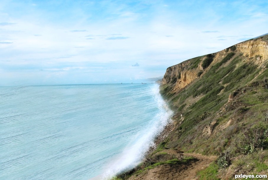
Too much obvious repetition of the waves in the outside source, and the perspective is off.
Howdie stranger!
If you want to rate this picture or participate in this contest, just:
LOGIN HERE or REGISTER FOR FREE
thanks to coloniera2 for the image (5 years and 2893 days ago)
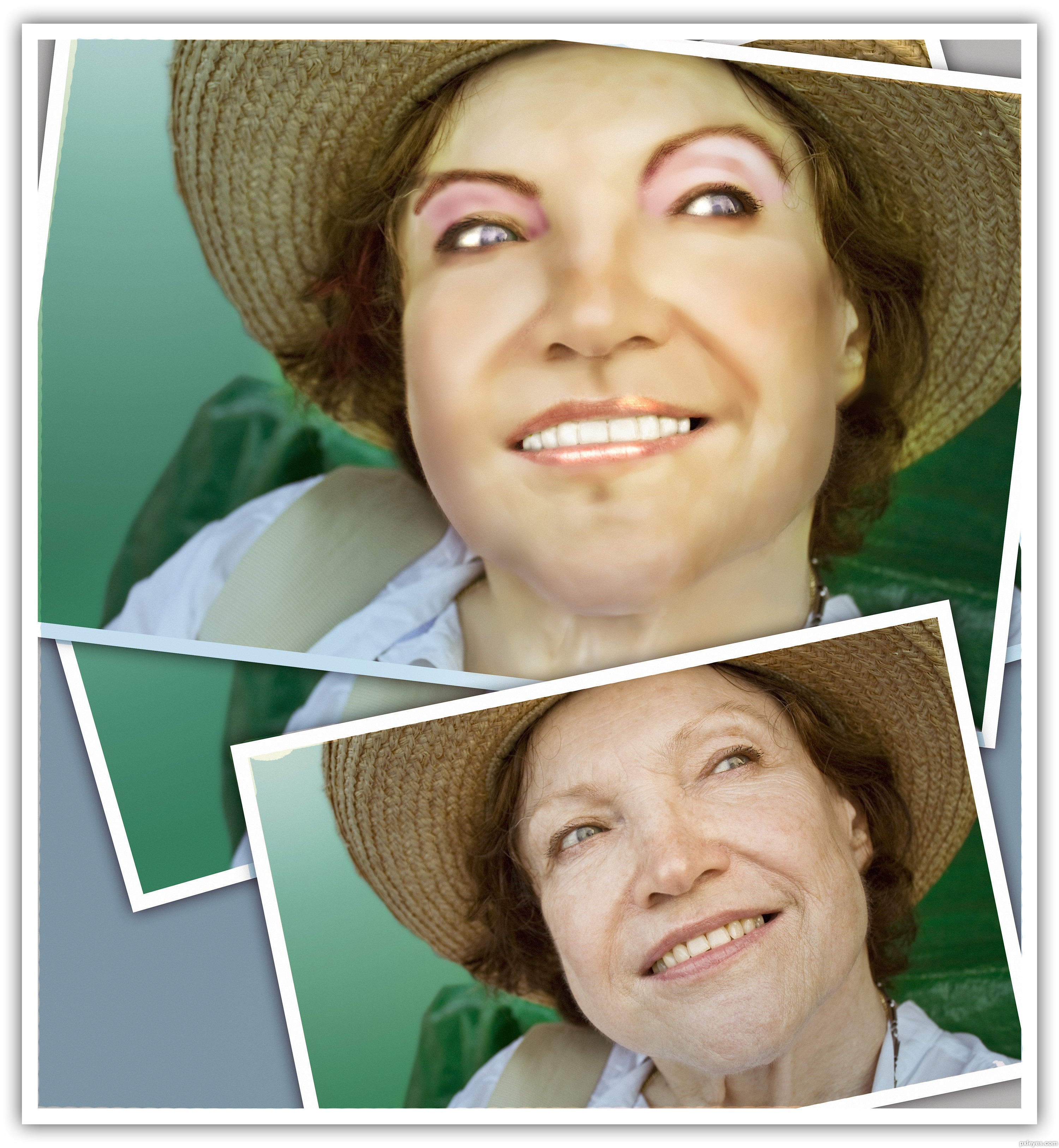
Her skin tones are very blotchy and strange - Her forehead looks almost green, while her jawline looks bruised...Makeup should even out the skin tones, not emphasize them.
You've also whitened her eyes and teeth a bit too much. Sometimes, less is more.
Howdie stranger!
If you want to rate this picture or participate in this contest, just:
LOGIN HERE or REGISTER FOR FREE
(5 years and 2985 days ago)
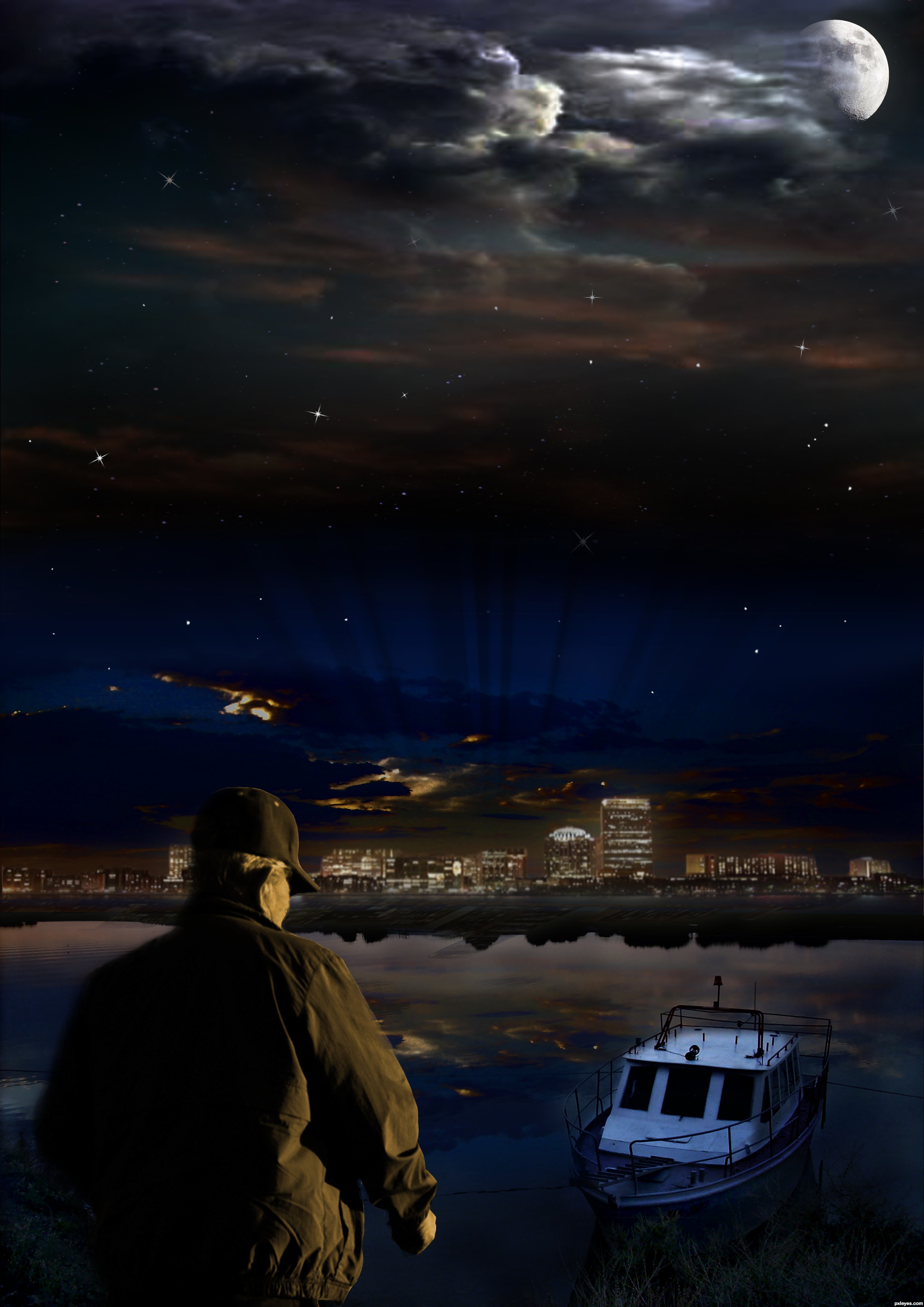
Beautiful starscape, but the bottom is too dark.
This is really nice...good combination of sources. The foreground guy is warm and the boat is cool. Perhaps it would look more together if they were both a cooler color....since lunar light is more cold than warm. It almost looks right now as if the guy is being hit with a sunset from extreme right. 
Cool mix of different images...gl
There's just as much yellow in the background as in the foreground. Yellow doesn't work well in a simulated night scene as described in the contest description, but if you want yellow lights in the background, the foreground should be more blue.
Howdie stranger!
If you want to rate this picture or participate in this contest, just:
LOGIN HERE or REGISTER FOR FREE
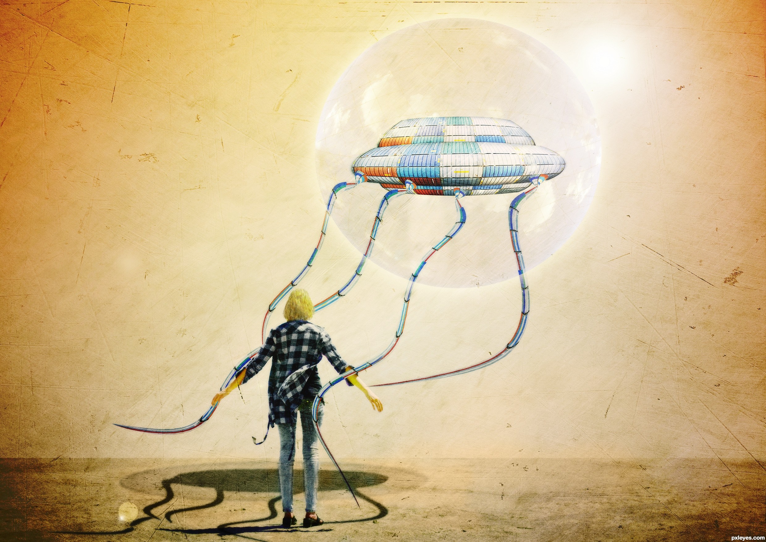
I know the shadow is not ok, so any help is welcome. (5 years and 3023 days ago)
great use of source
cool idea GL
I just wonder about the model,....dont you think that she should be bit smaller or that flying thing in a higher position or ......aarggh.....maybe it is just my eyes that are wrong to see the compo,.......but one thing for sure it is great work,.....
I didnt think of that, the model, but yes I will try to make different adjustments this week on this, thanks dek !
looks A LOT like a book illustration!!! Kudos!!! author.. good luck
Good image. The tentacle behind the figure makes it very hard to judge the shadows but for sure the dark comma shaped shadow to the right of the figure on the ground needs to go. You're on your own for the rest. 
Hey author, great work, my gf loves it.
Tentacles' shadow should be united with the main shadow which should be a perfect elipse. Because of the angle of the light you won't see the projection of the upper side.
Imo, it would add a great effect to make a shadow of the bubble as well, use this as reference:
http://farm3.static.flickr.com/2530/3676289691_7fd9418923_o.jpg
thanks guys,and greymval thanks for the advice!
interesting!
It definitely looks better, good job!
I don't wanna be pushy, but you should know that the shadow for a suspended object equals the length of an object when light source is above.
So the dark elipse should be same length as the ufo, and the light elipse same length as the diameter of the bubble ( which is an energy shield, right?  ).
).
ooo,,,
you are right againnn I spend a lot just for these shadow 
I love it. I love the concept, i love the execution and i love the title. Really well done author 
Wild! GL!
Very cool surrealistic image!
Author, here's a good link on casting shadows.
http://www.photoshop-pack.com/details/Casting_Realistic_Shadows/11041
I know there are others, but I can't find 'em right now. Good luck!
Love the illustration look. I personally don't get the title.
Shadows continue to be a problem. The figure's shadow seems to be cast in a different direction than the UFO's. A line drawn from the center of the UFO's shadow through the center of the UFO itself doesn't continue on through the center of the light source. The tentacle shadows don't blend that smoothly into the UFO body's shadow.
With the strong back-light source, the front lighting of the UFO (and especially its underside and the tentacle connections) and the side/slightly-front lighting of the figure seem unnatural.
cmyk: thank you for the link , it was usefull !
dan: the title cames from buble , if you look at source 3, the sky is in the buble but I blend it at hard light mode and I losee the shape of the clouds, I think I will change this too
for the shadow you are right, but I know now what the problem was
the proble is the shadow of the girl in originaly source , I manipulate the photo ....but I didnt manipulate the shadow og the girl!
I think that if I wash out a little the shadow of the girl and with the right perspective for the other shadows that will be much better!I will try.
Thank you again all, I learn a lot from this entry and this is good!
Very very nice work author...i did not saw previous edition,but this one look very good...best of luck
Congrats on second !!
Congrats...so cool work...
Congrats for 2nd, nice
thank you!
Congrats!
Howdie stranger!
If you want to rate this picture or participate in this contest, just:
LOGIN HERE or REGISTER FOR FREE
Photography and photoshop contests
We are a community of people with
a passion for photography, graphics and art in general.
Every day new photoshop
and photography contests are posted to compete in. We also have one weekly drawing contest
and one weekly 3D contest!
Participation is 100% free!
Just
register and get
started!
Good luck!
© 2015 Pxleyes.com. All rights reserved.


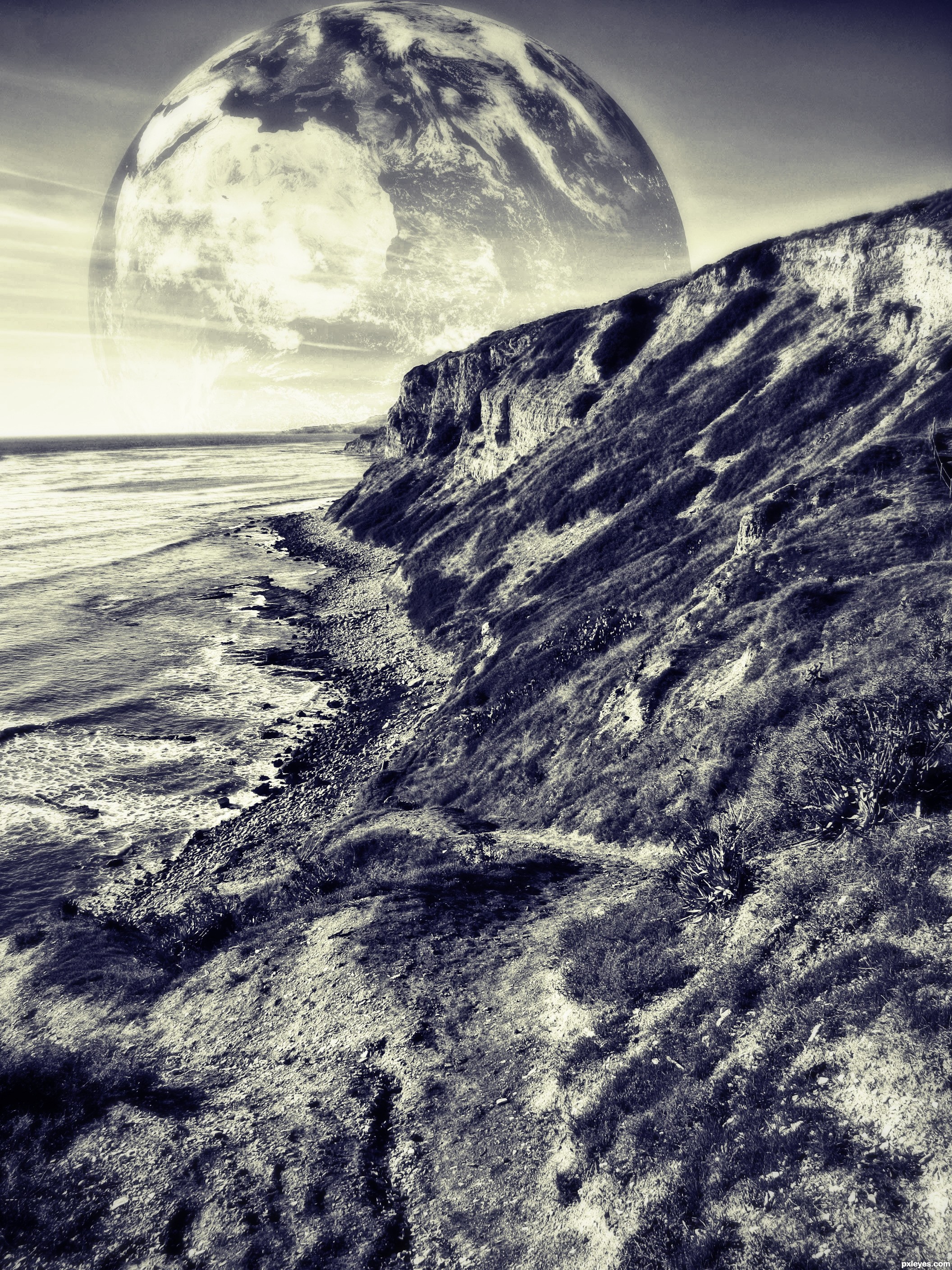
Would have been better in color...
I was going for a 50's bad science fiction movie look...but thanks!
I like the tone
I liked the shade!
good combination
Howdie stranger!
If you want to rate this picture or participate in this contest, just:
LOGIN HERE or REGISTER FOR FREE