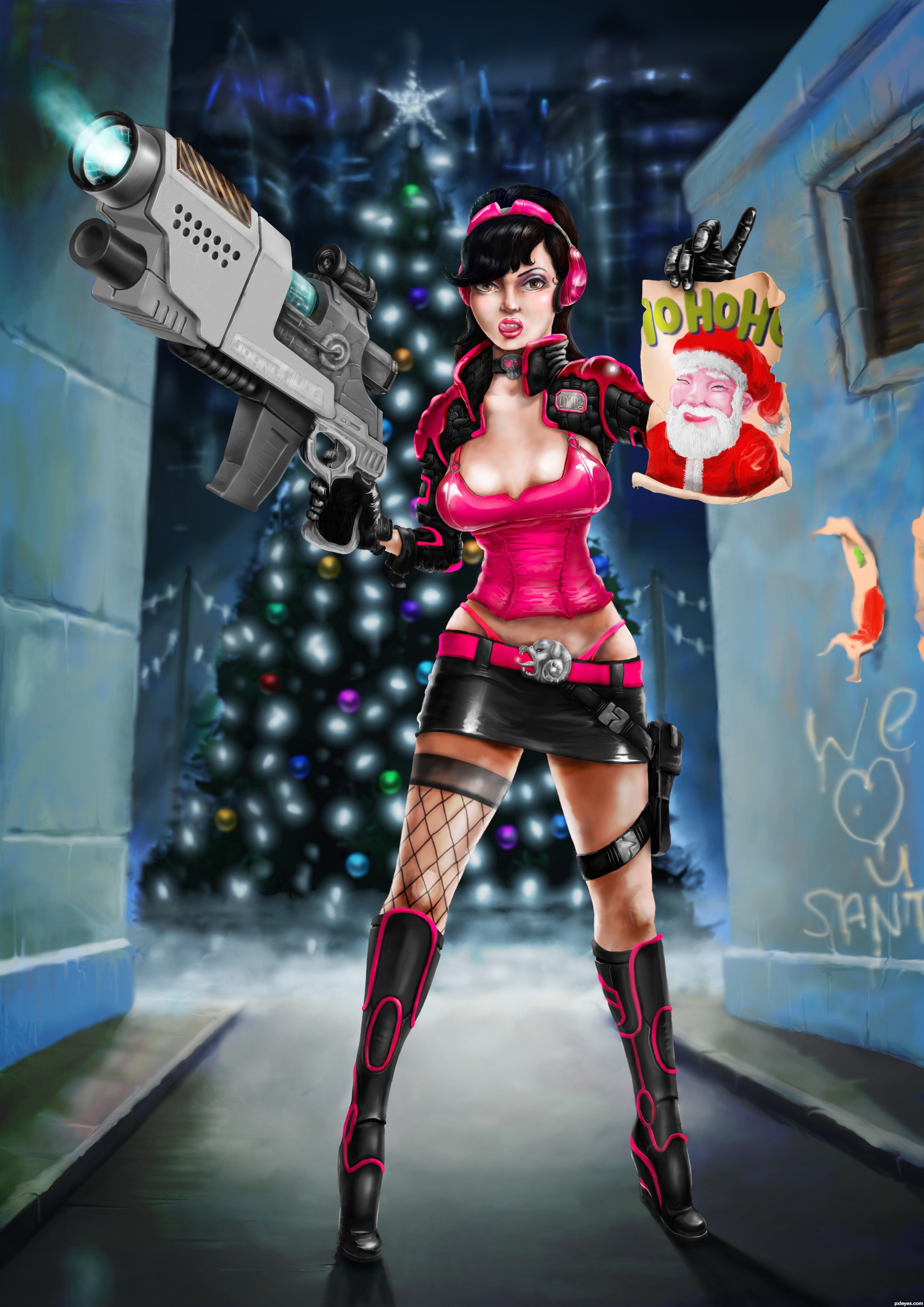
Being a bounty hunter is not easy. Sandy Clowes can tell you about it, because she is one of them. Although you live for the danger and excitement, it's also a lonely and exhausting life. In the end you can't trust anyone...
But ok, after all these years she's kind of used to it, the people, the threats, etcetera.
Until this last Christmas, which normally is her only time of hope and peace. Because it was Santa himself who refused to give poor Sandy a nice pressie for the holidays for the reason that (I quote) "she was not much of a nice and even a naughty lady"! Said Santa!! Who does he think he is and talking to?! Isn't this girl also just some mother's daughter?...
So yeah, then something snapped in Sandy's head and made herself a new hunter assignment. Wanted: Santa Claus!
It's personal now, you know?!
This entry is 100% drawn in ARTRAGE. The program is some simplified Photoshop where the focus is on drawing and painting. It's a pretty nice program, especially when you're used to the old fashioned way of drawing and painting; the brushes can make a same certain effect. However, many other options (like masking, advanced transform and more handy things from PS) are missing.
For this entry I used some references. Check the SBS how they're used (nothing is traced).
Needless to say that this entry should be submitted a month ago. Time wasn't with me though, and I didn't want to wait another year before I could upload this image.
Before I forget:
****must be seen in High Resolution****
Otherwise you can't see Sandy's tongue touching her upper lip...
Thanks for reading all this. (5 years and 3012 days ago)

 (
(


awesome

Awesome work I love her expression..... Santa had better watch out....
This is fantastic!!! Love everything about this art piece = )
This is amazing work.. The sbs is great! If I only could.. Wow wow wow.. Fav!
Awesome
This is making my juices flow and I have a good feeling must add.
amazing digital drawing Good luck!
Greatest as always........................... wooooooooo.... you are my favorite author...

It's always a pleasure to see your work! You don't post much but when you do..............SPEECHLESS!
That's so surprising for me to find your entry here, seems like you worked for that piece a long time and this contest is the perfect place for submitting whatever you like to do . Fav immediately and high marks. But, let me give some strict critiques (even though I consider it's a kind of perfect entry). In perspective, the positions of her legs are not much different (the right one is a bit closer to us) but, to me, their proportions are different considerably, the right boot is quite longer. About Santa's "poster", seems like the piece in her hand is from the one on the wall, but I can't find they're fitted together (just if my presumption is correct). About lighting, definitely you used a complex lighting mode, with the strongest direct light from her back, but the light comes from her front is not very well managed when we consider the shadows. Base on the shadow on the bottom of the picture in her hand, the light comes from her front but lower than her hand, base on the shadow under her skirt, the light come from the position higher than her skirt. So, the front light is from somewhere as high as her belly! From that conclusion, you need more shadows, such as the shadow of the picture on her left arm, some shadows on the other side of the gun, etc. And the most important thing is her second shadow on her back, which is not as dark as the main shadow, but should be more convincing.
 . You'll get one more first place for sure, even among the top work of the site
  .
.
Phew, finally I showed you all that I can find here, hope it's not frustrating to you
Holy moly, this is some amazing work! Overall really good, but I LOVE that gun! Nice attention to detail like the graffiti.
This is totally a fav! Great job on this!
wow, this is fantastic work, love it
So Hot!
Fantabulous!!!
Another classic... fantastic detail...I`m taking note
Wow, Santa Claus little helper has gone wild and invincible Great work and congrats in advance


´´´´´´´´´´´´´´´´´´´´´´¶¶¶¶¶¶¶¶¶……..
´´´´´´´´´´´´´´´´´´´´¶¶´´´´´´´´´´¶¶……
´´´´´´¶¶¶¶¶´´´´´´´¶¶´´´´´´´´´´´´´´¶¶……….
´´´´´¶´´´´´¶´´´´¶¶´´´´´¶¶´´´´¶¶´´´´´¶¶…………..
´´´´´¶´´´´´¶´´´¶¶´´´´´´¶¶´´´´¶¶´´´´´´´¶¶…..
´´´´´¶´´´´¶´´¶¶´´´´´´´´¶¶´´´´¶¶´´´´´´´´¶¶…..
´´´´´´¶´´´¶´´´¶´´´´´´´´´´´´´´´´´´´´´´´´´¶¶….
´´´´¶¶¶¶¶¶¶¶¶¶¶¶´´´´´´´´´´´´´´´´´´´´´´´´¶¶….
´´´¶´´´´´´´´´´´´¶´¶¶´´´´´´´´´´´´´¶¶´´´´´¶¶….
´´¶¶´´´´´´´´´´´´¶´´¶¶´´´´´´´´´´´´¶¶´´´´´¶¶….
´¶¶´´´¶¶¶¶¶¶¶¶¶¶¶´´´´¶¶´´´´´´´´¶¶´´´´´´´¶¶…
´¶´´´´´´´´´´´´´´´¶´´´´´¶¶¶¶¶¶¶´´´´´´´´´¶¶….
´¶¶´´´´´´´´´´´´´´¶´´´´´´´´´´´´´´´´´´´´¶¶…..
´´¶´´´¶¶¶¶¶¶¶¶¶¶¶¶´´´´´´´´´´´´´´´´´´´¶¶….
´´¶¶´´´´´´´´´´´¶´´¶¶´´´´´´´´´´´´´´´´¶¶….
´´´¶¶¶¶¶¶¶¶¶¶¶¶´´´´´¶¶´´´´´´´´´´´´¶¶…..
´´´´´´´´´´´´´´´´´´´´´´´¶¶¶¶¶¶¶¶¶¶¶……
Great work !
Knew this was done by you the moment I seen it in Hi Res, only one here who has that knack with photo manipulating to drawing, love the whole thing, don't see all the things Langstrum does, but I do see a serious problem at the center of her bosom, looks like a third one is starting ,lol. Very very well done. looks like a winner.
Normally I dont reply during an open contest, but an exception for everything. .
.
@Glockman: it's not half painted, half photo. Everything is drawn/painted with only photo references as inspiration. Please see SBS. I dont see a 3rd breast, but nothing seems impossible these days
what to say........ nothing is impossible for u ...... great work author ........
Totally awesome on so many levels. You took no shortcuts, there's such a lot of hard work apparent in this picture. Despite all the serious work put into it, it's still humorous and it looks like you had a lot of fun doing it. Could you share how long it took you to do this from start to finish?
Spectacular work, what else to say...
Great entry.The gun looks splendid.Maybe,color harmony should be little different,but it's a matter of taste.Congrats.Another fantastic work.
Where do I sign up for lesson, I will totally travel = )
I will car pool with Emik....WOW.
Wow, nice to see another masterpiece from you
Awesome Entry with classic touch..........Good Luck Author.
U r just awsome my friend....true artist.....i really dream to have artistic skills like u...
Amazing work!!!
Killer......and very encouraging SBS
JB
Congratulations, Waz!
Congratulations on a well deserved 1st place!
congrats Waz!!!!!!!!
Congrats Mr.Waz, another great art in your gallery. I expected much higher score tho. Hope to see you more in the future contests.
Thanks for all the comments. I'll reply a few. . And about your expectations: a PXL entry is like a piece from a mandarin, you never know if they gonna like it (free from Forrest Gump...), So I'll see if I'll spend so much time again.
 ).
).
@langstrum: about the legs, you're right. I messed it up a bit with the perspective. I wanted Sandy's right leg (on the left in the image) to be really coming to the viewer and therefore exaggerate the difference between the 2 legs a bit (together with a low perspective line). But then when I was doing the background I found out that some things wouldnt fit well with the position of her left foot and the walls. Also, it's a bit hard to see now if the walls are close to her or somewhat further away, due to this perspective. Ow well...
About the light, I might have made some mistakes with some light directions, but overall I think they fit well. In my view there are 3 lights: the one in the back, the one front up in the middle right and -very soft- light from under that bounces from the ground on her clothes, gun, etc. So then it's quite a puzzle when what object needs how much light
@Mad: Yeah, it was fun (doing all the details like the chain around her neck or dressing up the gun), but sometimes also frustrating. It was the first time that I made such drawing in Artrage (before, I just tried some sketches) and found out that if you work big, the program needs quite some time to progress changes (ie if you change a layer or make something bigger, things like that. And there was nothing wrong ith my pc). That keeps me off from a working flow. But ok, the drawing itself was also time consuming. I think I spent around 45-50 hours from the 1st sketch till the final. I'm quite sure I'd be faster in Photoshop (but it was more of a challenge for me to make it all in Artrage
For who's interested, I also captured the whole process of the drawing. It can be seen as a movie here: http://www.dailymotion.com/video/xgtmmv_time-lapse-video-sandy-clowes-is-coming-to-town_creation
Congratulations for 1st place, great pic.
Congrats Wazo absolutely superb
Congrats, though I thought it should have scored higher too.
AMAZING!
Well congrats and not just on this 1st but congrats on the one thing NONE of us have done and I'm sure never will duplicate. STILL a flawless portfolio of 1st place winners.

I hope you don't mind the pedestal.......
Howdie stranger!
If you want to rate this picture or participate in this contest, just:
LOGIN HERE or REGISTER FOR FREE