didn't add planes...its just too sad (5 years and 3331 days ago)
(5 years and 3389 days ago)
very cute idea
Thank you FairyGardens
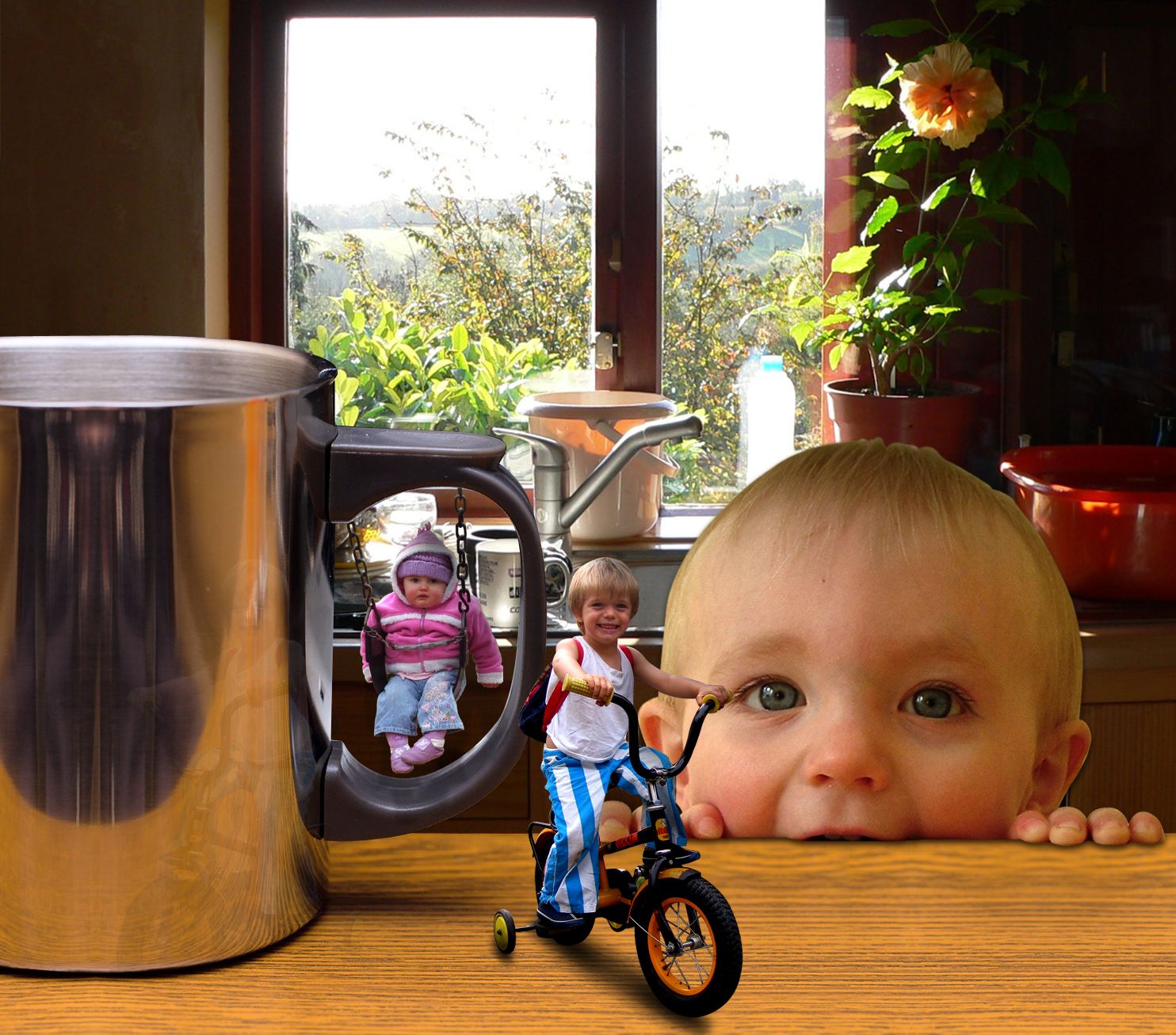
The shadows seem a wee bit off but this image is a unique entry, but I would remove the little scar or scab off the kids nose and forehead. (the big kid).
EDIT: Better
reminds me of Honey I Shrunk The Kids .... rofl
Howdie stranger!
If you want to rate this picture or participate in this contest, just:
LOGIN HERE or REGISTER FOR FREE
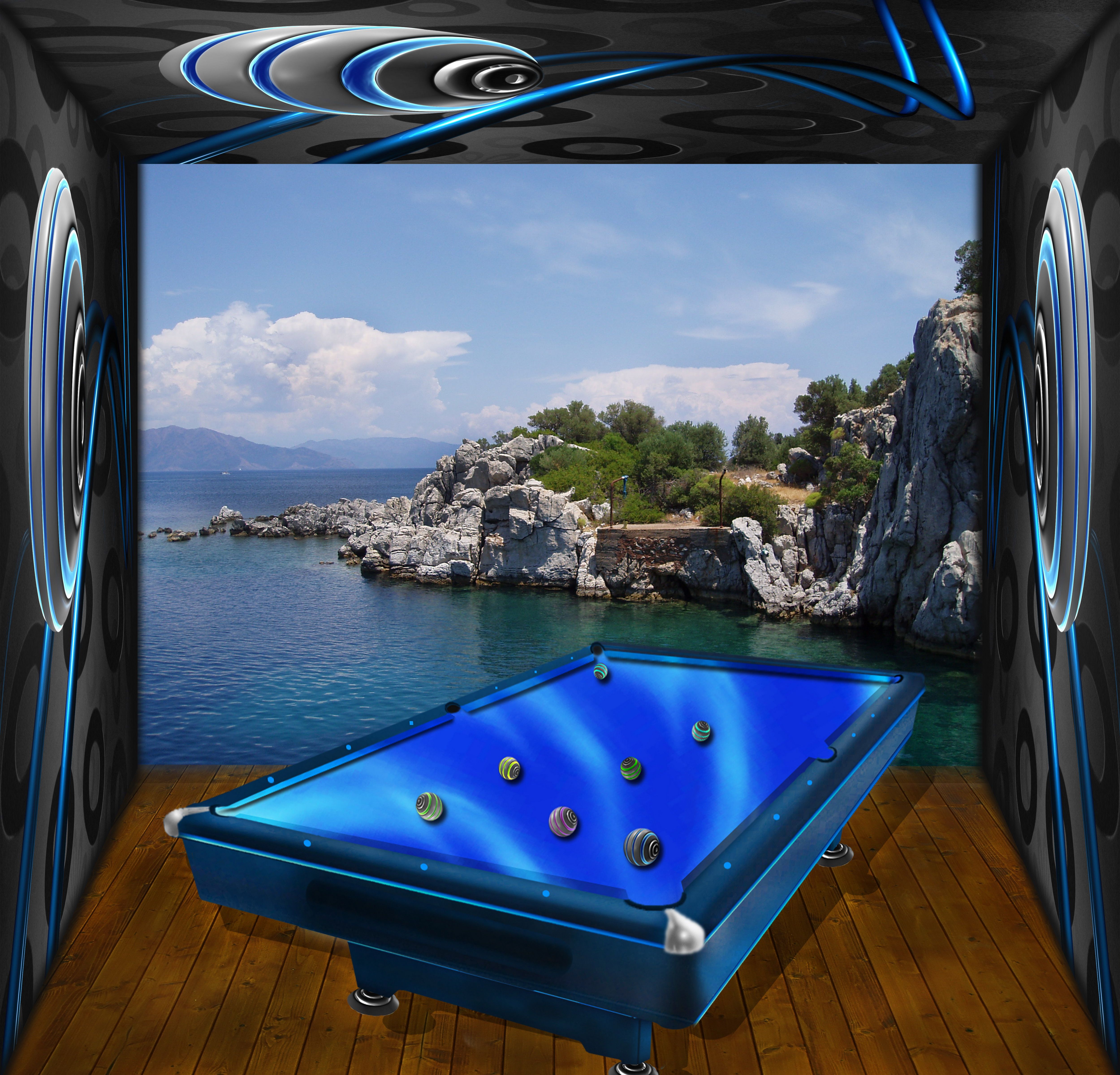
i used the source for the pool table and room. i am waiting your suggestions for improvements. thx. (5 years and 3488 days ago)
interesting work. The balls look a bit distorted and, most important, the shadows do not have the same direction. 
the blur on the pool table in high res is very heavy compared to the fantastic resolution of the floor and the walls (the poolballs are very blurry) But the overall image is FANTASTIC) though I think alot of the players are going to be hitting there cue sticks against the wall trying to make shots.. hehehe.. but the overall concept is quite beautiful.. I'd hang this in a game/pool room in a nanoscecond...good luck author!!!!
EDIT: great fixes... still and more elbow room.. woo HOO
thx for suggestions. i fixed the shadows and the balls, and enlarged the room .
.
Howdie stranger!
If you want to rate this picture or participate in this contest, just:
LOGIN HERE or REGISTER FOR FREE
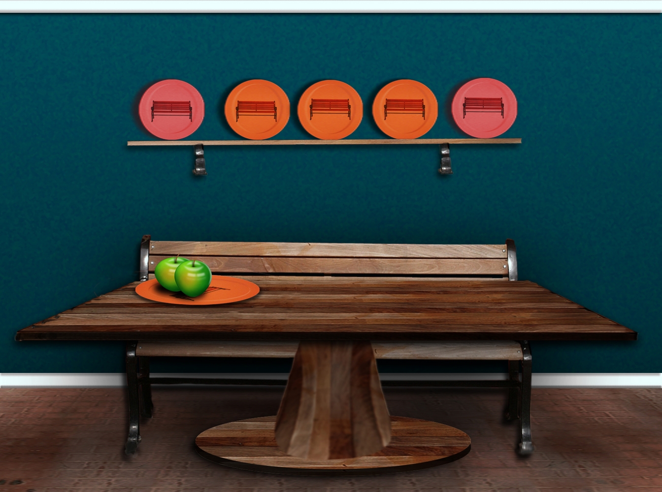
This is source and Photoshop only work. (5 years and 3587 days ago)
cool idea  gl
gl
good work, but perspective of table is too much
What a great visual!!! It's like Mr. Monk's Room... super tiny nit pic..the space between the first plate and second plate is off, and as Gopan Said the perspective is off on the table, it should match the pattern on the floor.. but this in NO WAY takes away from the piece..it's absolutely beautiful.. good luck on this author
well done
great
Grannies house and furniture are old, nothing is quite level there...lol, thanks for the comments 
Perspective is wrong both ways...table is too wide in front, and is leaning towards the viewer...
love those apples
Howdie stranger!
If you want to rate this picture or participate in this contest, just:
LOGIN HERE or REGISTER FOR FREE
Photography and photoshop contests
We are a community of people with
a passion for photography, graphics and art in general.
Every day new photoshop
and photography contests are posted to compete in. We also have one weekly drawing contest
and one weekly 3D contest!
Participation is 100% free!
Just
register and get
started!
Good luck!
© 2015 Pxleyes.com. All rights reserved.


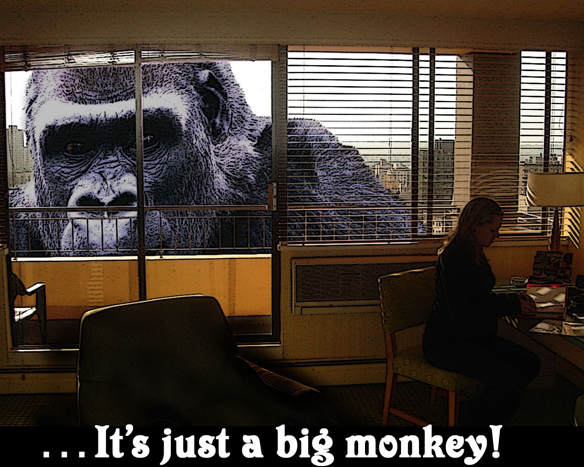
I agree with Nator, type doesn't work and detracts from the image. BTW on behalf of the great apes of the world, a gorilla is NOT a monkey.
nice, but did you use the photocopy filter or something like it on Kong ? I don't think he needed it, it gives him a newspaper cutout look. Nice masking around the railings mind
Really nice idea. The text and the filter on the gorilla spoil it a little.
Howdie stranger!
If you want to rate this picture or participate in this contest, just:
LOGIN HERE or REGISTER FOR FREE