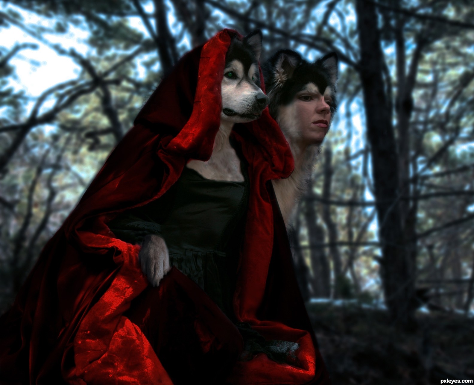
(5 years and 2388 days ago)
2 Sources:
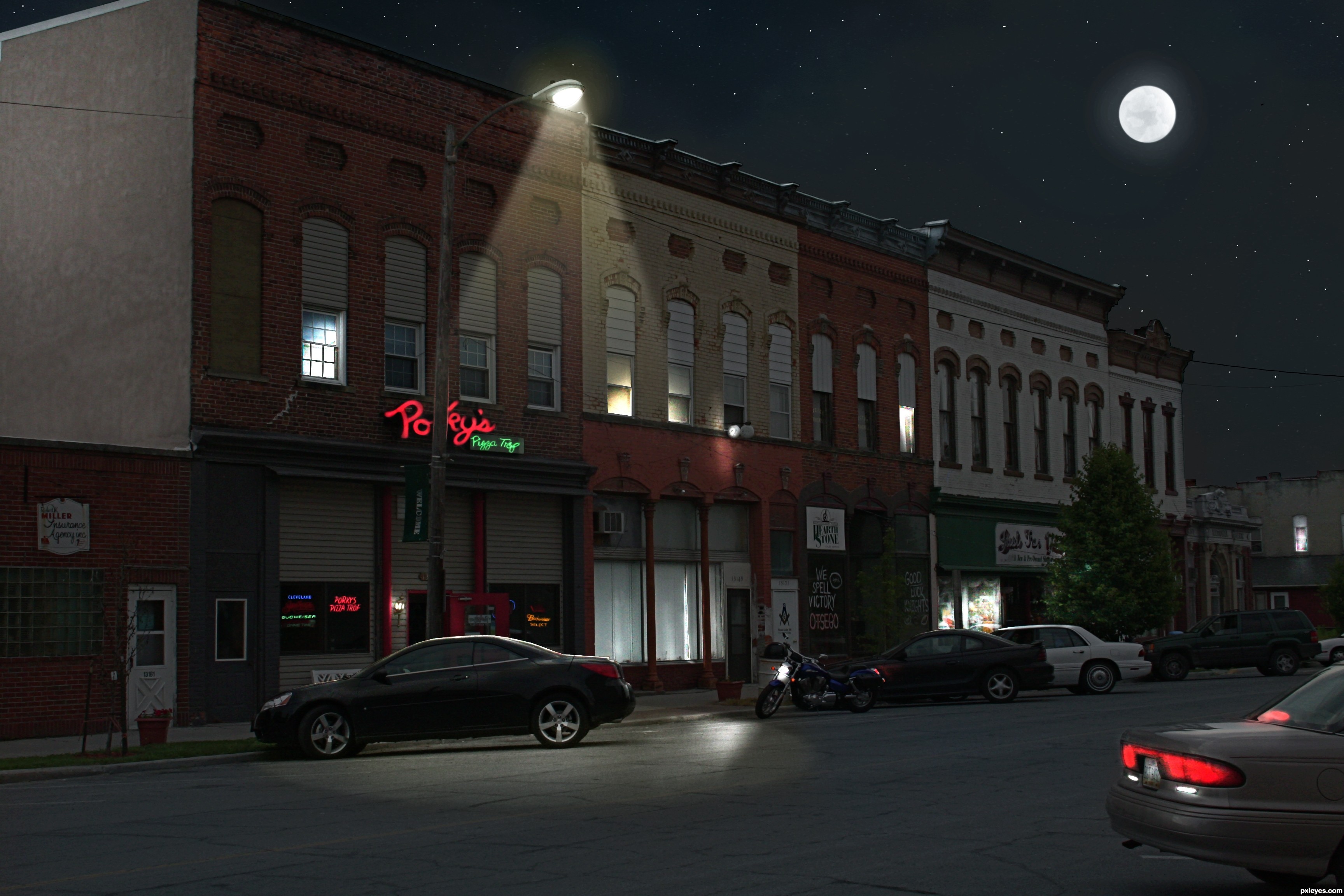
Old part of the village I live in. Day to Night. (5 years and 2488 days ago)
Very well done! Great lighting! 
knew it! good job author! good luck!
nice one...i always wondered how to do this..nice SBS too
i really like the SBS! nice job author. Good luck!
Well done, wish I had though of it = )
spooky!
Great work and helpful SBS.
Nice! Very realistic looking, great job. 
Congrats Chad  terrific work
Congrats Chalty669
Congrats!
Congrats!!
Howdie stranger!
If you want to rate this picture or participate in this contest, just:
LOGIN HERE or REGISTER FOR FREE

(5 years and 3393 days ago)
Your guide is very difficult to see, perhaps try it on a darker background. The image itself is very nice!!
the idea of the neon light is good but the choice of the font color combined with the background color is bad. I would suggest to add a shadow to the text so it can pop out a little or to go with a darker backround. Good luck anyway thought
how is this? is it better???? should i put something back...
Glass part looks good, threaded base should be metallic...
Go green, turn your light on? .. Isnt it like better to turn your light ofF?
this is suppose to be one of those light bulbs that are better for you. I forgot what they are called, but the ones with the curl in them.
great
Howdie stranger!
If you want to rate this picture or participate in this contest, just:
LOGIN HERE or REGISTER FOR FREE
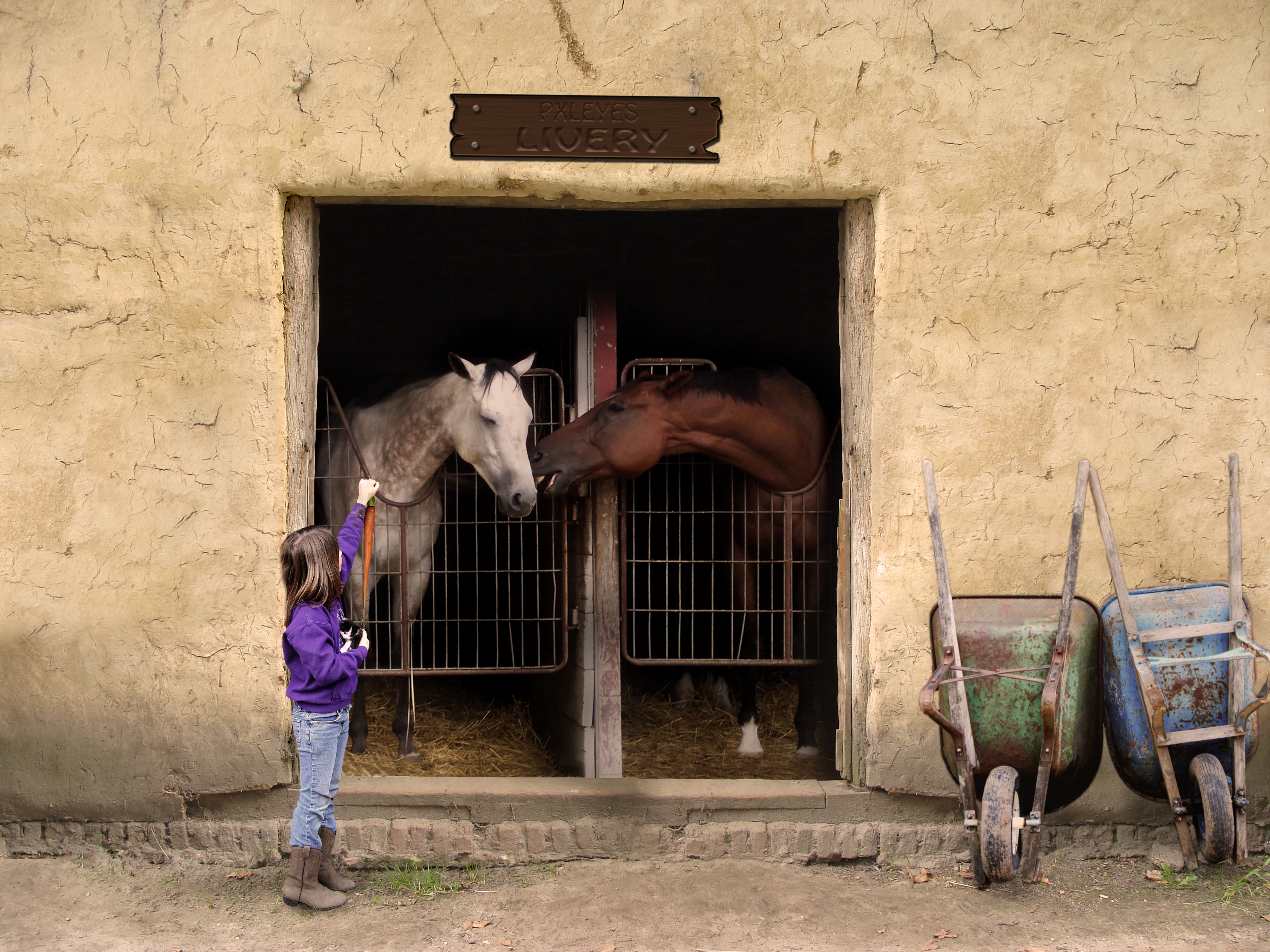
".... psssst, go for the one in the other hand - they taste like chicken!"
Constructed the Livery sign in CS3 - sbs to follow. (5 years and 3526 days ago)
horses don't eat kittens.. LOL.. good humor author
The girl is floating...otherwise this is great. 
PS: IMHO the only thing that would make this better is if we could see what the girl is holding, like maybe a carrot?
A horse is a horse of course of course....say Wilbuurrrr, Good work on this one
in high res i can see the lines where you copy pasted wall below the sign you can fix that ofcourse with the patchtool or by leaveing the top layer a lil long and with a large soft brush on like 25% or so erising the edge so the flow better into eachother.. as picky as i am.. at the doorstep the cuout is really a tat too sharp in high res use a soft blur on that edge and you will also that tiny dark cutout line there most likely... the girls feet are not on the floor and while looking there i also saw a copy paste line there that you easely can cover with patch tool
I rly like this piece.. very realistic done too
Thanks for the improvement tips. CMYK - am considering your carrot suggestion. And to Eladine - wow. Your eyes are far better than mine - after putting in the intitial time in the construction of this piece - I said, "I'm done. Time to submit" I never looked back until the comments started to roll in. Fixed what was pointed out (girl, masking, sharp edges) keep 'em coming - this just keeps better and better from your suggestions.
xD very nice!!
Very well. One thing though, if you zoom in at the girls feet the wall behind has a very sharp edge and doesn't quite meet with the floor. You can blend that out with the eraser and clone tool. It might help if you add some shadows under the wheelbarrows aswell. Otherwise great image!
XD sorry but dont worry im even mroe pickier on my own work o.o; and i rly like what you did.. good job on the corrections by the way altho the copy paste lines above and below the door openeings are still there :P high marks from me anyway.. good job
Nice blend and good composition. I like the simplicity.
Holy hi resolution  . No worries El, appreciate your attention to detail
  . Here is a sincere request; however - please provide me with your home email. Those c&p lines were dreadful! I gave a cursory look before submission, then I really took a look last night after your review (
  ), then today I come back to check and I didn't even get most of them!
  so perhaps you'd be interested in "proofing" my entries prior to submitting them?? (for a small fee, of course!
 )
)
At any rate - I think this final correction should make you happy. I challenge you to find a single straight line anywhere on the piece lol !
And to you Thomas - if you'll review the source pic, you'll see that the "foundation" of the stable is indeed lifting there too on the left side. I tried to follow your suggestion in creating a blend at that point - and with your skills I might have been able to accomplish it - but alas, with my own I was leaving Captain Cloning Marks all over the image which Eladine would have discovered later this afternoon
so in the interest of saving myself some more time (or just being lazy) I opted to leave it as it was. Great eye; however - good perception and even better attention to detail.
(sheesh - you guys are even better than I remembered! )
)
(little disappointed in you CMYK though - not until today did I realize I spelled PIXLEYES with an "i" in the sign - slipping in the old age, bro - or just going for the obvious oversights?
EDIT: There you go, Bob. A carrot per your request (hope it improves your  for typos and straight lines!!)


Ummm...I didn't mention anything about typos & straight lines, although I did say this is a great image. I'm glad the suggestions I DID make helped it be even better. Good luck, cranky author!
good use of source. Great to see you take on board suggestions to improve your entry. well done author.
great work..
great blending! good idea
Well done for trying Author. This entry definately deserves a high mark all the same.
I think you have improved it though haven't you? It looks better than it did.
Nice job.
aaaahhhhhh
Nice job.
Nice job.
Indeed Thomas, the image has improved greatly. The uh, carrot was an excellent suggestion.  as were the shadow enhancement below the wheel barrows.
Anything else jump out at you??
I like this one!
Congrats for your third place, MrBig
Congratulations for 3rd
Congrats on the 3rd place Amigo...well done
Congrats!
Congrats!
Howdie stranger!
If you want to rate this picture or participate in this contest, just:
LOGIN HERE or REGISTER FOR FREE
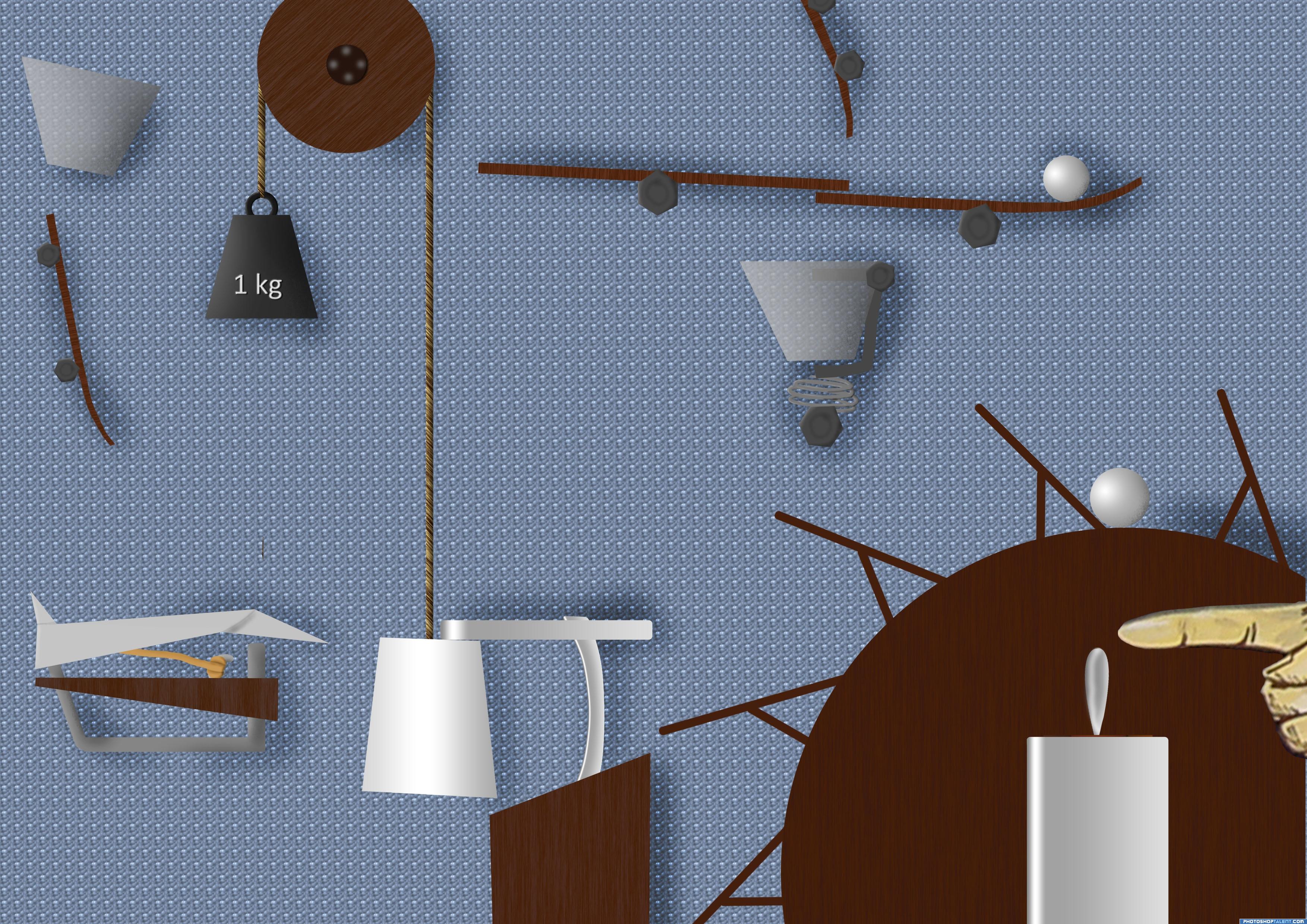
Note: please start reading slowly and increase your reading speed over time, it will make it more fun :)
It starts with the hand pushing against the switch, a motor activates the wheel, a ball then rolls over a ledge hitting a cup, taking the cup away from its blocked position, a 1kg weight pulls the cup up, activating the seesaws, the seesaws form a funnel ball rolls on the spring release, spring releases, ball flies against guide, scores 3 points by falling thru the basket, the ball falls on top of a paper plane which pushes out the rubber band holder, paper plane gets launched hitting the switch and the machine is back off!
Thanks to Jason Eppink.
P.S. I hope this is rube goldberg enough? (5 years and 3599 days ago)
i fear that your machine can be turned off much earlier from paper plane pushed from 1kg weight...
I was really waiting for someone to make an entry into this contest, I am drawing up my own ideas now and trying to make something good, nice work on your entry, I like it a lot.
oh hell.. I have no idea what to do about this contest.. glad to see someone attempt.. high marks for being one of the first
the weight falls in front of the plane (= further away from background) @ Ory: I was waiting too, but i thought what the hell. Its finished, ill submit it
aaa ok then! i didn't saw that
great job author, i wouldn't even know where to begin
GL!
Good entry
good but i dont really understand whats going on but good job looks nice
nice
Great job! Well done!
Howdie stranger!
If you want to rate this picture or participate in this contest, just:
LOGIN HERE or REGISTER FOR FREE
Photography and photoshop contests
We are a community of people with
a passion for photography, graphics and art in general.
Every day new photoshop
and photography contests are posted to compete in. We also have one weekly drawing contest
and one weekly 3D contest!
Participation is 100% free!
Just
register and get
started!
Good luck!
© 2015 Pxleyes.com. All rights reserved.


Howdie stranger!
If you want to rate this picture or participate in this contest, just:
LOGIN HERE or REGISTER FOR FREE