(5 years and 2792 days ago)
2 Sources:
created using clone, path, brush, and hue-saturation/brightness-contrast. (5 years and 2835 days ago)
The basket is too sharp edged in comparison to the rounded edges of the rest of the sculpture.
By comparison, the "neck" of the sculpture where the head was removed is too soft and rounded, making it look lumpy and somewhat "melted." A bit sharper "break" edge would better convey the headlessness. You may also want to clone in some of the leaf pattern behind the neck to better blend the space with the background.
To get rid of the sharp edged basket, try to use a little bit Gaussian Blur. Or just use the Blur Tool. A little lighting to the "neck" should make an illusion to the headless stone. Btw, where's the so called Crow? It's too dark to see the crow standing by the "neck". Try to add a little highlights to the Crow's feathers that reflect the lights/sun rays.
Hope it helps. Awesome idea, Author.
Thanks for the tips!
The neck looks much better, but now you've increased the overall contrast too much, making the brights look "blown out" to almost pure white, which really makes the ground look bad, almost like a poor infra-red effect...
Also, although you've now softened the basket, it shows NO highlights to correspond to the rest of the statue. You may have to hand paint those in with either the Paintbrush, or the Dodge tool.
Perhaps you should add a bit of the green color of the foliage back into the image?
Howdie stranger!
If you want to rate this picture or participate in this contest, just:
LOGIN HERE or REGISTER FOR FREE
Credits to katiesea (5 years and 2842 days ago)
wonderful lighting!!!!
very neat!
Very beautiful, perfect shading.
nice!!!!!! \m/ GL
its a beauty..
Nice work, author! Love the overall color and composition. Perhaps darken the right side of the statue a bit and lighten the right to give a bit more contrast to the statue. Just a thought.
EDIT: Marvelous! Love it!!
Very well crafted! Great lighting!
Superbly done specially the lighting! Great job author, an instant Fav here!
cool one
nice.... hmmm... what else? maybe a crown fit for a prince
Lovely work 
Looks very nice.. i like all the natura and at the same time it looks like a movie..
well done.
Fabulous!
Congrats, very nice work
| Congratulations....well done
nice idea! Congrats
Howdie stranger!
If you want to rate this picture or participate in this contest, just:
LOGIN HERE or REGISTER FOR FREE
(5 years and 3010 days ago)
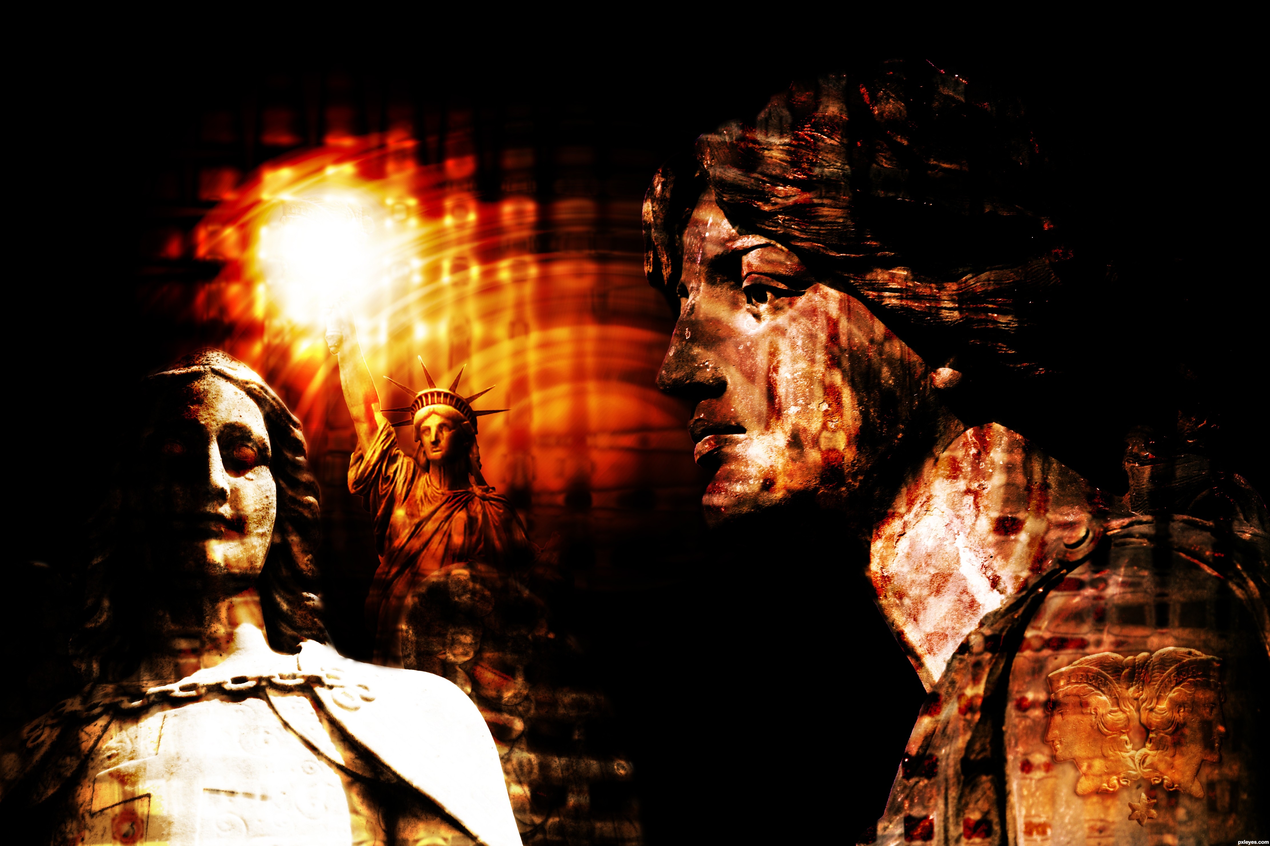
We usually provide a SBS so that people like me won't have to ask: What happened to the source?
Is it only the coat of arms on his shoulder ?
Sorry for the trouble of not posting an SBS. I am new and fully do not understand all the regulations and normal procedures of this site, and the coat of arms is the noticeable one, the eyes on the angel statue are coins, but is almost unnoticeable after all the tinkering I did, also there was another face in the torch, but all the tinkering made it completely unnoticeable. I always appreciate tips though.
People here are eager to help once they get what the author intended to do - that's why you can use the description . For ex. I see you have an overall pattern but is hard to understand how did you achieve it. Instead you can make it out of coins. You can experiment with masking the negative so that it looks like your image is made of different coins, stuff like that.
nice thinking and great title...best of luck author
Well I'd appreciate all the help I can get. And I completely understand what you are saying and I will start doing that from now on, and for this piece of work, i didn't apply any patterns. First off I spent a couple hours messing with my work, so there are no real clear steps since I kept going back and changing/adding or subtracting. But if you want I can try to go over all the steps I did.
To clarify on the "patterns", I actually merged all the layers at the end, and duplicated the product a few times and took a gaussian blur to one of them, and i used the twirl and wave distort filter on another layer. Which my original piece of the bottom layer with the blur and distorted layer above the original with the blending modes changed.
I liked the use of light, the color used and experiment result. Nice work. GL
Howdie stranger!
If you want to rate this picture or participate in this contest, just:
LOGIN HERE or REGISTER FOR FREE
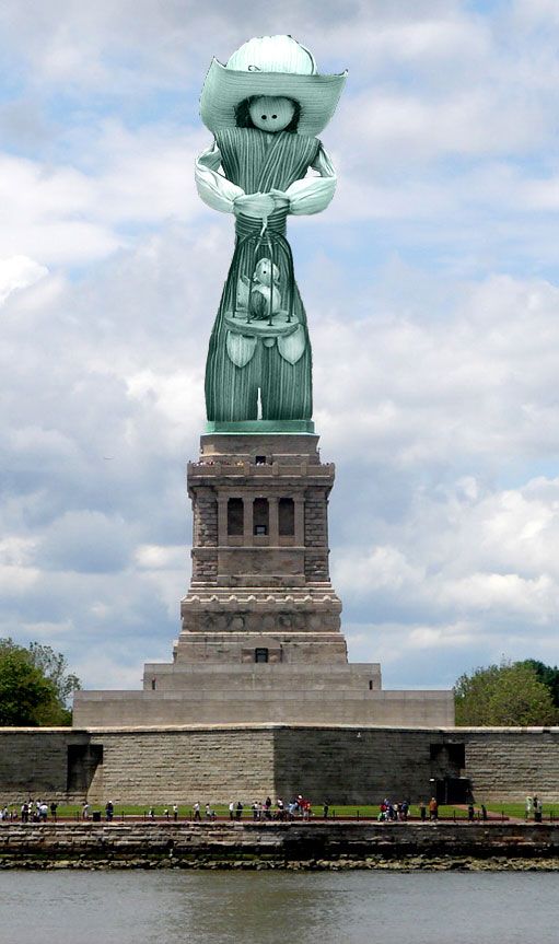
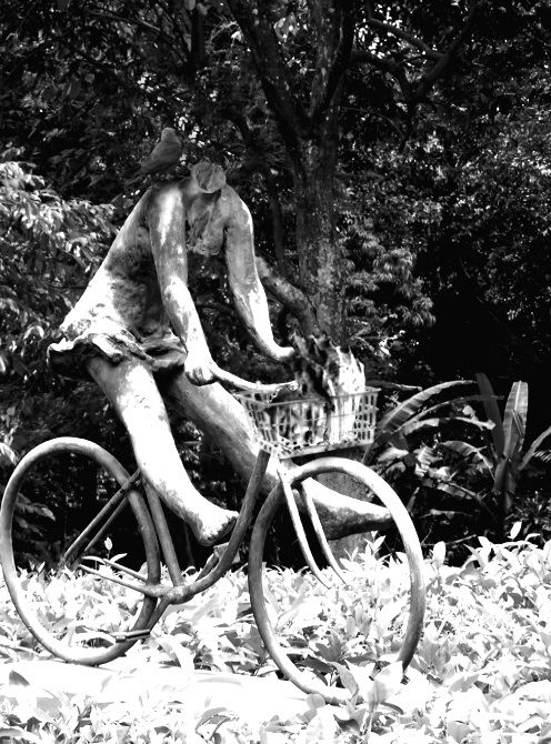
I'm considerating to make the puppet's texture smoother. (5 years and 3061 days ago)
Try to adjust the color to your source pic.
This can be done by selecting a part of the stone pedestal, make it a new layer and select the guy layer then go Image- Adjusments - Match colour and select the stone pedestal layer.
For realismyou need to put a shadow from the cage on his pants and place soem shadows/highlights. Pay attention to the shadows in the background when you make this.
EDIT: in case you're new around here, i should tell you that you can edit your entries (before the contest closes) by going to My stuff-My contest Entries, and uploading the new & improved image.
But as i can see , if no one else enters, you'll win the 3rd place, lol!
I think you did a nice job, I think the statue or "Puppet" looks to big, in proportion to the bottom part. Still I wish you good luck.
Howdie stranger!
If you want to rate this picture or participate in this contest, just:
LOGIN HERE or REGISTER FOR FREE
Photography and photoshop contests
We are a community of people with
a passion for photography, graphics and art in general.
Every day new photoshop
and photography contests are posted to compete in. We also have one weekly drawing contest
and one weekly 3D contest!
Participation is 100% free!
Just
register and get
started!
Good luck!
© 2015 Pxleyes.com. All rights reserved.


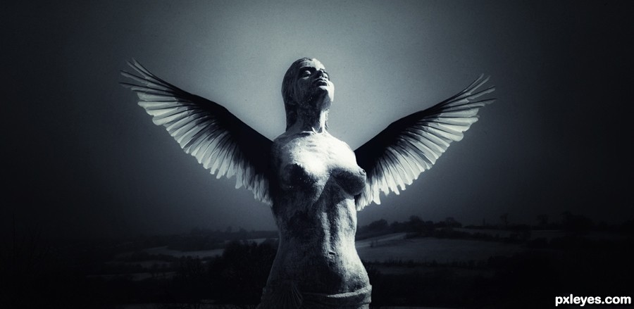
mood is nice but i think the wings are not suitable with a statue
but good attempt
Lovely author! Nice imagination!
Howdie stranger!
If you want to rate this picture or participate in this contest, just:
LOGIN HERE or REGISTER FOR FREE