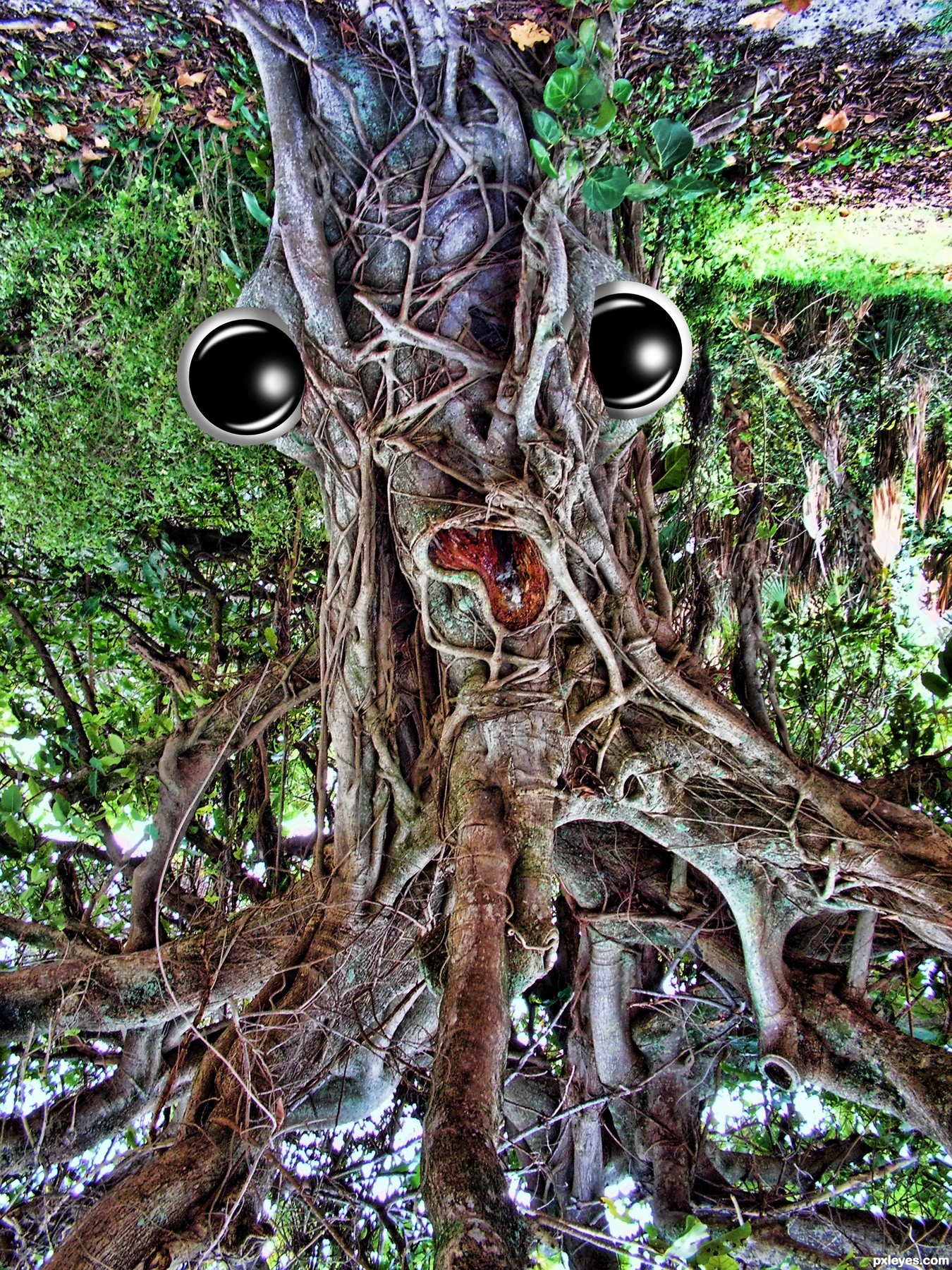
original work is in the sbs, got pulled and rethunked.. kind of cool this way too :) (5 years and 2488 days ago)
(5 years and 2646 days ago)
Howdie stranger!
If you want to rate this picture or participate in this contest, just:
LOGIN HERE or REGISTER FOR FREE
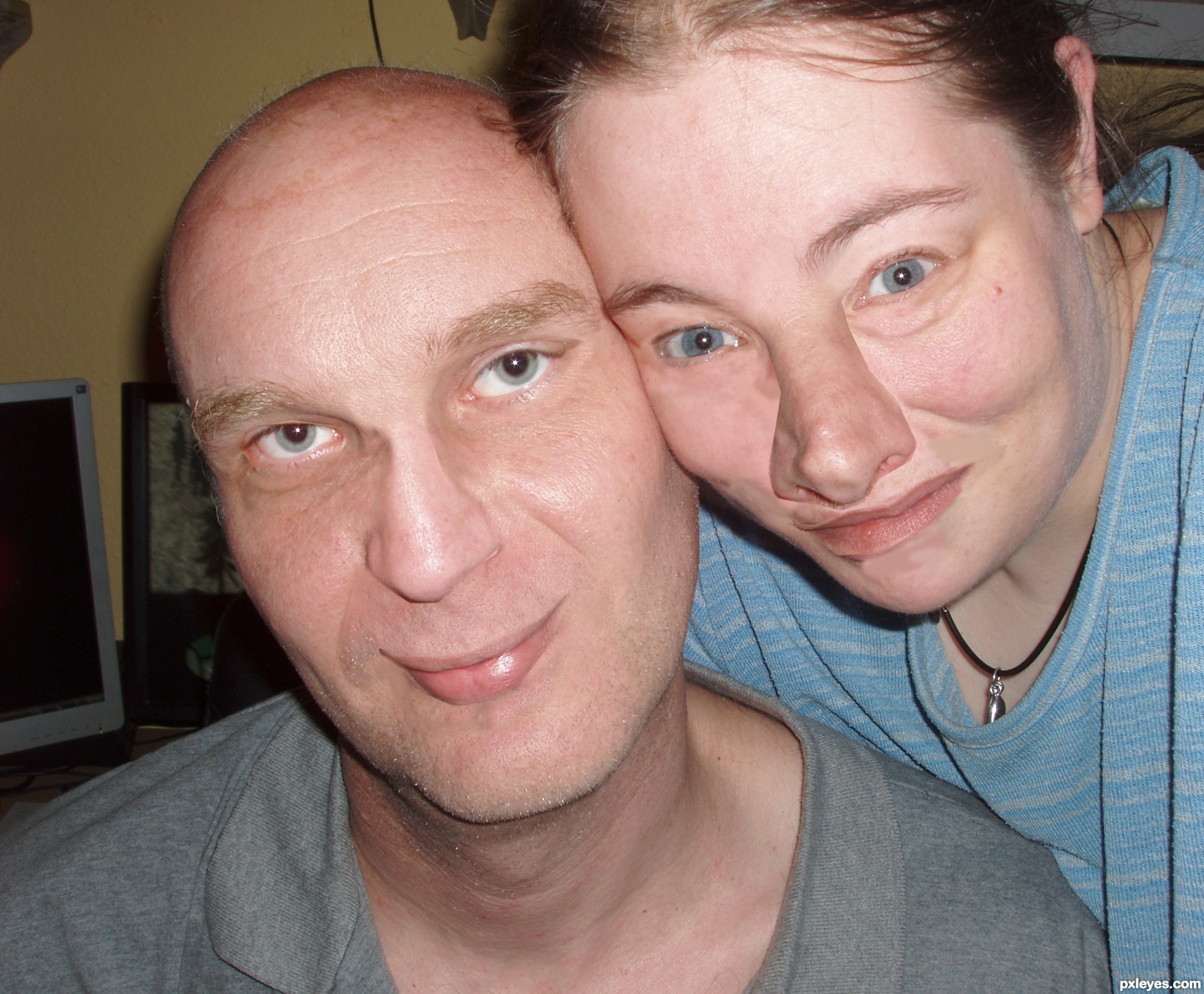
I have only used on of the images from the Wedding Album.
Thank you Rob and Lelania (5 years and 3260 days ago)
I would blend the nose a bit better in her face. Maybe smudge the little part by his eye and nose up a bit. Just smudge with a soft brush.
I spotted the diff, one person has a reverse tan-line on her nose :P. You can probably adjust the color using levels and maybe applying a color layer over the nose to match the skin-tone.
The disturbing effect this has on the senses is part of it's charm.. I'm very drawn to it because I can't look away... and I'm sure I want to.. hehehe.. good luck with this
Rob's face still looks natural, but Lelaina's seems a collage. Besides blending the nose, I think lips need to be flipped to match better, I don't know... 
Hi
Thanks for all the support.
Well In some places i have on purpose left the parts unmatching.
the idea is the pic should look like there is something amiss. Like something that doesent belong where it is.
that was the idea.
well... but still if everyone feel i should blend them better.. i will morph and blend them again.
Thank you
Differences? What differences? 
Funny idea!
I always wanted to have his eye colour anyway. Thanks for giving it to me, author
Thank you for this entry and good luck!
@Lelaina: but you have a beautiful pair of green eyes!...
I counted 63 differences so far  , thanks author
nice
gud luck author ..... nice work ........
Thank you again for making this entry, Rad!
Thanks so much for entering in this contest!
We've decided to make a photobook of all the entries as a memory!
Howdie stranger!
If you want to rate this picture or participate in this contest, just:
LOGIN HERE or REGISTER FOR FREE
Don't forget to check the high res image ;) (5 years and 3273 days ago)
Crazy stuff...
This is great ! Goes to my favs !
Great blend author 100% realistic...u did great job here...good luck
This is incredible work, author, great chop! 
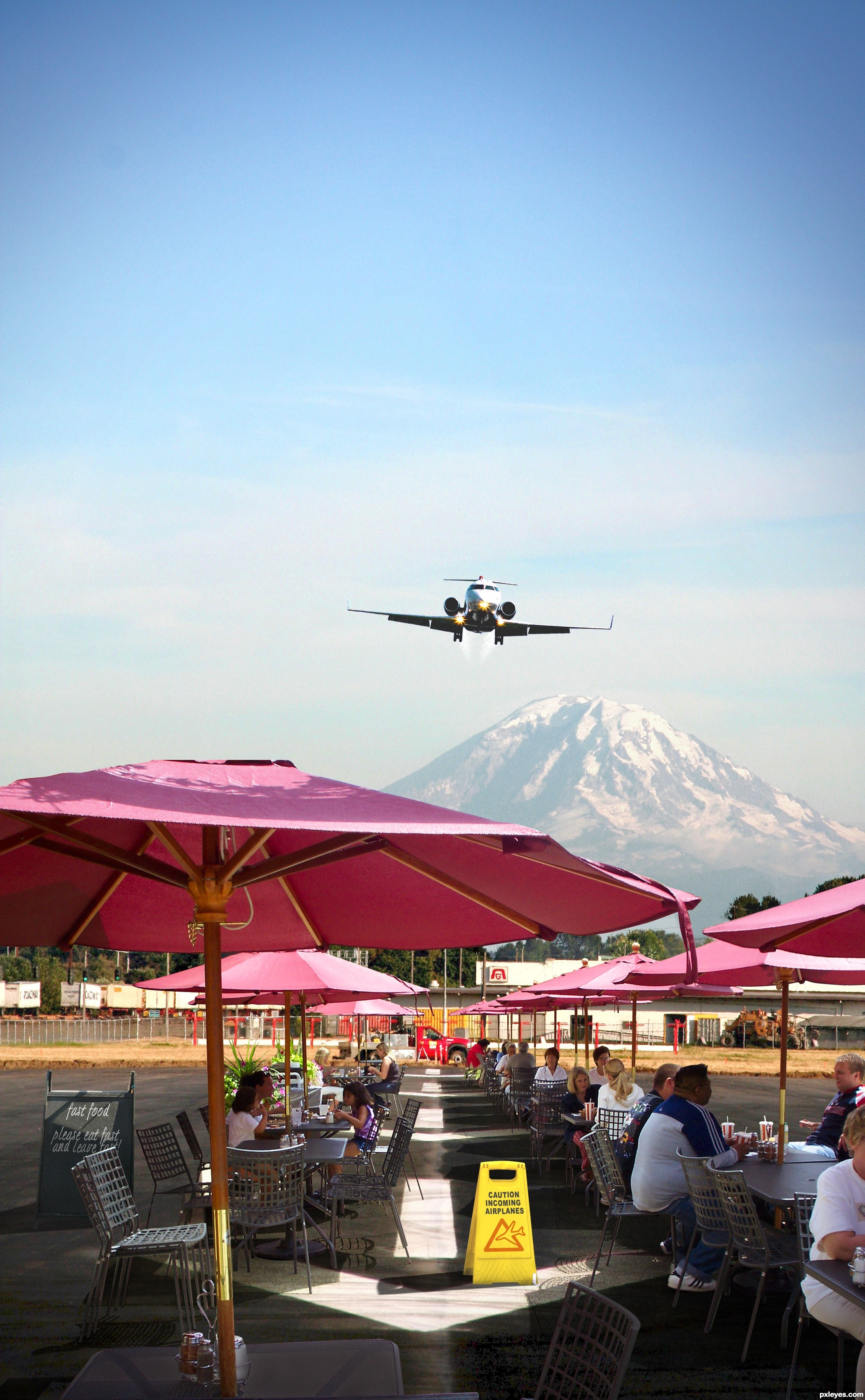
The restaurant extraction is indeed awesome. But I think the airstrip is too hidden. I would move the left and right sides of the restaurant away from the center and toward their respective edges in order to open up the middle to reveal the arrows on the runway more. That would also allow the yellow warning sign to stand out and be a greater focus.
Thanks! the cut out took me a few hours
Changed a few things, opened up the middle a bit and brought in a bigger closer airplane, changed a few colours, the mountain is brighter too.
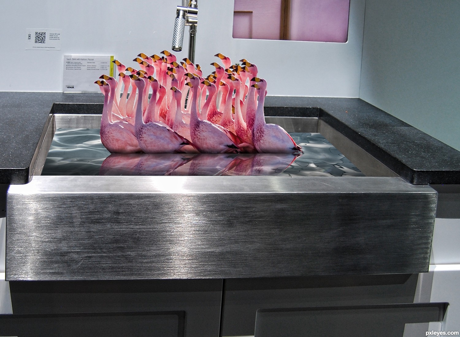
Rofl, i hope the plane doesn't land on them xD nice idea.
Great masking. I'd like to crop image from top, there is some extra sky space.
Why would you? I like the feel of it.
EXCELLENT !
Great idea and wonderful construction....GL
funny idea! Great entry, author.. gl
nice
And also congrats for your second place!
Congratulations for 2nd too
congrats again
and again congrats on 2nd ;P
Congrats!!!!
And again thanx all
Congrats!!
Howdie stranger!
If you want to rate this picture or participate in this contest, just:
LOGIN HERE or REGISTER FOR FREE
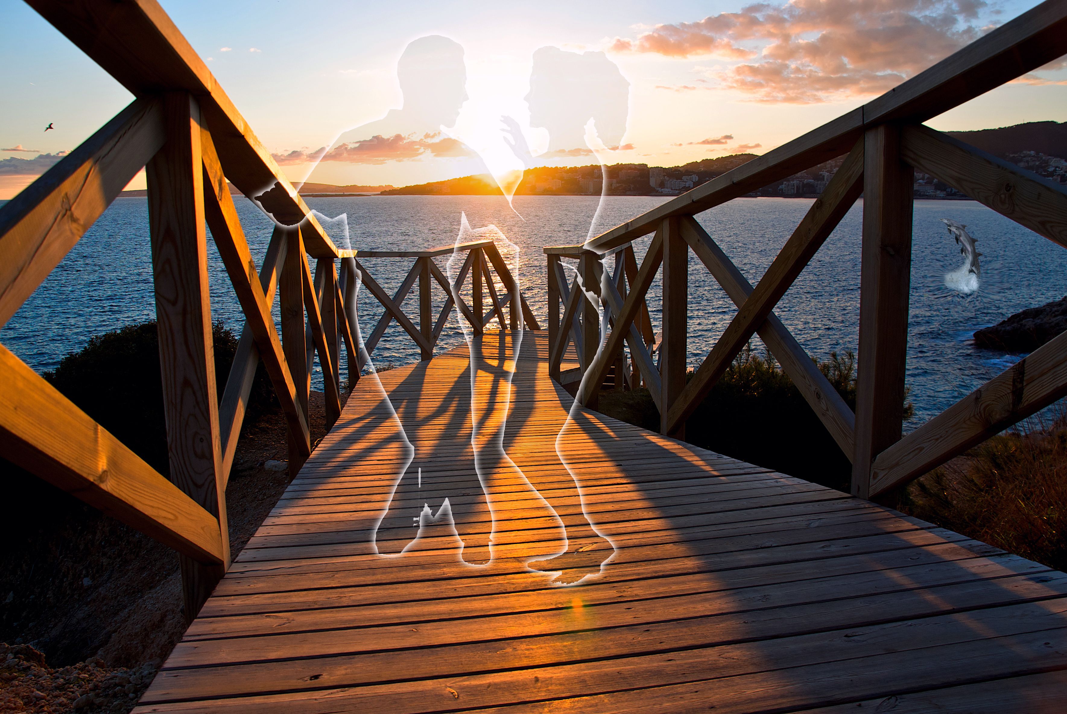
Ghost came back to their favorite spot.
credit to source 1
"noguerajef"
credit to source 2
"Cholin" (5 years and 3305 days ago)
It's very hard to see the source, and it;s very minimal use of the contest image. You should also correct your spelling to "Remember"
yup, ponti is right.. you just added the silhouette and reduced the opacity.. can you do a bit more work...?
You probably could do a little more with the source. Not sure what exactly. Perhaps someone else might suggest an idea. If you're new, it's a nice first-time chop and at least the source is present.
thanks for your suggestions i really appreciate it, i changed picture a few times today, but I'm new here, and I'm not sure what you're talking about. could you please explain just a bit
good image but i can't see the head clearly with the strong light lol
Nicely done, very nostalgic. Great Work and good luck.
What part of my comment were you confused about? Just email me.
Howdie stranger!
If you want to rate this picture or participate in this contest, just:
LOGIN HERE or REGISTER FOR FREE
Photography and photoshop contests
We are a community of people with
a passion for photography, graphics and art in general.
Every day new photoshop
and photography contests are posted to compete in. We also have one weekly drawing contest
and one weekly 3D contest!
Participation is 100% free!
Just
register and get
started!
Good luck!
© 2015 Pxleyes.com. All rights reserved.


Nasty and weird, but good looking!
Awsome! Only one thing bothers me... the eye highlights. They seem to be in the wrong place and too fuzzy.
other than that I love it!
fixed the eyes (puppet warp did a mess to their shape and form and I forget to use my magnifier when I use it sometimes to check my work, can't see worth Shiite ) THANKS!!
This is very cool... but... "enhance" does not mean "completely change"
the original image is there... you can actually lay it across itself, (it's a photoshop contest, not a photography contest) give us some freedom of creation
The original image is in most chops... that still doesn't mean they're "enhanced."

if you are going to poke me you had better take me to a movie first LOLOLOL.. and nachos.. I want nachos LOL
this would fall under the questionable thing....are layers of cut originals fine or just basic adjustments? this is pretty cool either way.
by the way, I didn't think it should be pulled because you used your own picture in multiple layers
No big deal k5683, I'm fine with it
ahh poop, controversy always means I'm gonna get the boot... double poop!!!
Well... I'm making Nachos!
EEEPPPPP
Well I got pulled you negative Nancies.. JUST KIDDING.. went back to the drawing board and modified to go back to the guide lines ... sorry mods
what is a flood fill filter
http://www.flamingpear.com/flood.html
I bought it a long time ago and it sits in your PHOTOSHOP PROGRAM and gives you hundreds of options to show water reflection (I think you can try it for free for a limited time, it's a lot of fun and really easy to use) it has TONS of options
cool,did not think I could use third party filters
But this looks cool... and far closer to the theme
You are allowed to do whatever you want with your photo BUT you are not allowed to use other sources.
Not sure what you mean by the theme, and being closer to it just makes me want to give it a breathe mint (hehehehehe)
Trips me out, well done = )
I think the theme evolved from a thread (by Vibeke? I'm not sure) that pointed out that for many Photography sites, and for photography in general nowadays, Photoshop (or whatever program) is commonly used to erase powerlines, enhance colors etc. for a "better" end product. This revolved around a debate (which goes far beyond the borders of this site) as to whether or not this type of enhancement is "photography" or "chopping."
Here, we generally steer closer to the "purist" side with the photography rules (which IMHO is a great thing). But someone suggested we have a photo theme without the usual photography restrictions of this site to see what kind of shots we got. Then, it was pointed out that a theme like that would be better on the Photoshop side... and... VOILA! This theme was born. So, you see, the initial intent was not to take a photo and change the content by adding things. It was to take a photo and "enhance" it.
Then this contest should be in photography with the enhancement restrictions lifted, photoshop entries that use a one click adjustment are generally frowned upon because adding a filter/adjustment takes no skill, the chopper is therefore relying on the quality of the original photograph & skill of the photographer. If I took one of your best photo`s and clicked auto color who gets the glory? me? you? or the guy that wrote the code for the auto color? The guidelines you mentioned really just makes this a contest for photographers to get some easy 2d points.
Geexman... filters which apply to the image as a whole (e.g. contrast) are already legal in the photo contests, although just hitting "auto color" wouldn't do too well against someone who really knew how to edit well. What you cannot do (generally) are things that don't apply to the image as a whole - for example, if you had a great shot, except for those power lines through the top. In the photo section of this site, you could not legally take those power lines out. This theme was created to show shots like that, except that they could legally be "enhanced" without the power lines. That of course, is just one example. The point though, was that the shots (in this one theme) would not have things (objects/images etc.) ADDED to them.
Very creative Photoshop work with One Image!
Howdie stranger!
If you want to rate this picture or participate in this contest, just:
LOGIN HERE or REGISTER FOR FREE