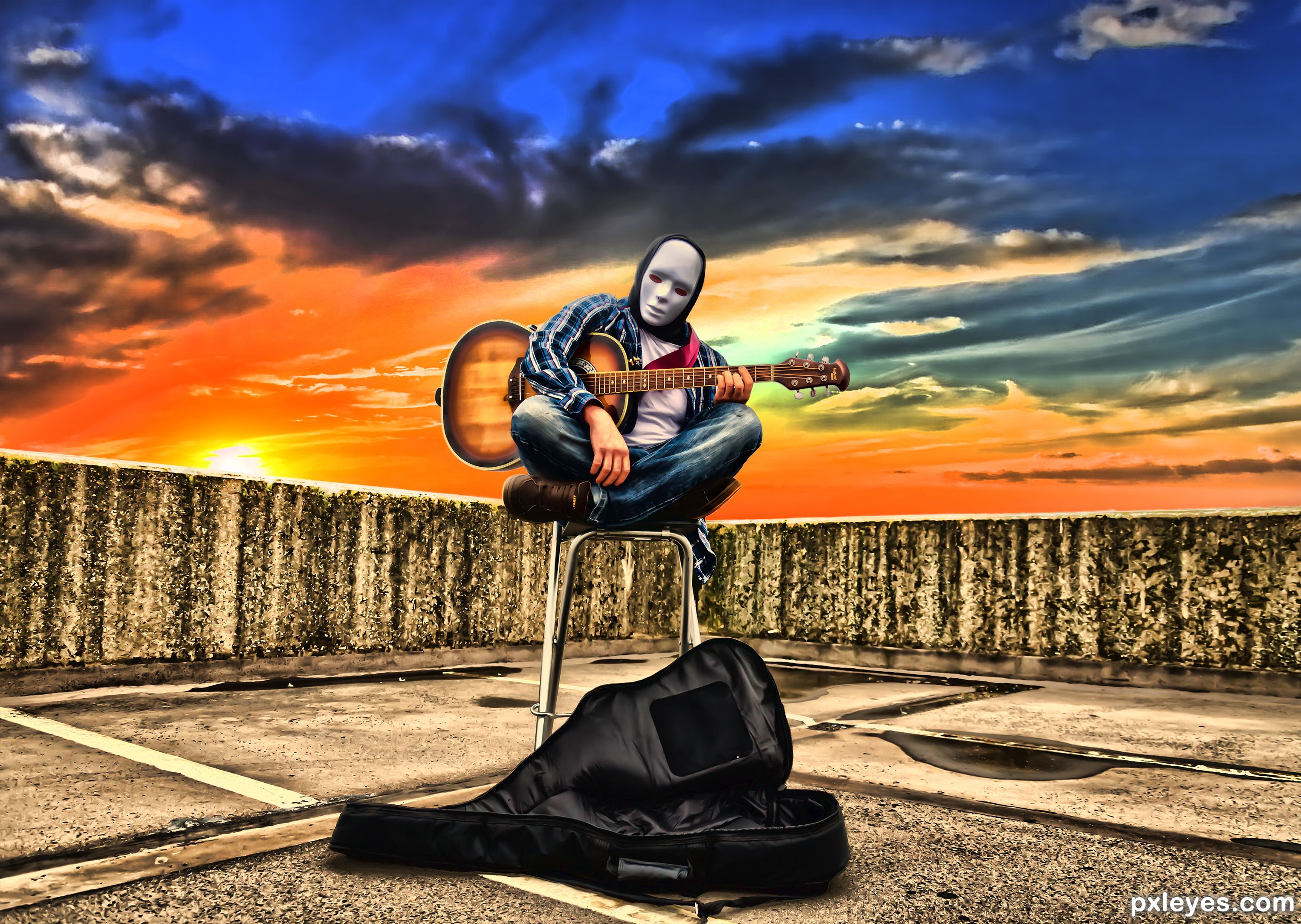
Used only Photoshop and my stock photos to create the image. Please, don't vote before you have seen the SBS! :) (5 years and 1037 days ago)
This is a shot for my brothers new EP, great shoot very random. (5 years and 2010 days ago)
SBS now added as best I can, used a different image for the sky, source has now been recorded. Everything else is from my photos.
I think it doesn't represent halloween....
will you please stop commenting for the sake of commenting, it's a creepy image of a guy in a mask............it is the second time that you have voiced your opinion and both times what you have said is not relevant......they are both masked guys showing a scary or creepy image. If it wasn't in fitting with the theme the website would have taken them down.
If you don't stop commenting on my images based on your own personal views on what Halloween represents the I will be forced to report you.
Remember the movie Halloween????? Killer in a mask????.............
Just because your idea of violence or reelvance is different, doesn't make my entry wrong on not in fitting with the subject.
The reason those masks give people the creeps is because they are terrifyingly stoic/ Zero emotion. Good luck author, I like the overall texture 
Thanks very much for your great (and knowledgeable) comments. Glad you like them.
Not sure you should be saying you have multiple entries in this contest, even though the final image quality is the same, that's different to actually broadcasting it in the comments.... I've got to agree though, this image isn't very Halloween like; performers where those masks all the time and as a result, it's not very creepy - maybe if his hands were also white? - or the guitar case was a coffin it might present the idea better!? - that's not to say that the image isn't good, just could fit the theme more I guess.
Many thanks for your commend and ideas. I've just followed the guidelines and entered something either creepy, scary or horror. To be honest I didn't want to distract or change the image too much as it's almost original. It's supposed to be a contrast between light and dark, dark is the guitarist, light is the skyline. And as mentioned previously of course it's a horror theme as lots of horror movies include masks. Everyone perceives Halloween differently so the is no right or wrong answer. What I don't want though is comments like this putting voters off as it is just one opinion, it's more about the work that has gone into it and the quality of said work. But thank you for your comments all the same.
Howdie stranger!
If you want to rate this picture or participate in this contest, just:
LOGIN HERE or REGISTER FOR FREE
(5 years and 2722 days ago)
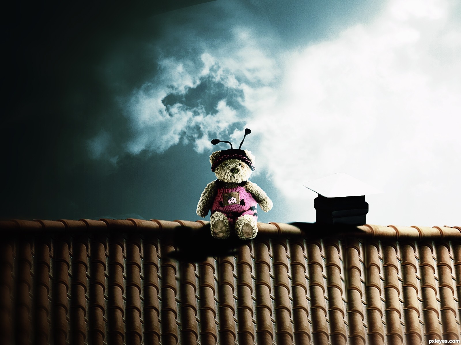
The top of the chimney vent disappears against the background.
What do you suggest for it to be fixed?
Beautiful art, lovely. Love the color tones...
... But I agree with CMYK in the same point...
I know you did'n ask to me, but the suggestion that at least around the chimney the light is reduced.
You're pro, you'll not be hard to get! 
Darken one or the other.
Nice job on the blending and the colors. A small addendum to the remarks of CMYK and Daniela: The light is coming from behind, so the visible part of the chimney top should be shaded.
awww.its adorable....i love to see more of the chimney though...but other than that its a great chop...(i'd probably add some gray smoke coming from out of the chimney so ppl could recocgnize it more)
Nice colors!
Howdie stranger!
If you want to rate this picture or participate in this contest, just:
LOGIN HERE or REGISTER FOR FREE
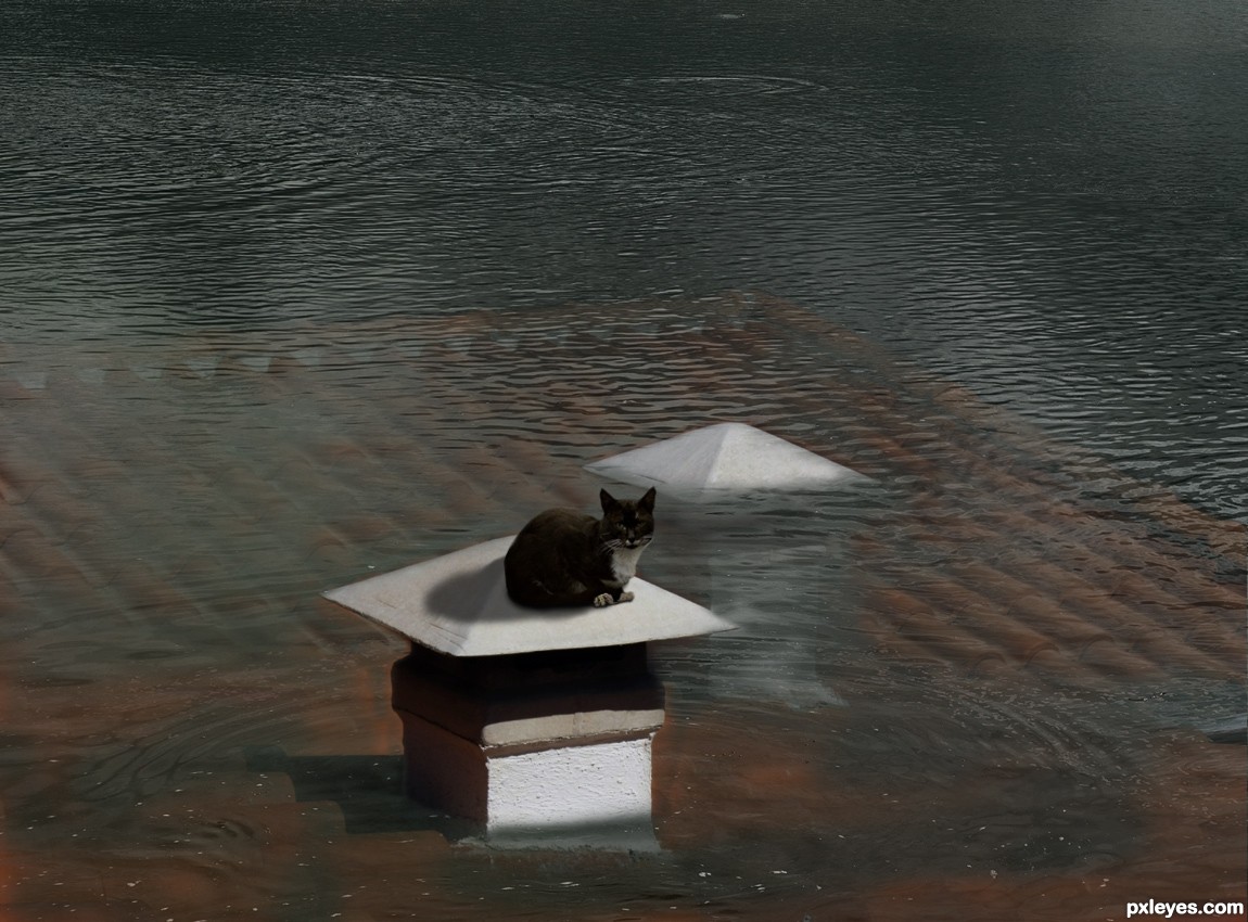
Thanks to mqtrf from pxleyes for the pics of the water and the cat. (5 years and 2724 days ago)
Very well done image! 
wow i thought it was real for a moment!! amazing job
Great job on the water GL
Thank you for comments.
Whoa! nice one. I'm totally a cat person. One thing though, the cat seems a bit pasted, add some tones. Above all a great entry with wonderful execution. Good luck author
great job with the underwtare and water part...i'm not that sertain about the cat and shadow, but it might be my opinion only...good luck
Fantastic!, great imagination and very well done but....the cat is not very well. Anyway great job.
Thanks again for your comments.
@Author A few things:
The cat's posture is a bit weird w.r.t. the contour of the chimney. Some puppet warp might help to align that front paw resting "mid-air". The tones are tad warm & saturated a bit more that the environment. Shadows are present but the whole body of the cat is equally lit. Try burning some of that or painting with a soft brush.
I liked this work, including the idea.
I liked what I did with the water.
But at the same points I agree with nbaztec.
Good luck author.
Moved the cat to the right. Worked on shadow and gave some tones to the fur of the cat using the burn and dodge tools.
Good job on the cat's new position & tones. Try playing around with HSB and/or Levels to get to that Goldilocks point. The image is very well done by the way. Good luck once again author.
I lowered the saturation on the water, to make it look better. Thanks for suggestions.
Great mood, the cat is so sweet
Howdie stranger!
If you want to rate this picture or participate in this contest, just:
LOGIN HERE or REGISTER FOR FREE
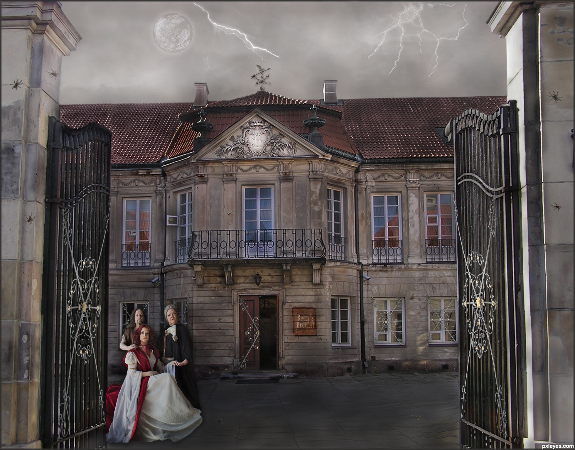
Betty's Brothel is in need of some repair and perhaps has a bit of eccentric clientele. (5 years and 2911 days ago)
Sara Barth and Lies Meirlaen have both been notified of their image being used, by note thru Stock.xchng.
I like the overall colours of this image, it suits the elements in the image so well. Good work!
I like it overall however I think it could have been straightened up to make it look level.
I thought of straightening the right entry post, but decided it added to the state of decay. Therefore, I left it as it is, to be fitting of the theme.
This is nice entry author and with few tweaks this can be even better...Sky image and the overall mood don't go with each other...U have day light for the house and people but rainy dark sky...U have to made image darker or to find some other sky for this image...I think that some other sky would be better in this case...Also IMHO spiders are to big..For better blending u can use some color layers in different blend modes..There is slight difference in resolution of provided source image and images that u used so some color layers would fix that difference...sorry for this nit picks...
Erathion, all the changes you requested have been made, with the addition of a nicer weathervane and lightening.
Cool concept. The fairly uniform lighting makes it all rather blah, however. A lot more shadows would make it a lot more dramatic. Some green (for example) interior lights might convey both "open for business" and "eccentric."
it looks loke a painting, very nice good luck!
It's sort of scary, really like it!
Howdie stranger!
If you want to rate this picture or participate in this contest, just:
LOGIN HERE or REGISTER FOR FREE
Photography and photoshop contests
We are a community of people with
a passion for photography, graphics and art in general.
Every day new photoshop
and photography contests are posted to compete in. We also have one weekly drawing contest
and one weekly 3D contest!
Participation is 100% free!
Just
register and get
started!
Good luck!
© 2015 Pxleyes.com. All rights reserved.


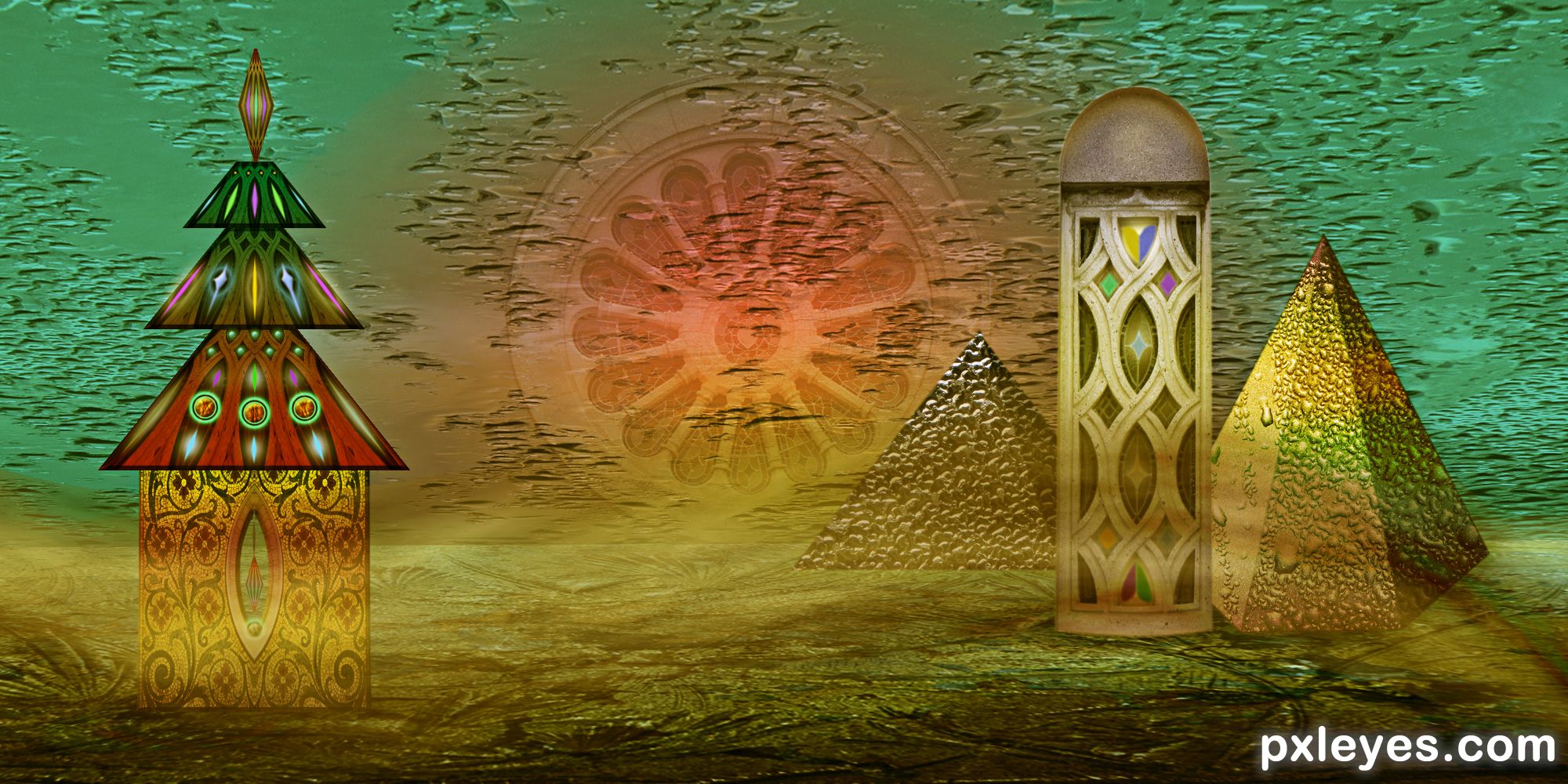
Fantastic textures and work. Your sources are AWESOME.
Beautiful... I like your shapes and color.
Congratulations...
Congrats!!!
Howdie stranger!
If you want to rate this picture or participate in this contest, just:
LOGIN HERE or REGISTER FOR FREE