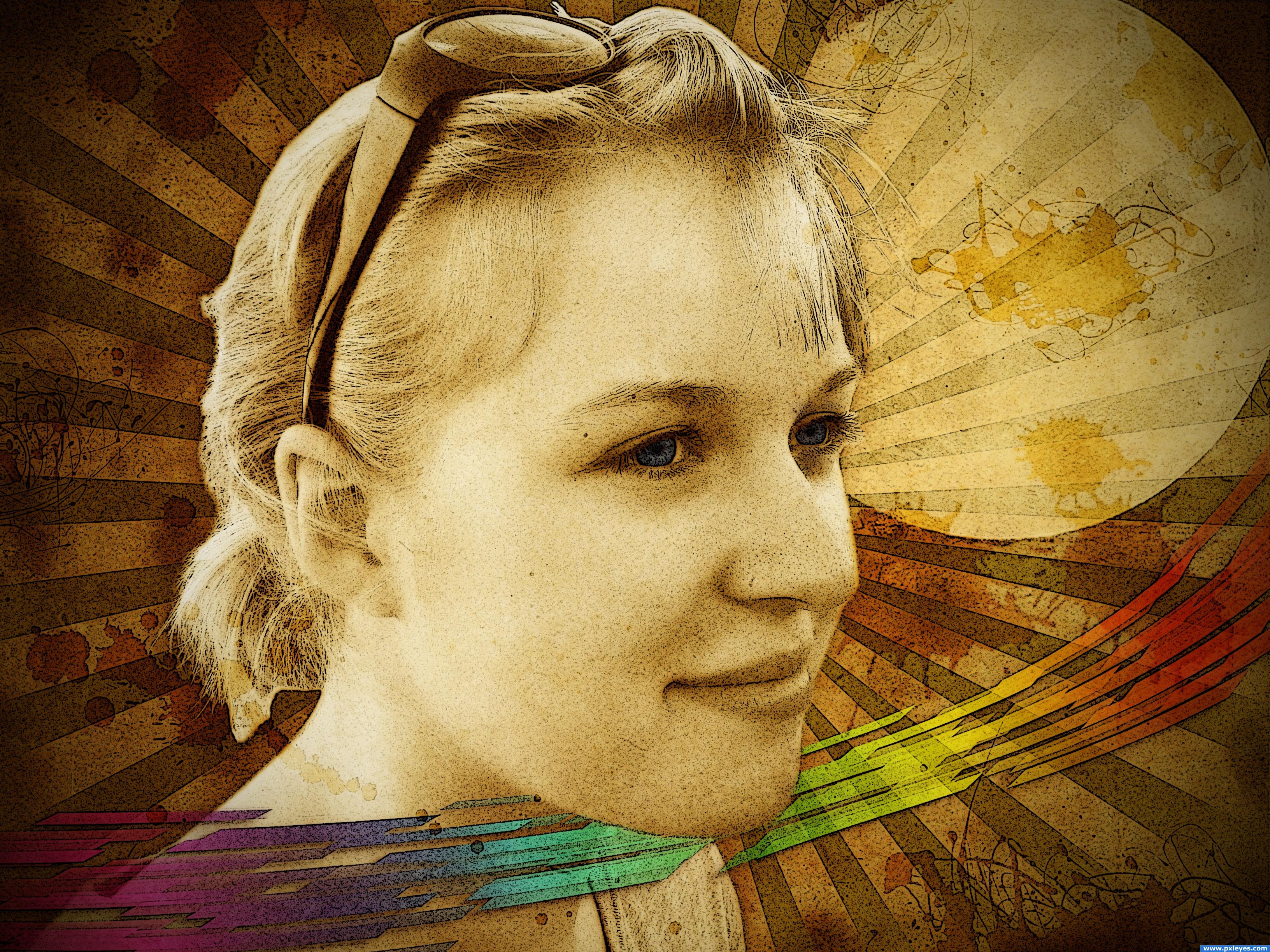
My version of something grungy... My favourite style)))
Hope you like it)
Viewing hi res is a must as always))
sbs on its way...
Girl photo I used is one of my own. (5 years and 3541 days ago)
2 Sources:
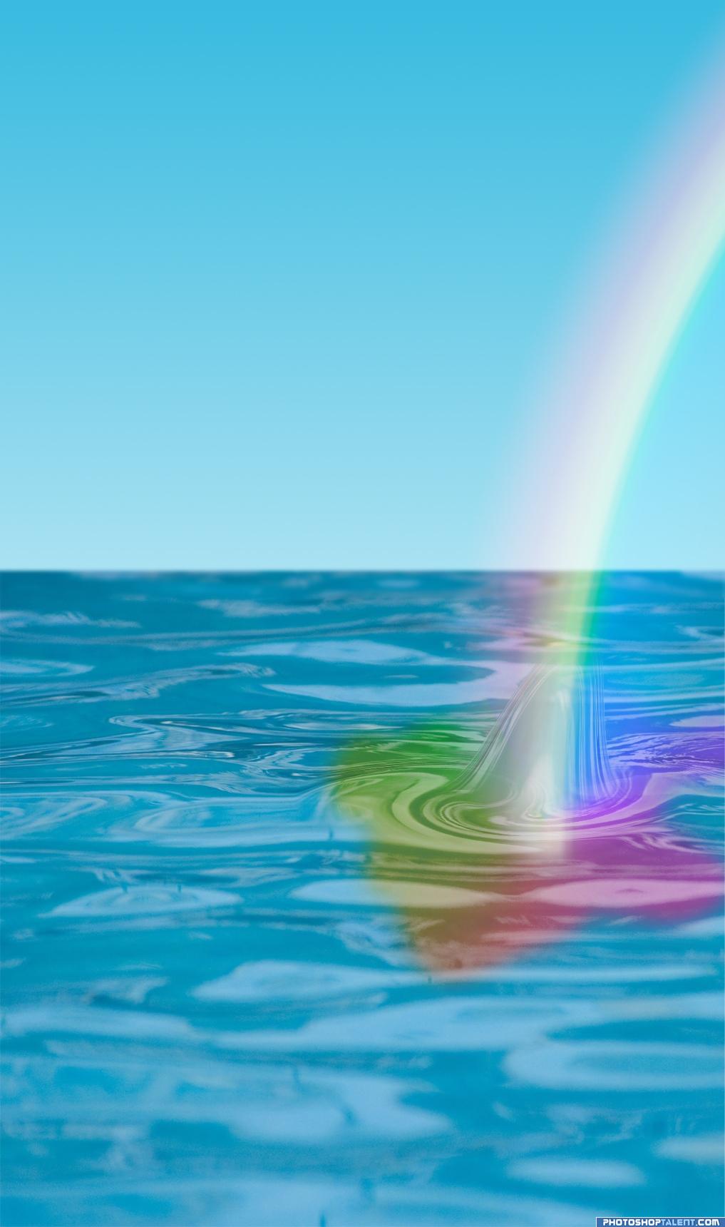
Where does the rainbow end?
Only the source image and a lot of work with gradients was used!
I won't upload a step by step guide because my computer is pretty much full right now, so i'll just describe my method:
The sky was a blue to white gradient, and i just blurred that back of the water to increase depth.
I made a water abnormality using a high feathered selection and the liquify filter, then i added a a russel's rainbow to the image. that can be found in the drop down menu in the gradients tab under 'Special effects'
I then changed the opacity to 60% and changed the blend mode to screen.
I added a Spectrum (again in th gradients tab under 'spectrums') and placed it in a high feathered selection, then i just reduced the opacity to about 60%.
That's it!! (5 years and 3578 days ago)
huhuhuh OH NO!!!
I just wanted to say that this isn't my usual manipulation.. i suppose it's good to try new things, but then again, i hate gradients 
I'm sure there was a lot of work on this.. its just a shame doesn't show in the result (your description pretty much covers the Labor) but i saw a piece on here just awhile back where some one took a picture and manipulated the source picture BACK into the same exact picture.. it was really really weird, but I learned a lot from it, it's good to do new things.. gives you perspective on other things available to you.. GOOD LUCK and good job..
good thought
superb
Thanks everybody! It's not a very striking result, i know GolemAura, i just thought i might as well give it a shot.. everyone needs to try things they hate. and apparently Gradients hate me as well 
very nice
aww pretty, nice work but it is rather simple really.
Yeah.. once i get more confident working with gradients i'll move on to more complicated things.. this was just a test really :p
nice job with the rainbow not sure how I feel about the liqueify coming out of the water with it. But your learning quick keep up the good work
Well i didn't want to make something so simple even simpler, so i shoved in a little water spout Thanks DigitalDreamer!
Howdie stranger!
If you want to rate this picture or participate in this contest, just:
LOGIN HERE or REGISTER FOR FREE
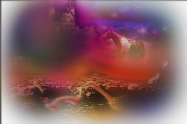
Mainly just curve adjustment, hue/saturation, clouds andthen a lot of overlay colour for the and gradients for the dreamy, pink/orange effect. To make the horse and the castle blend in, i went to image>ajusments>variations and then i went to brightness and contrast. It took me a while because i kept changing my mind about things =] (5 years and 3597 days ago)
I think their is just too much going on here, the different images just dont seem to relate enough, also your colours are overbareing, I suggest toning it down a little
GL!
THe castle does not need to be blurred out of focus in a big black dot. Nice choices on color. I also like the stars. GL
this is what you dream at night and you make in photoshop next day... ) nice job
Howdie stranger!
If you want to rate this picture or participate in this contest, just:
LOGIN HERE or REGISTER FOR FREE
Photography and photoshop contests
We are a community of people with
a passion for photography, graphics and art in general.
Every day new photoshop
and photography contests are posted to compete in. We also have one weekly drawing contest
and one weekly 3D contest!
Participation is 100% free!
Just
register and get
started!
Good luck!
© 2015 Pxleyes.com. All rights reserved.


Looks GREAT!
Good job & SBS. What's the source for the girl?
like the background.
Nice...............I also see some Retro stuff. Good luck
i like the image its very cool but, the girl doesnt have a very grungey essence to her might want to use a different girl but other than that, the image is awesome!
awesome! everything's positioned well it has a nice feel to it
very nice job... i like this... and i like blond... just to know that....
Thanks guys for the great comments!
Nemanja I like the girl too
Howdie stranger!
If you want to rate this picture or participate in this contest, just:
LOGIN HERE or REGISTER FOR FREE