(5 years and 3196 days ago)
Previous entry .... photo by woodsy & bubisantos. (5 years and 3586 days ago)
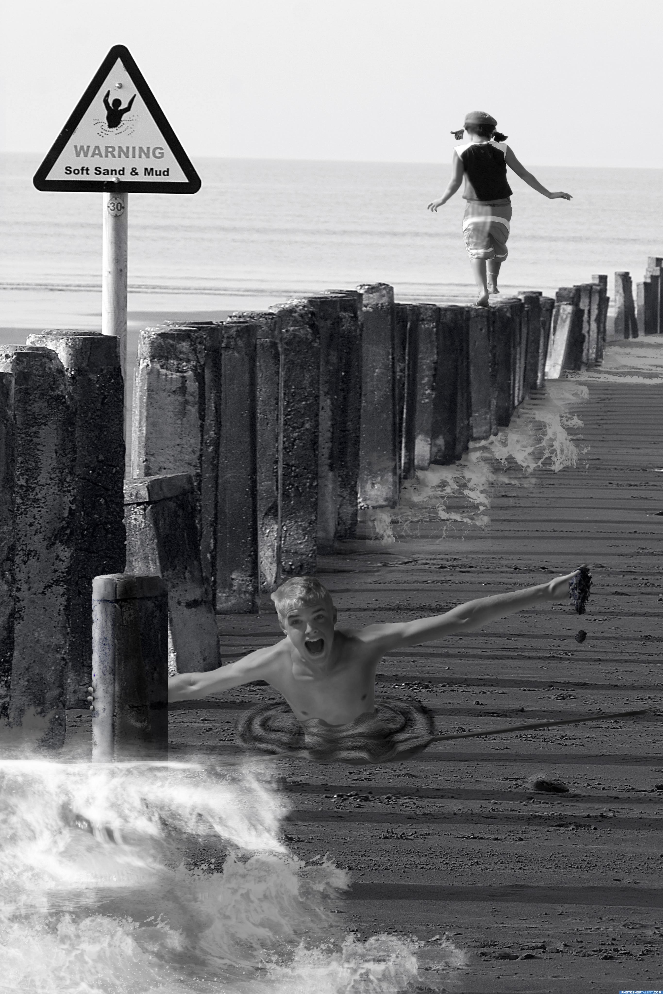
hehehehe..it would be creepy if the little girl cared LOL.. but it's kinda funny with her tra la la la ing away LOL
Hello...those are boards covered with sand...
I would just stick with the girl actually - take the boy and the sign out completely. Stretch the girl a bit higher too? She looks a bit squished!
good idea
She looks like a giant. I think you can do better especially with a previous entry.
hahahhaahahahahha cooool
Is the girl walking on water???!!!
Very creative pic! But the boy and girl looks flat, cut and pasted imo.
Best of luck, lovely idea
Howdie stranger!
If you want to rate this picture or participate in this contest, just:
LOGIN HERE or REGISTER FOR FREE

First try to this contest...
Full size interface on http://img23.imageshack.us/img23/5228/essai1p.jpg (5 years and 3607 days ago)
Preety cool work......love this one........
nice
Nice work, I like it 
I like it
oOo!this is actully pretty good!
Great feel to it 
this one is nice good luck!
Sleek and professional...well done
good luck
I love this one!
good job and good luck
very good... simple yet screams sophistication goodluck.
Nice Job! Good Luck
nice
nice one
Pretty nice and clean, but maybe here and there needs some improvements. Right now a bit too many things happen, despite you kept it clean. I agree with Nator about "com", should have the same font size as "eyes". Also, it's a bit out of balance since too many things happen on the left side (some kinda frame, some white lines, huge "pxl". I might have removed the white vertical lines and align "eyes" with PXL (of course also align on right side). The reflection most likely hàs to stay, makes it glossy, but then not sure about the half frame on the left side. If you wanna keep it, at least align the whole logo to the center of the frame. But I do see possibilities here . Good luck!
Modest! Good luck!
Too much going on, but nice idea... (the EYES and COM should be same height, and not distorted. I like the background, but don't think the red/green work).
Too much going on, but nice idea... (the EYES and COM should be same height, and not distorted. I like the background, but don't think the red/green work).
Too much going on, but nice idea... (the EYES and COM should be same height, and not distorted. I like the background, but don't think the red/green work).
Too much going on, but nice idea... (the EYES and COM should be same height, and not distorted. I like the background, but don't think the red/green work).
Howdie stranger!
If you want to rate this picture or participate in this contest, just:
LOGIN HERE or REGISTER FOR FREE
Photography and photoshop contests
We are a community of people with
a passion for photography, graphics and art in general.
Every day new photoshop
and photography contests are posted to compete in. We also have one weekly drawing contest
and one weekly 3D contest!
Participation is 100% free!
Just
register and get
started!
Good luck!
© 2015 Pxleyes.com. All rights reserved.


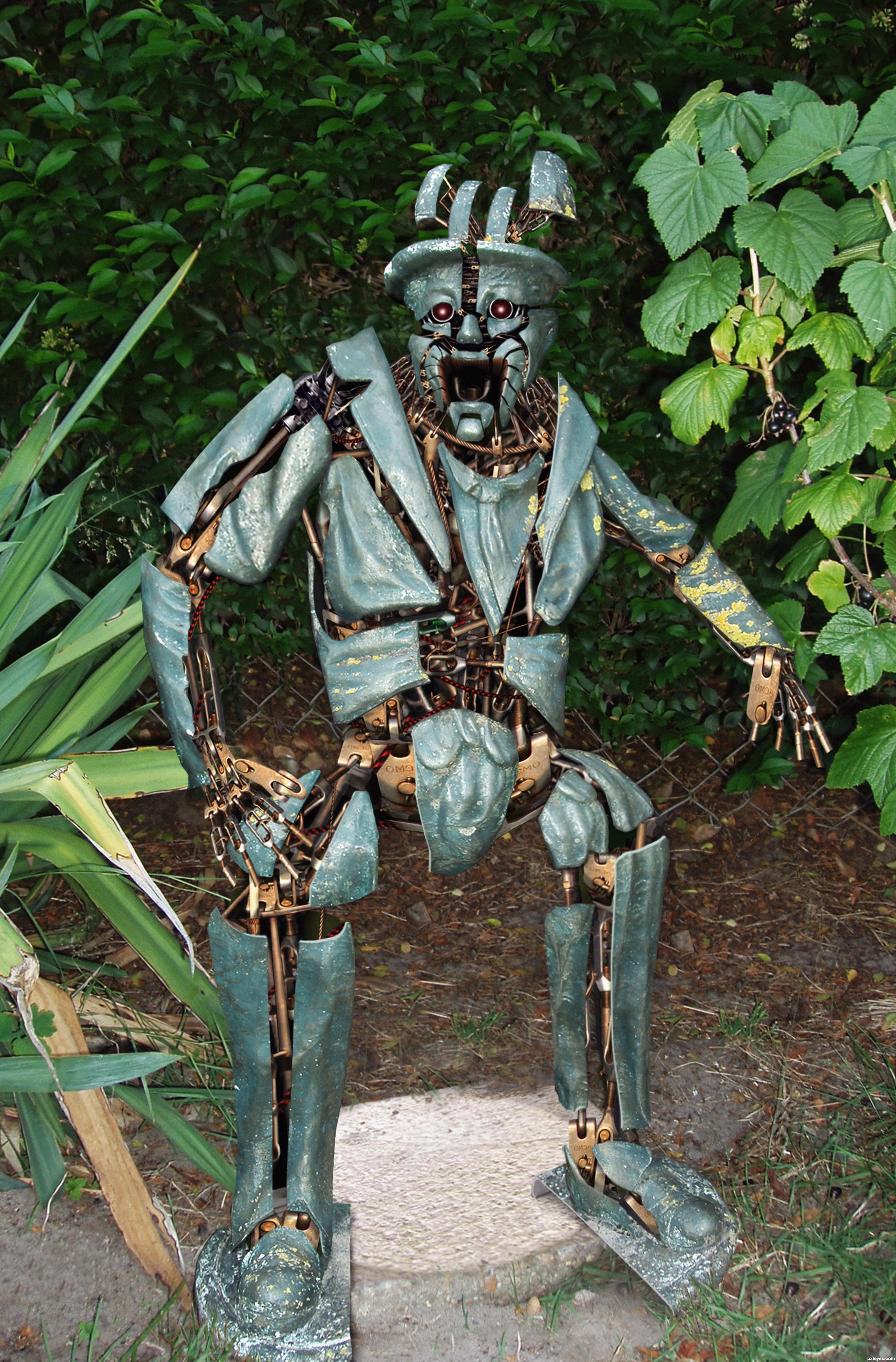
Haha! The image goes great with the title.. his expression is priceless! Super work (the high res is a definite must see).. good luck!
Great idea and nicely done.i would remove the drop shadow or airbrush work from the leg (viewers right) looks out of place....
Thanks for the input guys I'll look at the shadows again they are a pain on this image, as it looks like the picture was taken with a flash.
My mistake.....Yes indeed they are a pain, you have the time to remove them if you so wish,I definitely know you have the skills.
wow this is awesome!
Agreed.. great work, great title. I would actually go with some more shadows for the outer pieces and add more contrast/levels for the cover parts, as his internals(tm) have a lot more contrast, as does the bg-bushes. With a better overall lightning this will look even better.
Hilarious expression and great idea, gonna vote later if there comes some small tweaks. Good work..
Well done...good luck!
This is really great! And I see you had a lot of work here, author... GL!
Great job on a very original idea
Nice expression on robot
Amazing image. Very good, GL
With or without shadows it's still a most unique creation! GL
Added more contrast ect to the body I think it all fits alot better now thanks for the input
Fantastic work author,especially on hands...good luck
Wow! Creepy statue

Congrats on the first place!
WOO HOO CONGRATS!!!
Congrats!
Congrats Ironcow very creepy
Thank ya all
Congrats for 1st
Congrats IRONCOW
Congrats! for 1st
congrats on your winning
Congrats!
Congrats for the great 1st place...
Congrats for your first place!

And I'm happy, that the crappy shadows of my picture weren't such a problem in the end
Howdie stranger!
If you want to rate this picture or participate in this contest, just:
LOGIN HERE or REGISTER FOR FREE