(5 years and 2740 days ago)

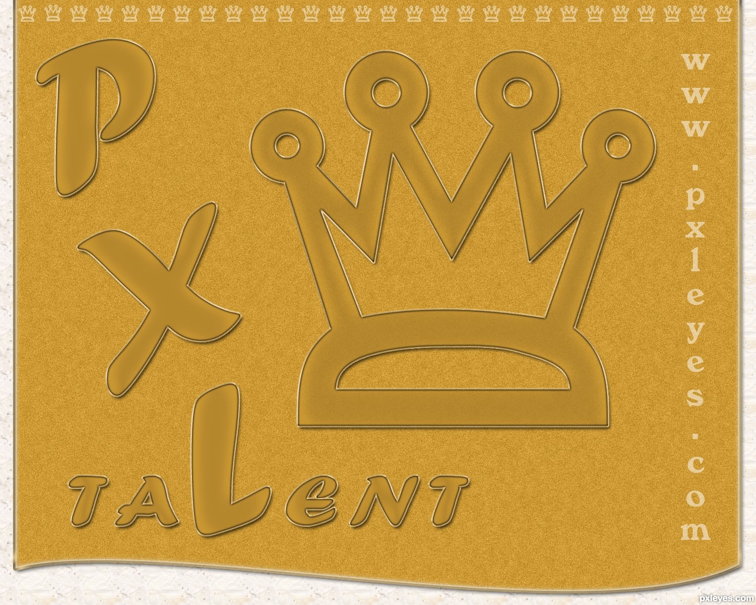
Created in Photoshop. It is vectorshapes with layerstyles. Clarendon is the font. Texture is a lot of noise with a radial blur. (5 years and 2741 days ago)
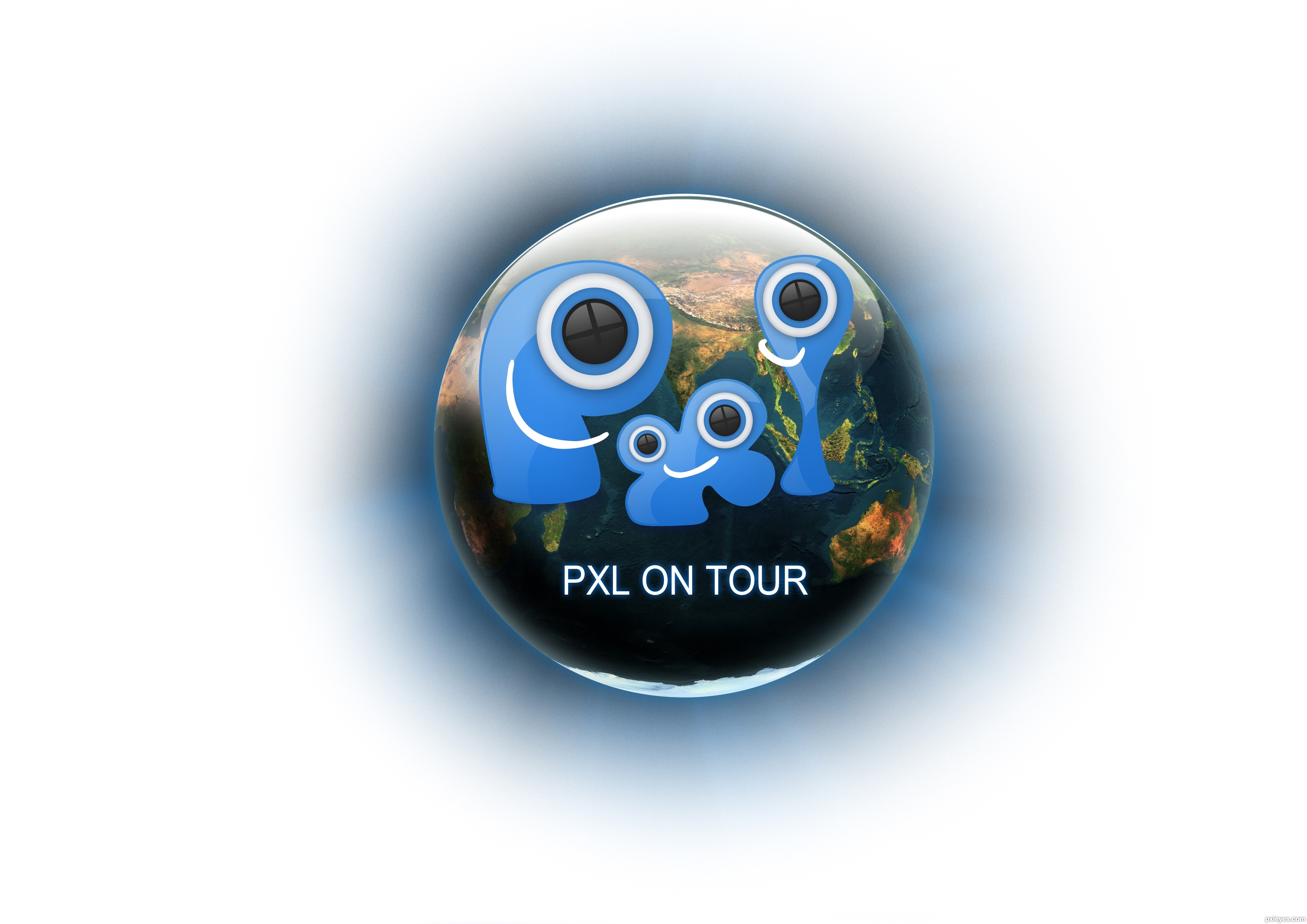
I thought it would be nice if the winner can have a little icon in the corner of his or hers profile picture. What do you think?
Nice work! Comgrats 
nice job congrats
congrats
Howdie stranger!
If you want to rate this picture or participate in this contest, just:
LOGIN HERE or REGISTER FOR FREE
(5 years and 2787 days ago)
The earth is a bit too dark, and might be hard to see on a t-shirt, but I like the button idea!
i like it author good luck
Howdie stranger!
If you want to rate this picture or participate in this contest, just:
LOGIN HERE or REGISTER FOR FREE
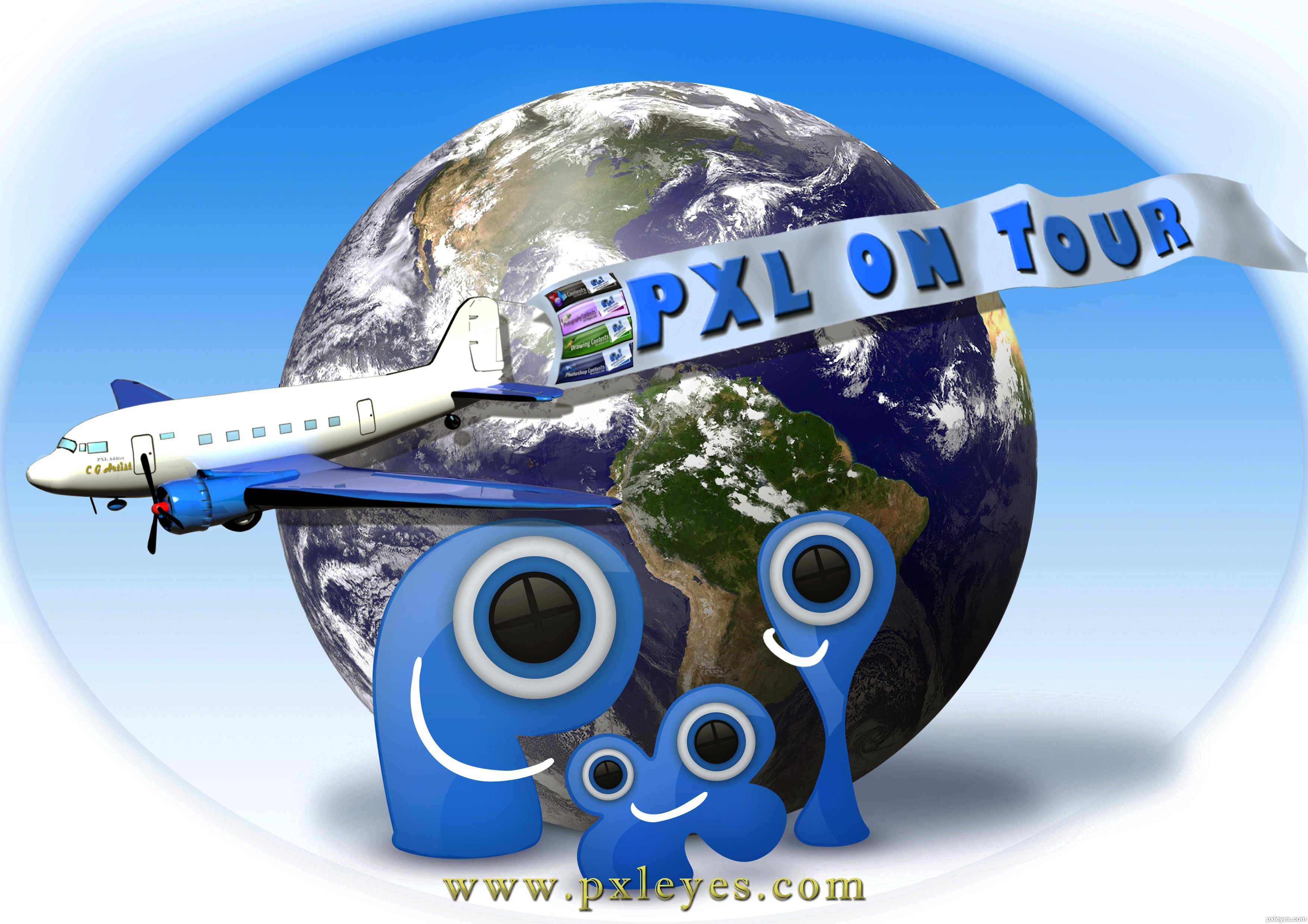
The source for mother Earth is compliments of "NOAA-NASA GOES Project" The images at this site are in the public domain.
The particular image is the GEOS EAST latest full disk image 19:40 UTC Sept. 1 2011. I used this particular days picture for this work it was found@ http://goes.gsfc.nasa.gov/goescolor/goeseast/overview2/color_lrg/latestfull.jpg
The WEBSITE where I got this particular picture is linked below...find the NASA link named "full disk image" these will vary as so does the weather. (5 years and 2790 days ago)
This entry has been edited and republished. Due to an oversight on my part regarding PXL policy on the use of pre-made illustrations or "tubes." The former airplane illustration has been replaced by a 3D render created by me using 3D Studio Max. Thanks
The sources used were masked and positioned.The flying banner is a rectangle filled with color, text rasterized and merged down. Shadow of Earth is brush work. Gradient fill as background.
Stunning!!!!! This is amazing!
The drop shadow off the plane wing and banner are falling onto the planet behind it, while the Pxl shadows are dropping down and are more diffuse...

very happy image good luck author
MossyB I am fully aware of the way my shadows are, and did it intentionally. Thank you very much.
I thought you might have been deliberately inconsistent, so as to reflect all levels of talent here on the site, since inconsistent lighting and shadows are some of the biggest and most common mistakes people make, but thought I'd mention it just in case you were striving for a higher quality entry. Glad to know my initial feeling was the right one. 
Appealing concept.
In hi-res, the four mini banners on the left side of the big banner are sharper than the rest of that banner. But it's hard to imagine that those mini banners would be legible printed on a T-shirt, let alone why they're flying in a different breeze than the big banner when I would assume those mini banners are actually printed on the big banner. Bottom line: I would delete the mini banners and sharpen the remaining part of the big banner.
The earth is realistic, the logo is drawn but clearly a logo, while the plane with banner is in-between. I think the plane and banner should be an obvious illustration on top of everything else so it stands out as the true foreground element that expresses the primary message of the image. Making the plane and banner bigger so there is greater overlap with the PXL logo would emphasize that point.
Looks amazing, very good job!
Good design, maybe you can change the background a bit? The final shirt will be white, meaning this print on a shirt will look like a block on it. If the background is more flowing into a gradient to white towards the outside it will look nicer on a shirt.
Can you add "www." in front of the URL?
Thanks for the compliments everyone. robvdn I made edits hopefully this will blend better to a white shirt.
i would put pxl air on the airplane or something instead that artist and i see some "stuff" in front of the right engine and around wings that should be erased.....small banners are not that good....but good idea...will vote later to see how it goes...gl
Deki, wow thanks for holding your Vote... The point out about my masking is appreciated and the problem has been edited, rookie error. lol. As far the name of or the text on my Gooney Bird and the small banners ( I presume you mean the PXL contest ad banners) your opinion is noted. Thanks
Very nice work, author - I love how ALL of the elements are 3D, or have that look. Work on the plane is very good, especially the detail of the engine and reflections of the fuselage and tail in the wings! I used to do artwork and print t-shirts, and this would look great on white.
Blue on blue, heartache on heartache...
the plane in the eyes doesn't look god. maybe you should put the P in the foreground
amazing work author
Howdie stranger!
If you want to rate this picture or participate in this contest, just:
LOGIN HERE or REGISTER FOR FREE
(5 years and 2791 days ago)
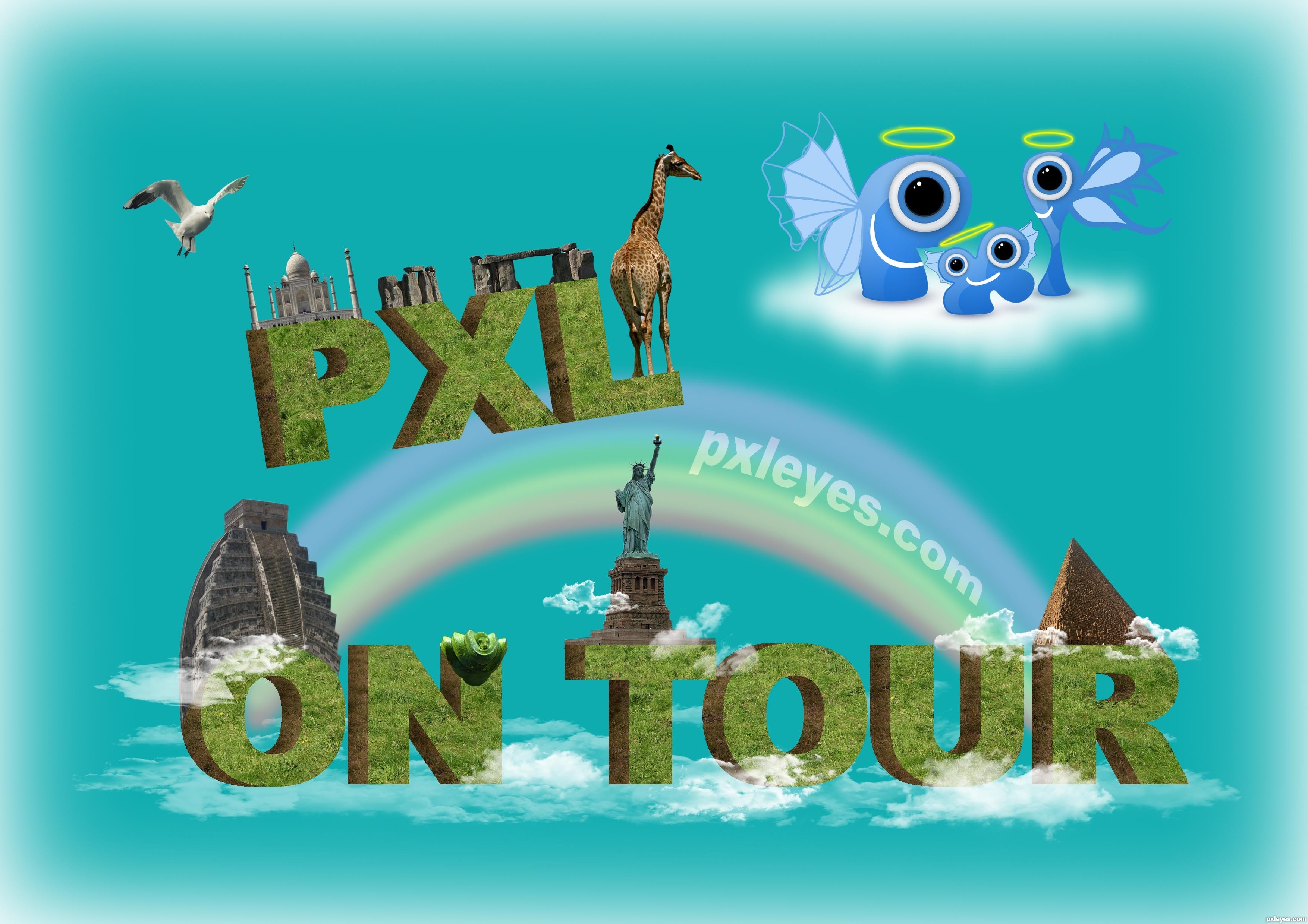
very nice concept......
Like your idea.... is what the logo is about. Good luck.
Needs www.pxleyes.com. Also the PXL logo is hardly visible.
thanks Dek, George and Bob..
good thinking author...
Why not putting the logo instead of the word "PXL" ....................... people may not understand the word PXL but a photo ( logo ) could be more attractive plus of corse the pxleyes URL
good luck author
thanks Mehul and Designed..
great work...
nice work
thanks passionboy and neo...
Howdie stranger!
If you want to rate this picture or participate in this contest, just:
LOGIN HERE or REGISTER FOR FREE
Photography and photoshop contests
We are a community of people with
a passion for photography, graphics and art in general.
Every day new photoshop
and photography contests are posted to compete in. We also have one weekly drawing contest
and one weekly 3D contest!
Participation is 100% free!
Just
register and get
started!
Good luck!
© 2015 Pxleyes.com. All rights reserved.


Howdie stranger!
If you want to rate this picture or participate in this contest, just:
LOGIN HERE or REGISTER FOR FREE