Photoshop Pictures: Playing (page 4)


results 16 - 20 of 28

Playing with butterflies - created by erikuri


Playing with butterflies
Favs: 4SBS: 8Hi-resRank: 4/19Score: 57.7% (20)11785 views

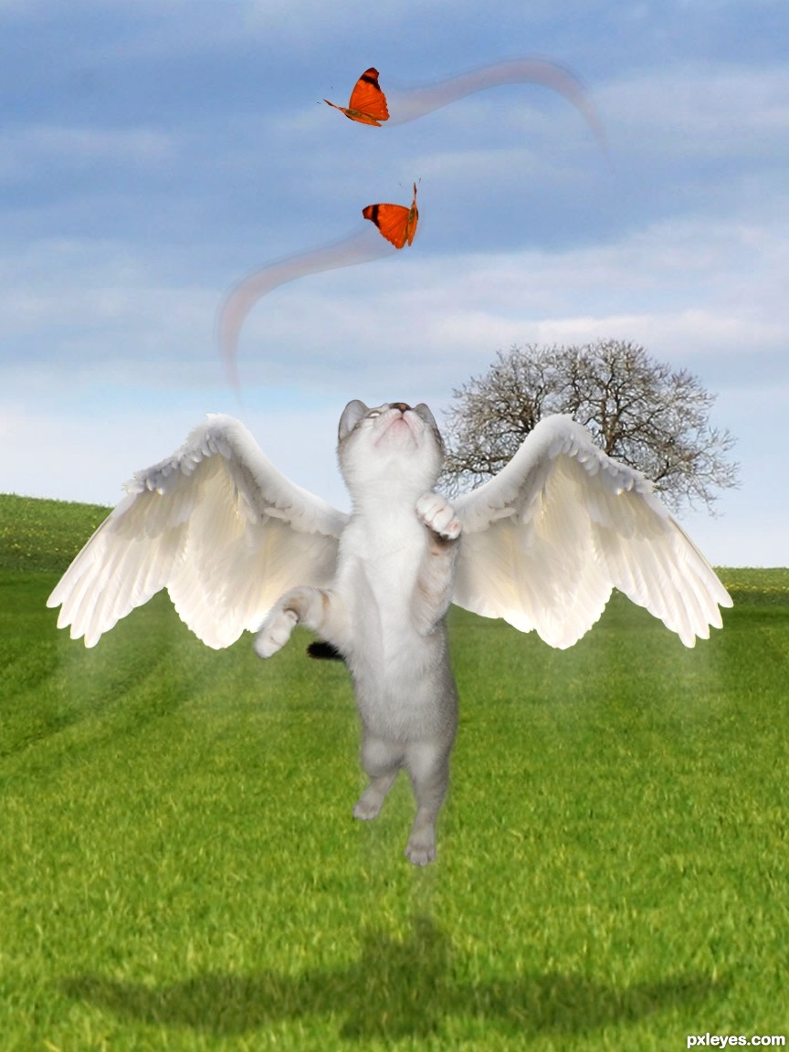
My pic, a source of another contest and some outsource images.

Thanks to:
- jans canon at Flickr;
- 13dede, clemmesen and alitaylor at sxc.hu;
- and Pxleyes.


Edit: I removed some butterflies, but I'll keep my thanks to the authors above! (5 years and 3224 days ago)

5 Sources:

avatar RayTedwell

Nice image, the only things I would suggest changing are the butterflies (it is too obvious you have cut and paste each one three times, use more different images). I would also remove the blurry train from below the cat and the wings, adding a slight motion blur or manually blurring the ends of the image would make it look more realistic imo.

avatar Drivenslush

SOOOOO SWEET!!!... maybe arrange the butterflies in swirl patterns that are playing with the kitty... like that effect you get when you tie a ribbon to the end of a long stick and make it follow a trail pattern.. just an Idea.. the kitty is BEAUTIFUL!!

avatar CMYK46
CMYK46 says:

Just my 2 cents, but if there were only one butterfly (possibly a bit larger), it would give the image more of a focus. Good idea, though!

author says:

I COMPLETELY agree with you all! Let me see what I can do... thank you!

avatar erathion
erathion says:

Damn,this kitty cat is very focused...yummy butterfly's...great work author...best of luck

author says:

Isn't she so fluffy and cute?

avatar Drivenslush

yes she is fluffy and cute.. just like you.. much improved with the single butterflies!!!

author says:

Thanks, Ernie... Fluffy is you, friend of mine...

avatar annabat
annabat [banned] says:

Really CUTE! I would shift the bottom butterfly to the right slightly so it's more in the kitty's line of site, and I would drag the shadow layer a little further down so it looks like it under neath the cute flying cat. Motion trails may not be needed, but that's up to you. Such an adorable idea!

avatar RAZ0R
RAZ0R [banned] says:

avatar Drivenslush

congrats girlfriend!!!!

Howdie stranger!
If you want to rate this picture or participate in this contest, just:

LOGIN HERE or REGISTER FOR FREE


Playing w/I-Pod Idea Browser - created by Drivenslush


Playing w/I-Pod Idea Browser
Favs: 6SBS: 2Hi-resRank: 3/19Score: 58.8% (25)10165 views

ps7 (5 years and 3242 days ago)

avatar ponti55
ponti55 says:

Very creative! Excellent presentation too. Good luck

avatar wazowski
wazowski says:

Nice idea, I like the thought that the buttons can be dragged . Tiny thing: for some reason I'd connect "refresh" and "stop" with each other. I understand your link with the red button=stop, but I'd place "home" in the middle, so that the other 2 buttons will have more in common. On the other hand, maybe I think too much in the classical buttons, so it's up to you if you want to change or not . Good luck!

author says:

actually WAZ I was staring at my browser and the stop button is an X and that's why I placed it in the center of an X... (I'm always looking for the X button when I accidentally load a viral website and forget that X means stop.. I want a red button.. LOL.. Great Suggestion though.. thank you!!

avatar HeinrichB
HeinrichB says:

Cool stuff! I really like this

avatar erikuri
erikuri says:

Really cool and functional!

avatar nasirkhan
nasirkhan says:

Very creative and nice work

avatar JamesD
JamesD says:

interesting concept, but as icons, do they need to be text based??... I think your 'out of the box' concept is let down by the idea to put conventional text in place of many icon based buttons... whereas a development of these would be more in-line with your concept...

author says:

I made it so that you could EDIT it.. you can replace the words with Icons if you want.. it's up to you

Personally, I hate Icons JamesD... I prefer words, I got my new phone because it came free with my renewal and it takes me about 20 minutes to get my messages because I have to wade through a stack of cute icons that make no sense to me...

Instead of RINGTONES.. I have two golden bells that wave at me
Instead of MESSAGES.. I have a red square with a tiny MS in the corner that I can barely read and when I scroll over it a cute little letter with stamp and everything comes flying out from behind it
Instead of RECENT CALLS.. I have a old school phone with an orange and green arrow pointing at it.. for added joy it wiggles... woo hoo
Instead of CONTACTS.. I have a blue book thing with a piece of paper falling out and when I scroll over it, it unfold into the tiniest little notebook that isn't even recognizable... (eye roll)
Instead of MEDIA CENTER.. there's a shape of such massive confusion that I have no Idea what it is (it looks like a purple duck head jumping out of yellow box with bad hair)
Instead of EMAIL... it has a Plasma TV with and @ symbol in it.. (it's so small, I thought it was the symbol for GE
Instead of NAVIGATOR.. it has books falling over on a shelf with a clock..
Instead of MOBILE IM.. I have two bubble people exchanging thought bubbles (that one is okay, but since I never IM anyone, totally useless and I'd like to erase it all together..

Oh and the Red Tool Box with the yellow smiley face and the "TOOLS" jumping out of it the size of a rice krispies is really helpful... NOT

There's a reason why the Lettering system of Romans still exists and is in use today and the hieroglyphics of the Egyptians has been placed in museums..

(I have an IPOD and I know how to fast forward, rewind and play.. as to all the other little buttons, I have no clue.. hehehe

Much thanks for the comment though

avatar loopyluv
loopyluv says:

Good 1

avatar swordfish
swordfish says:

great job........ all the best to u ...............

avatar vinshine
vinshine says:

very creative Good Luck

avatar JamesD
JamesD says:

ok thanks for the essay, unfortunately i got bored and didn't finish reading... if you can change the words to icons then you should make your presentation more clear!

As for using Roman lettering!?... not every country on the planet writes it or can infact read it... icons are therefore universal and speak to everyone. If you find icons unreadable, wouldn't it be more of a challenge to evolve them...? what icons would 'speak' to you??
Just seems like you've taken a lazy approach to what could have been a novel idea... anyway I don't care one way or the other...

and am i seeing right that you give constructive criticism a lower thumbs up than a plain comment?...

author says:

James D wrote:ok thanks for the essay, unfortunately i got bored and didn't finish reading...

CASE AND POINT..
you can't read a three hundred word essay? (a whole 30 seconds of reading time) but you can note that I gave you a GOOD ICON.. (damn.. I should have used text messaging icons) hehehe.. very funny (your constructive criticism was more opinion... (your opinion is that ICONs are better and that is just fine)... (WAZ on the other hand got a gold star for explaining his Idea and why.. that's constructive)... you kinda just said ICONS are better and I disagree.. (I know the whole reading thing is hard.. but I did make it clear that the browser is editable so you could put any old ICON you wanted

OOPSS.. to many Words.. sorry.. I just couldn't figure out how to use icons to communicate the idea.. but then as you say.. I'm Lazy... I prefer to use words...

(You would have really hit your Idea home if you would have made your entire response in ICONS, that would have been awesome!!!) but since you probably got bored half way through reading this it's a moot point now

Thanks for the comment (Oh look.. smiley Icon.. that must mean I'm smiling) and there's your gold star

avatar erathion
erathion says:

very creative work...good luck author

avatar pearlie
pearlie says:

highly creative, author! I like the way you made it like an ad with the copy in the upper right.

avatar JamesD
JamesD says:

I don't think you are actually understanding what i'm saying... and are hell bent on being awkward with me on this... have we perhaps had a similar discussion before...???

you might as well have used an existing browser and made it all text... and I mean every single button and/or link... that would have been more in keeping with the icons being bad approach.

I'm going to be interested seeing who you are author... lol guess i'll just have to wait till results day!?!...


author says:

unfortunately I got bored and couldn't read all those words... do you have the cliff notes?

avatar lchappell
lchappell says:

Author I really like the text and agree with you about the ICON thing going on in this world today, it's kind a like a flame about 3 feet high... it burns my ass. It is a shame I have to go back to school to learn a new form of communication called icon. I wonder if English used icons work in say... Tibet? The only thing I see that could be corrected is that you did not put a MUTE button on your navigator. I like the idea of it being scalable, customizable, move-able why I suppose you could even change the language used on it of course that might require some folks learn to read.

avatar DML
DML says:

Great idea!!

avatar Barracuda
Barracuda says:

Great Job, it would be very cool if pyleyes adopted this. Great presentation

avatar Barracuda
Barracuda says:

Great Job, it would be very cool if pyleyes adopted this. Great presentation

avatar RAZ0R
RAZ0R [banned] says:

avatar dollmommy
dollmommy says:

Wonderful idea, good luck!!

avatar hereisanoop

brilliant

avatar Kid
Kid says:

This is actually pretty creative. It would take up less space than what current browsers have. gj

avatar CorneliaMladenova

Congratulations, Slushy!

avatar RichieMB
RichieMB says:

Congratulations for 3rd

avatar swordfish
swordfish says:

congrats slush...... nice entry ........

avatar chakra1985

Congrats!!

avatar oana
oana says:

congrats!

avatar spaceranger

Congrats!

avatar erikuri
erikuri says:

Congratulations, Ernie!

no avatar

nice idea... congrats...

Howdie stranger!
If you want to rate this picture or participate in this contest, just:

LOGIN HERE or REGISTER FOR FREE


playing chess - created by demi


playing chess
Favs: 3SBS: n/aHi-resRank: 10/19Score: 56.1% (0)9343 views

(5 years and 3269 days ago)

5 Sources:

avatar erikuri
erikuri says:

As a good cat lover I am (and you too, author) I can say: cats are clever and intelligent! Just like the image you created! Nice...

avatar lchappell
lchappell says:

I like your montage a lot not bad.

avatar kakarot
kakarot says:

Funny

avatar CMYK46
CMYK46 says:

Love the glasses on the cat playing Black, but the paw isn't right, and the piece it's moving makes no sense. Otherwise it's a good idea you have time to fix.

avatar erathion
erathion says:

Very nice work author...good luck

avatar lchappell
lchappell says:

Wow looks like it's the 1st move of the game.

avatar rasellia
rasellia says:

omg.. such a cuties!!! Best of luck author!!!

avatar Akassa
Akassa says:

Very cute!

avatar loopyluv
loopyluv says:

Awww, too cute

avatar sunzet
sunzet says:

Sweet!!

avatar hereisanoop

very nice idea.... ( I would like the cat playing against a dog or mouse.....) but this is really cute and good luck to you author....

avatar itsdesign
itsdesign says:

really cute

avatar swordfish
swordfish says:

Great.... i know u r a genius.....( comment is not for u... it is for the cat .... ha ha...... )........ nice work author ... gud luck......

avatar artgirl1935

Cute, smart kittens. Nice job. gl

avatar swanze
swanze says:

Nice use of source. Cat looks like he/she is really thinking. Just a technicality though... the white player always moves first.

avatar dollmommy
dollmommy says:

Very intelligent kitties......really good entry....GL

avatar RAZ0R
RAZ0R [banned] says:

avatar CorneliaMladenova

I want to cuddle the yellow kitty :

Howdie stranger!
If you want to rate this picture or participate in this contest, just:

LOGIN HERE or REGISTER FOR FREE


Good and Evil Playing Cards - created by jawshoewhah


Good and Evil Playing Cards
Favs: 0SBS: 7Hi-resRank: 9/19Score: 56.3% (0)12853 views

I wanted to add more PXL members but honestly I ran out of time.

Special thanks to andrej2249 and CrAzYChelie for their photos. (5 years and 3411 days ago)

5 Sources:

avatar RAZ0R
RAZ0R [banned] says:

awww, the evil one looks so innocent here as a queen

cool idea

author [banned] says:

Thanks. I was hoping I'd get more comments, especially from the people I chopped... Chelie? Andre? You opinnions would be great even if it might not be what I want to hear.

Howdie stranger!
If you want to rate this picture or participate in this contest, just:

LOGIN HERE or REGISTER FOR FREE


Playing the angel - created by mqtrf


Playing the angel
Favs: 2SBS: 6Hi-resRank: 1/19Score: 61.9% (35)18339 views

Only source (5 years and 3411 days ago)

no avatar
JKSinger says:

the girl gets my vote!!! g.l

avatar CMYK46
CMYK46 says:

Nicely done, just blur the edges to soften them a bit...they're way too hard in high res.

avatar annabat
annabat [banned] says:

This is such a great start! This could be an amazing entry. There are parts of this that are just plain AMAZING, though her left leg looks a bit broken, not because of positioning (though the knee curve is missing) but because of shading. and from waist down on the right leg most importantly in the hiney area the shape is lost, it looks almost like a leg from the front view, but I think you have LOADS of potential! an absolutely GREAT effort! I love the placement of it over all, it tells a very nice story.

avatar jaskier
jaskier says:

Very good image.

avatar Siminho90
Siminho90 says:

cool image author! gl

avatar oana
oana says:

congrats!

avatar RichieMB
RichieMB says:

Congratulations for 1st

avatar Lelaina
Lelaina says:

What a week for you! Congrats for a great first place!

avatar cabldawg71

beatiful cheeks congrats

avatar nasirkhan
nasirkhan says:

congrats! for 1st place.

avatar demi
demi says:

Congrats for your first place

Howdie stranger!
If you want to rate this picture or participate in this contest, just:

LOGIN HERE or REGISTER FOR FREE