Photoshop Pictures: Passion


results 1 - 5 of 11

Consumed by passion - created by erikuri


Consumed by passion
Favs: 0SBS: 1Hi-resRank: 35/56Score: 62.7% (0)6254 views

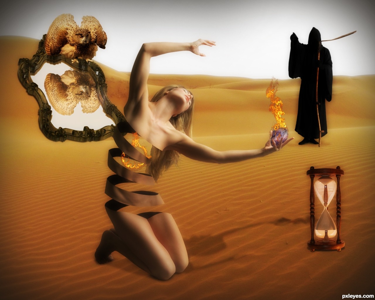
Time doesn't goes by, and what you feel hurts. It burns until you collapse...

Thanks to:
- Marcus Ranum (Deviantart);
- xandert (morguefile);
- lillyfly06 (Sxc.hu);
- stellab (RGBStock);
- César Vonc (CGTextures);
- julietvanree (Flickr);
- S. Sepp (Wikimedia Commons). (5 years and 2588 days ago)

9 Sources:

avatar EmiK
EmiK says:

I like how you did the woman here, and how you can see through her in some parts, well done =)

avatar kyricom
kyricom says:

The "Death" figure seems a little dark, but I love the woman's "ribboned" body

Howdie stranger!
If you want to rate this picture or participate in this contest, just:

LOGIN HERE or REGISTER FOR FREE


commounity of passion - created by rakib888


commounity of passion
Favs: 0SBS: 8Hi-resRank: 13/56Score: 55.9% (0)4949 views

size:-728 x 90
general
no outside source is used beside the pxl logo (5 years and 2923 days ago)

avatar gornats
gornats says:

"with passion of pixel" can mean community with a very small passion , i think you need different phrase
p.s. sometimes this is completely true

author says:

LOL YEAH. but I have changed it.

avatar Drivenslush

It's quite pretty.. good luck

avatar rbsgrl
rbsgrl says:

Very nice work here!

avatar wazowski
wazowski says:

Not bad, but the logo straight on a blue background doesnt work well imo. It needs more contrast or you'd hardly be able to see it (while it should be one one of the more important elements in the banner). The icons are ok, I'd recommend a better aligning inbetween the icons. I'm not completely sure about the tagline, since there are also photographers and perhaps they dont see themselves as graphic artists. And well, I'd add a "s" to artist. Good luck!

author says:

thanks guys ..when comes to tag line always got confused..I couldn't find a great tag line..any one have any recommendation?about the tag line?It would help to improve the entry..please share

avatar CrystleClear

lovin the 4 glossy buttons on the right of the add! well done (just a thought to add pxleyes.com somewhere!) good luck

avatar MnMCarta
MnMCarta says:

I like it! Very appealing

avatar CMYK46
CMYK46 says:

There shouldn't be an apostrophe in "artists". Also, the reflection should be proportional to the type above.

author says:

great catch crystleclear..and thanks every one

avatar CMYK46
CMYK46 says:

Sorry to belabor the point, but the reflection is still wrong.

avatar erathion
erathion says:

Very nice work author...GL

avatar DanLundberg

I don't get how all of this would be used as a banner on a Web site. The apparent reflection doesn't line up with the 'real text' (so the reflection doesn't look like a true reflection) and I don't understand why the below-the-base-line portions of the 'real text' have been cut off. Furthermore, I would think "pxleyes" should be the most prominent element, not the tag line.

author says:

Dan not all of this would be use as a banner the banner is the bar of 728*90 pixel main bar which contains the buttons..putting it in the blue background is just a way of representing.the main file does not contains the background or reflection.thanks for asking

Howdie stranger!
If you want to rate this picture or participate in this contest, just:

LOGIN HERE or REGISTER FOR FREE


No Passion For This Fruit Head - created by Chuck


No Passion For This Fruit Head
Favs: 0SBS: 14Hi-resRank: 16/56Score: 49.1% (0)10052 views

Spec Thanks to NickWheeleroz for use of his picture on Flickr photo sharing.com & on nickwheeleroz photostream. (5 years and 3176 days ago)

2 Sources:

avatar erikuri
erikuri says:

Reflection of the cut fruit is not matching, and spilled juice is not convincent. The reflection of the knife (and the knife itself) is right on the original; now, for your image, according to the perspective of the glass table, it's wrong, and needs correction as well.

author says:

Thanks erkuri I did it over any better?

avatar Disco
Disco says:

I am impressed with the amount of work you put into this entry.

no avatar

Good technique.

avatar EmiK
EmiK says:

Nice title = )

avatar Tuckinator

ha...ha...

Howdie stranger!
If you want to rate this picture or participate in this contest, just:

LOGIN HERE or REGISTER FOR FREE


The beauty in passion forest - created by bingbong088


The beauty in passion forest
Favs: 0SBS: 5Hi-resRank: 15/56Score: 49.8% (0)6415 views

(5 years and 3176 days ago)

1 Source:

avatar CMYK46
CMYK46 says:

Interesting background, but the figure is distorted.

author says:

just fixed it

avatar erikuri
erikuri says:

It's a very different use of the source, quite abstract; I like it. But girl's image is still a little stretched - when you resize an image, do it pressing shift key, image doesn't distort. And she's too much bright, maybe an adjust on contrast could help.

author says:

thanks im going to fix it

avatar erathion
erathion says:

very nice work author...good luck

no avatar

Mhm..

avatar Tuckinator

nice idea

Howdie stranger!
If you want to rate this picture or participate in this contest, just:

LOGIN HERE or REGISTER FOR FREE


all passion... - created by nonotkrov


all passion...
Favs: 0SBS: 7Hi-resRank: 20/56Score: 44.6% (0)6064 views

(5 years and 3178 days ago)

avatar elficho
elficho says:

i think it would look better without the frame

avatar Tuckinator

nice concept

author says:

elficho.. i thought that too.. but my paint as a background so ugly n plain..

author says:

tuckinator.. thx...

avatar Tylerboston

I wonder how far those wheels could make it..... XD

author says:

Tylerboston.. hehehehehehe as far as the fruit to my mouth.. heheheheheheh

no avatar

Different..

Howdie stranger!
If you want to rate this picture or participate in this contest, just:

LOGIN HERE or REGISTER FOR FREE