(5 years and 2521 days ago)
(5 years and 2521 days ago)
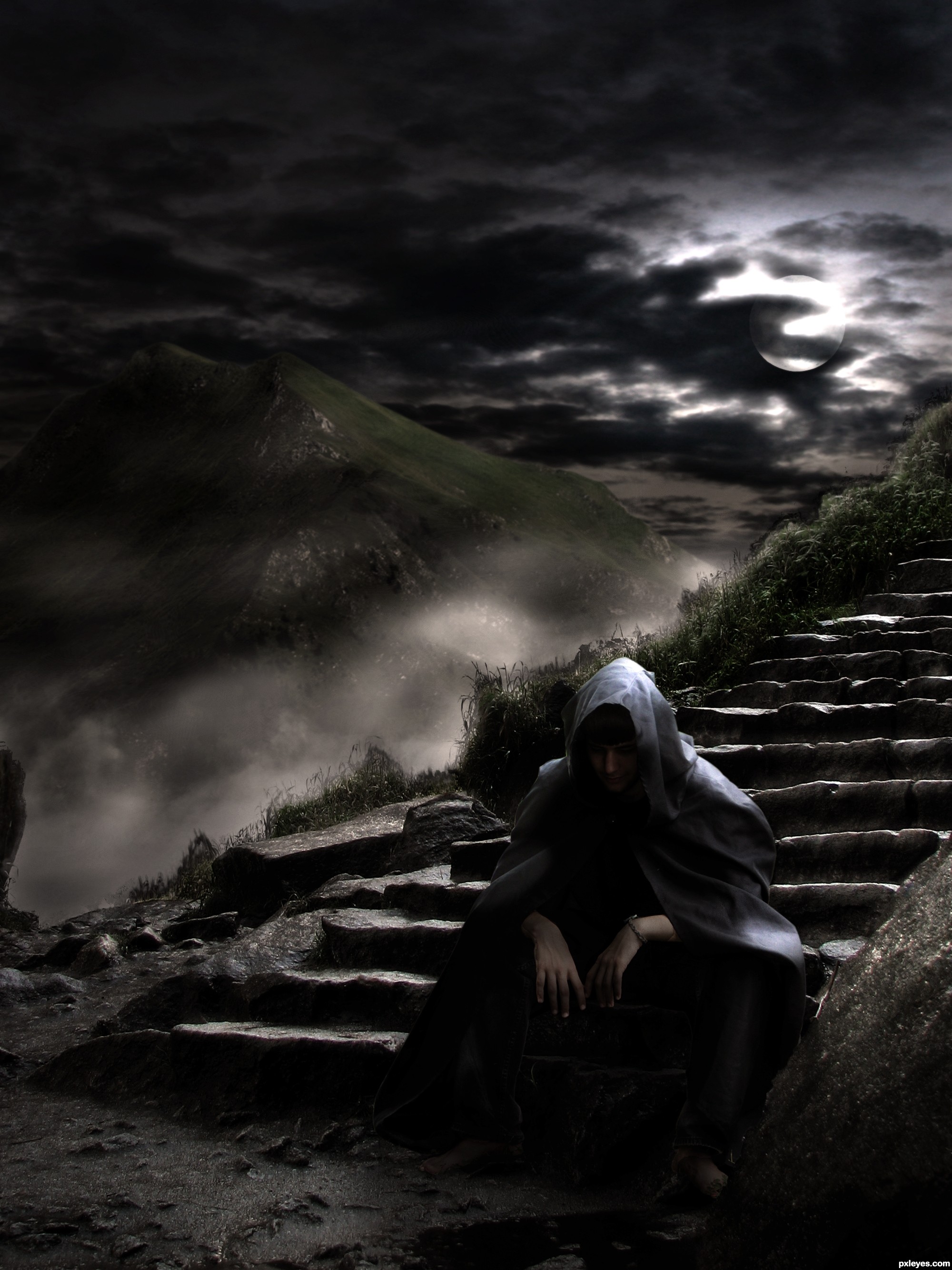
darkity dark dark dark.. as it should be.. good luck, fun mix of images 
Like the mood & lighting...GL author.
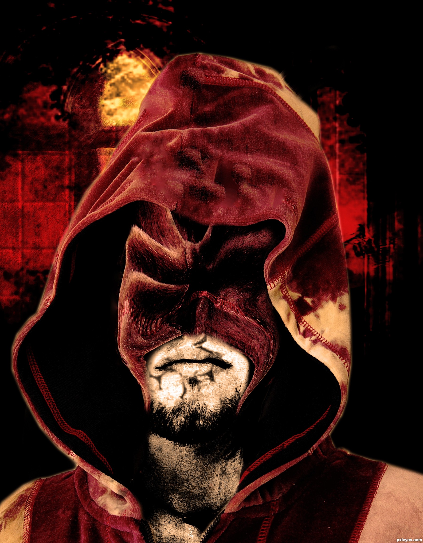
nice, be little carefull on selections and on the colors
Congrats, well done 
Congrats!!
Howdie stranger!
If you want to rate this picture or participate in this contest, just:
LOGIN HERE or REGISTER FOR FREE
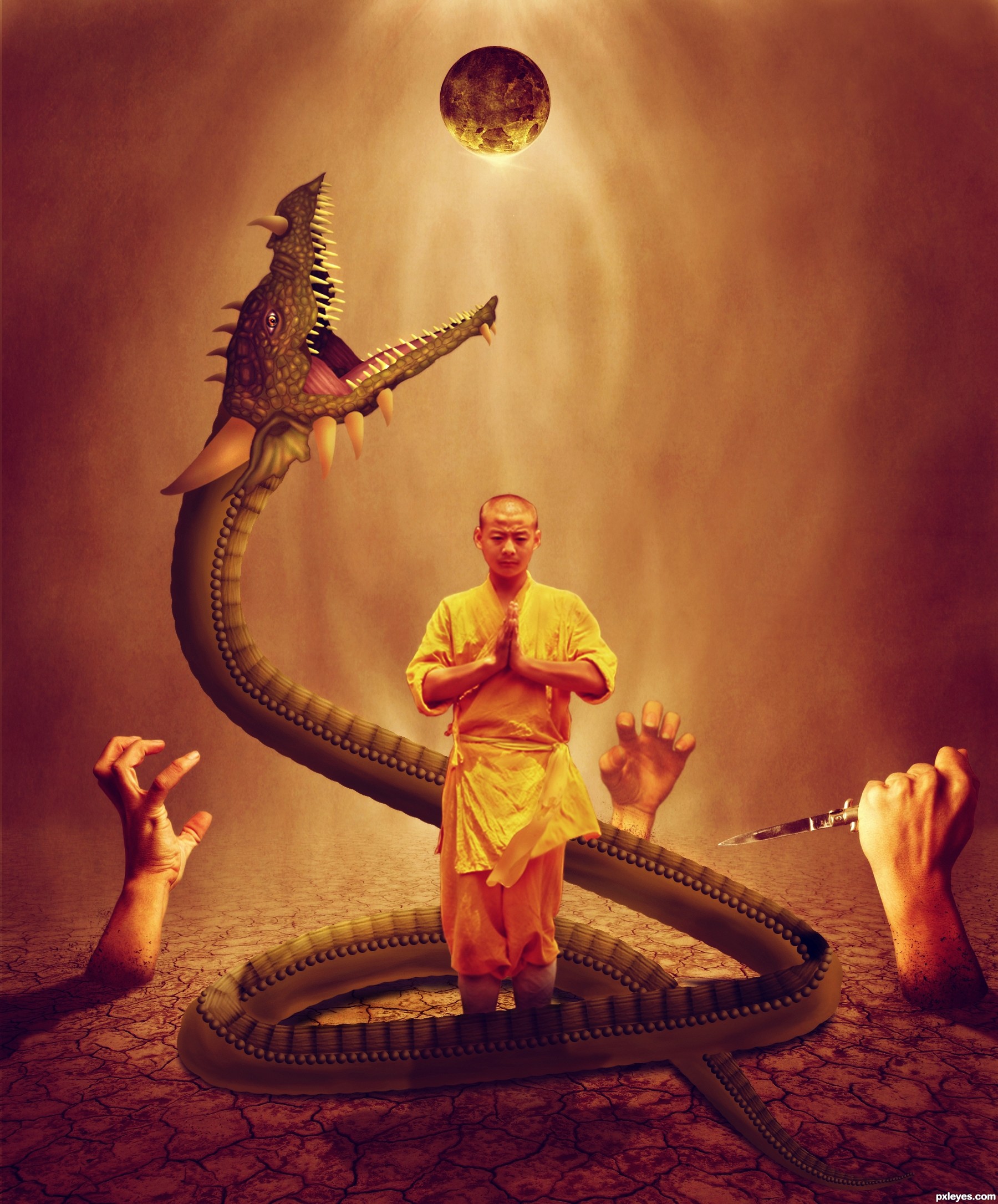
please go for high resolution and SBS before voting friends (5 years and 2523 days ago)
Do you think if the monk was bigger it would balance the image more? (Like double in size so he's more center) The worm/dragon is beautifully drawn but he is SO MUCH bigger then the monk, that his figure seems lost in the image. (I just keep seeing him rising into the middle of the image to be the focus and not an after thought.) IMHO of course, high marks and beautiful chop. Lovely color and textures... Good Luck!!!
I think now its looking better. thanks to you Drivenslush
Much improved, the monk is now the focus in my eyes, good luck author and great job
At about the level of the monk's knees, the dragon's belly scales should be beneath it, not on top. Otherwise not bad.
nice colors!
Great drawing and concept, author!
congrats!
Congrats!!
Howdie stranger!
If you want to rate this picture or participate in this contest, just:
LOGIN HERE or REGISTER FOR FREE
(5 years and 2745 days ago)
Howdie stranger!
If you want to rate this picture or participate in this contest, just:
LOGIN HERE or REGISTER FOR FREE
(5 years and 2989 days ago)
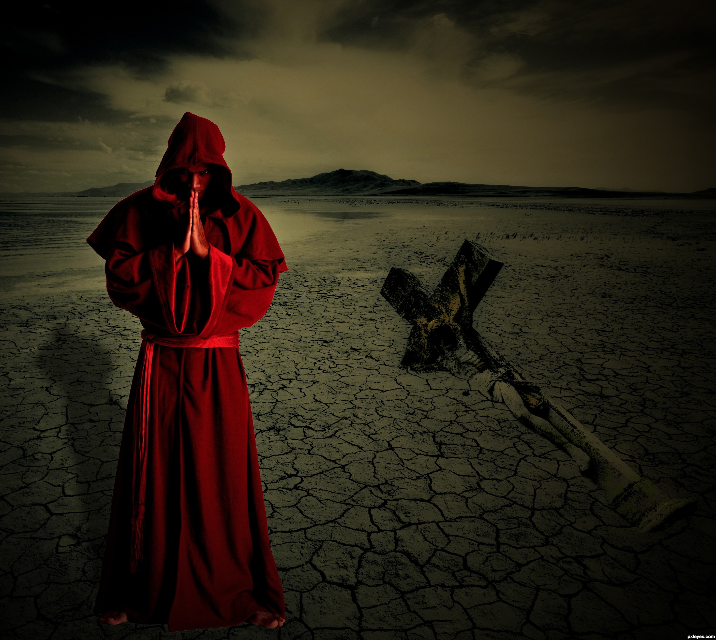
on a tech point the Cross would have the same shadow as the monk.. on a surrealistic point.. who really gives a rip.. very well put together image
Hi. Any idea how I get hold of the artist? I would like to use some of this for an album cover
Finally someone understand my image Thank you friend!
very very cool moody work author...IMHO maybe u could create some slight black gradient at the bottom of the image...Cause u don't need some light parts in that area and monks foots now look like floating...sorry for the nit picks....best of luck
Interesting and very sinister image ... the look on his face works so well with the overall concept ...good choice of stock!
I would suggest softening (just a tiny bit) the outline around the Monk ... the hard edge works for the piece but is just a bit too hard ... a little softening will make it look less like a cut & paste. On the whole though it a well conceived and put together image!
I hope I will make the changes but until Friday I'm not home so I can't make anything right now...anyway thanks for your advice
Howdie stranger!
If you want to rate this picture or participate in this contest, just:
LOGIN HERE or REGISTER FOR FREE
Photography and photoshop contests
We are a community of people with
a passion for photography, graphics and art in general.
Every day new photoshop
and photography contests are posted to compete in. We also have one weekly drawing contest
and one weekly 3D contest!
Participation is 100% free!
Just
register and get
started!
Good luck!
© 2015 Pxleyes.com. All rights reserved.


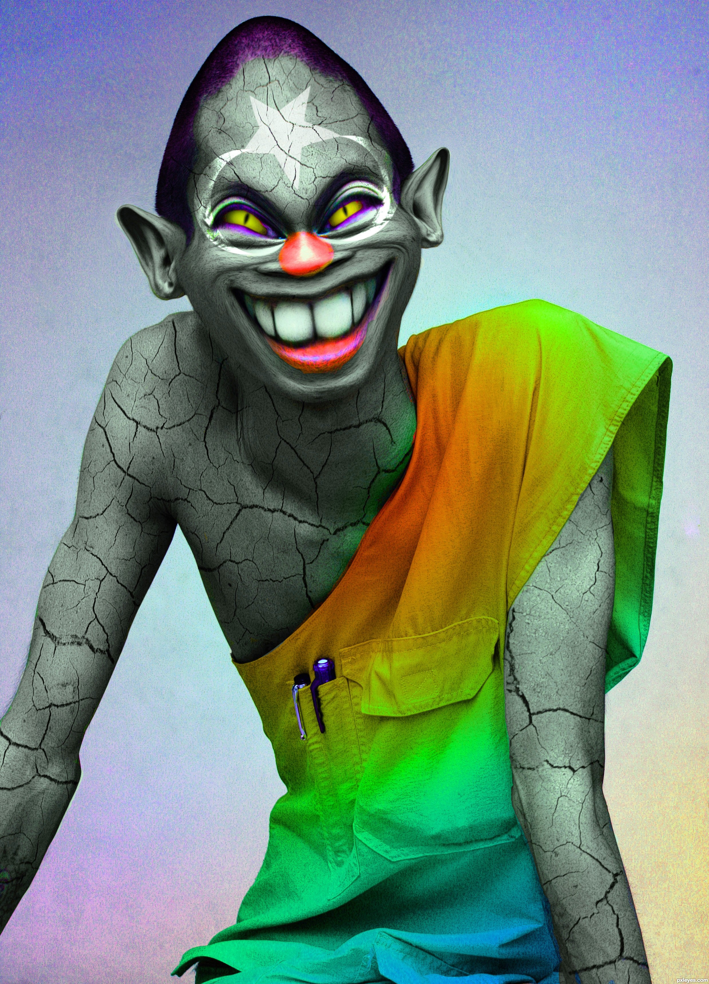
Good manip & color!
Yeah, very evil! I really like the cracked skin tone. Good luck
Great manip - and he LIKES the sun that cracked him up!
Howdie stranger!
If you want to rate this picture or participate in this contest, just:
LOGIN HERE or REGISTER FOR FREE