Thanks to Ingorrr at Flickr. (5 years and 3269 days ago)
1 Source:
- 1: Man
Special thanks to quelbs. (5 years and 3348 days ago)
Points for the idea...agree with Nator
You should have found a higher resolution source image.
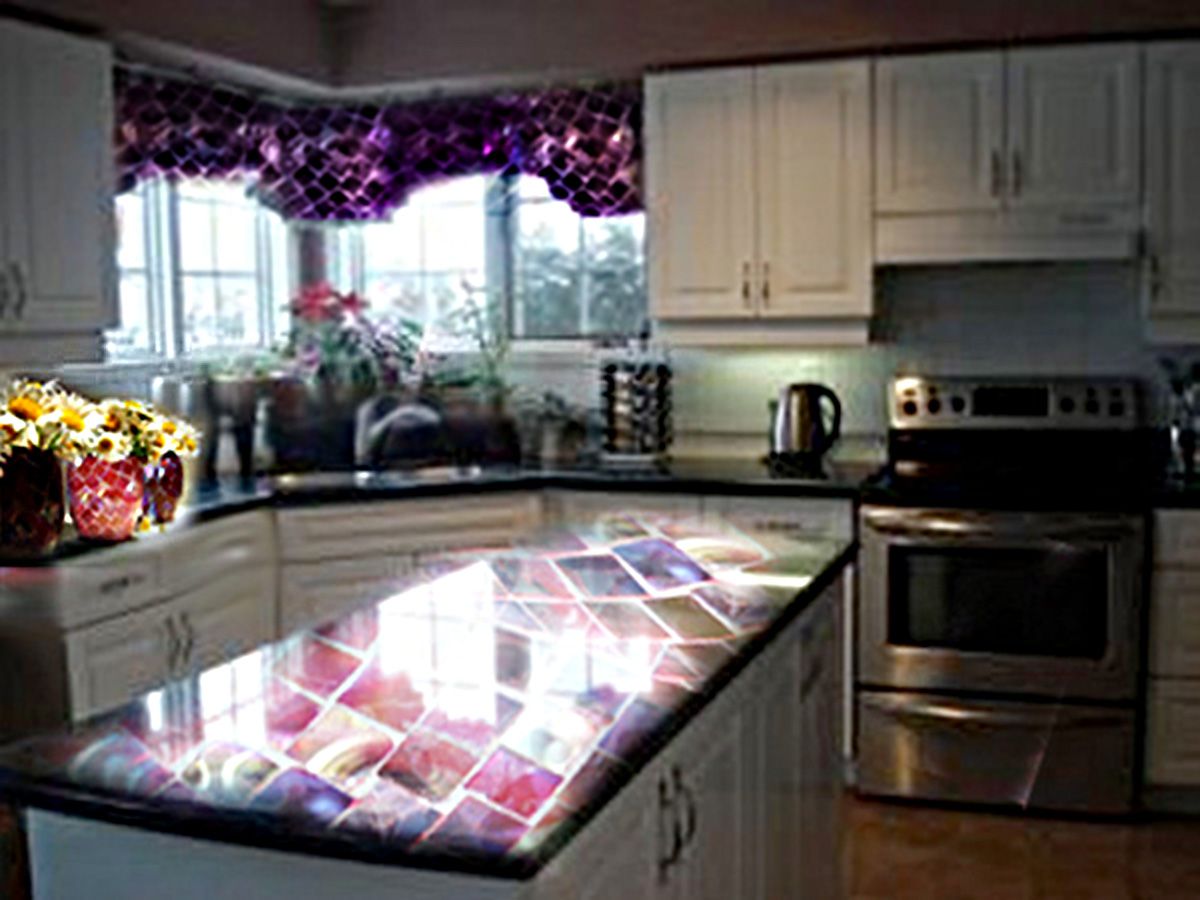
Interesting! wished the back (ketchen) wasn't so grainy... in contrast to the flowers.
Howdie stranger!
If you want to rate this picture or participate in this contest, just:
LOGIN HERE or REGISTER FOR FREE
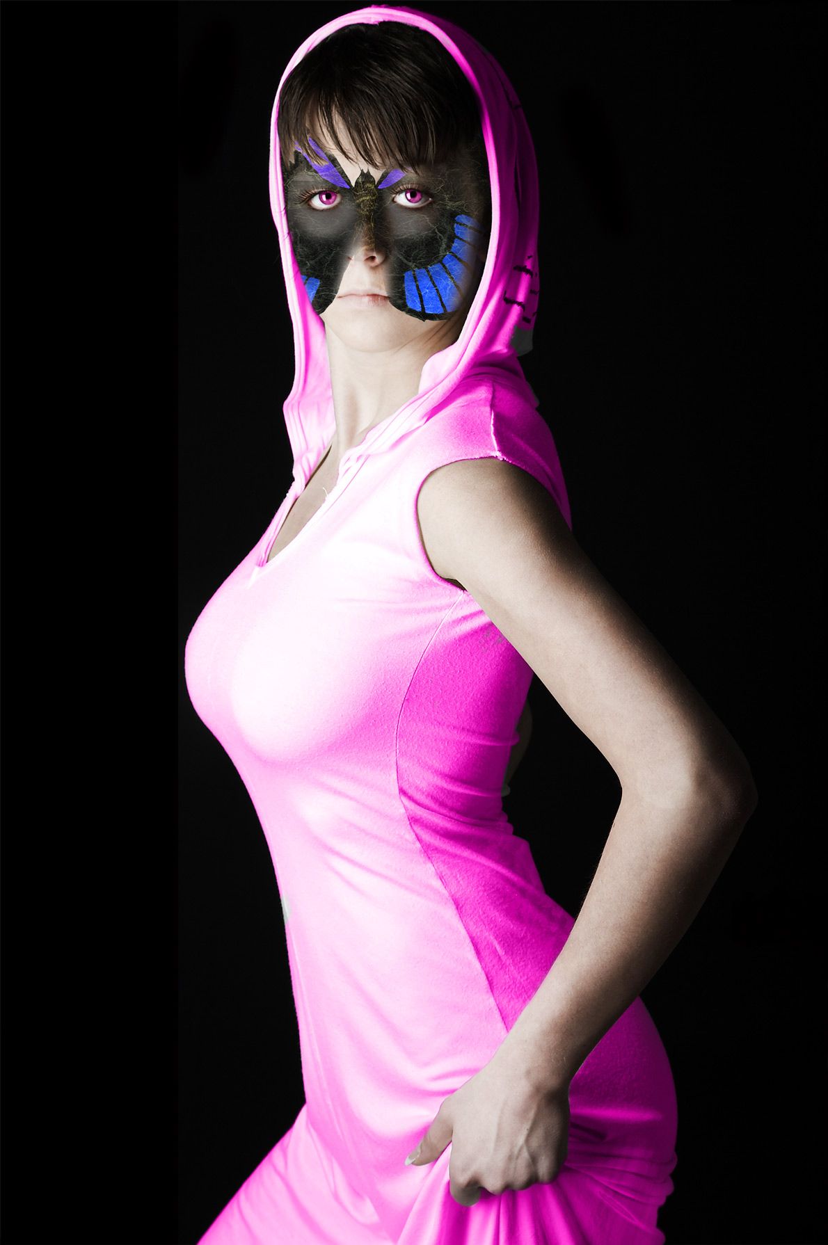
I was trying to create a "modern" version of a fairy. No wings though... (5 years and 3355 days ago)
Whoa, fantastic pair of... eye's. Good work on the dress but the lighting on the nose doesnt match the mask/face paint. Good luck
I'd like to find one of these at the bottom of my garden.............. ....................lovely.
Lovely lady....What a beautiful Fairy! good work,....and great creativity....
Nice work!
I barely noticed the make up. 
Thanks for all of your comments!!!
Howdie stranger!
If you want to rate this picture or participate in this contest, just:
LOGIN HERE or REGISTER FOR FREE

Well I think I went overboard... But I loved the headphone stock... Wanted to use all, but could use only 4 outta 12...
But using the same person/ model does bring good consistency in this template...
Yes, I made it in a template, but it's a a mock template, coz it's not in the actual size...
Based on a 3 piece girl modern/soft rock band called "Gaussian Resonance" XD
There are some white line between the covers... Those are not border but rather gaps..
The top most leaflet is the double type fold able front cover...
The middle leaflet in the inlet cover...
And the bottom is the back cover and the cd itself...
Oh man, did this took lot of time... Editing the pic was fast... It was the text and lay outing that took away most of my time... Now I know why people want huge pay for lay outing lol...
The font I use is mentioned in sbs... Also the headphone link provided leads to a zip file... It's a pack... I didn't find separate images... So if you want to validate my source, you have to download the zip file...
Also permission is show in sbs as well...
Hope everyone enjoys this template...
View in High res to be able to see the song list properly...
And very much thanks to these person...
Thanks to da ~xopion for his awesome mockingbird guitar shot...
Thanks to da ~Lina-Tsu for her gorgeous and sensual guitar playing pic...
And most thankful to da =TwiggXstock which is the really the bulk of my template... XD (5 years and 3517 days ago)
This is absolutely incredible! This image is creative, catchy, cool, colorful, and careful in preserving even the most minute details found on CDs. Only a few things I can say that might be improved, and it's mainly a matter of my personal taste so don't feel the need to take my suggestion: first, the nude girl is not playing any chord which makes sense (though this neither matters nor can be avoided); second, the dots in the border around the picture of the nude girl should be blue and silver as opposed to blue and red, to preserve the color scheme.
I ran out of room, so let me continue. Third, the picture of the nude girl has too stark of a transition between itself and the sorroundings; maybe a fade effect could make it less harsh on the eye. Also, since the catch phrase is "blurring the blur in the music" you could perhaps find places to add blur in the image, such as faded edges or slightly blurred fonts to make this catch phrase more evident in the image. Other than that I can't really say anything. AMAZING image!
Thanks vibs... Well I agree with your suggestion although I am happy with the end result for now... Also my eyes are tired now... Will get some rest and then try tweaking it... And about that girl not catching any chord, I noticed it but I liked the pic so much I had to include it lol...
Edit: @ Golemaura I was waiting for someone to say something about the white space... Glad it was you... But I made this not a chop but rather a template... So I don't really care about the white space... Also if i try to expand the bottom cover, it would really really mess up the proportion of the covers... Coz even if the covers are not of actual size, they are proportional to each other... Maybe I should add an invoice to Gaussian Resonance in that white space...
@Akassa I was also expecting that... Knew some people won't see that as a rock cover... But I mentioned that the band is modern/ soft rock maybe with some element of pop... And band that is totally rock is quite rare now a days... And I made the album according to contemporary style... At least it is not emo lol... Well each has it's own opinion... 
Thanks for the feedback peeps...
Edit: Added an cd to the white space...Just for you Golem cause I LUUBBB you ROFL  ha ha ha ha... enjoy...
Also made the color scheme more consistence in the inlet cover... Got rid of the orange red color...
hehehe... things get out a hand every once and awhile..LOL.. the huge white space on the bottom right corner is a big NO NO.. but I know you know that already author.. LOL.. you could just expand the bottom image and lengthen the whole piece.. no big whoop .. good luck.. hehehe
EDIT: Simple excellent fix.. great save author
I love it, great creativity.
Very nice, it really looks like a real cd cover! Love the model but doesn't look like a rock cover to me.... maybe pop? :P
cool
Congrats for your third place!
Congratulations for 3rd
Congrats!
Congrats...
Thanks... 
Congrats!
Howdie stranger!
If you want to rate this picture or participate in this contest, just:
LOGIN HERE or REGISTER FOR FREE

this pic shows new world of transport becoz now we hv to save energy and reduce pollution (5 years and 3520 days ago)
clever and high marks.. but if your goal was realism you have to work on the shadow/shading.. but the overall effectis very effective... I could see this as a great wall poster.. good luck
we gonna need a lot of those then XD O.o great imagination but like golem said shadows are missing
Unfortunately it is the habit of people new to photoshop to use drop shadow for all of their shadow needs. This is rarely the solution such as in this case. When you use drop shadow and let the shadow ring your subject, it no longer appears to be in the scene, but rather in front of a photo of the scene. If you must use drop shadow, experiment with the angle of the shadow so that it comes out only at the bottom. Otherwise, make a shadow out of a duplication of the object, or use a soft brush to make your shadow.
the car looks like it's floating around...loose the drop shadows...
Howdie stranger!
If you want to rate this picture or participate in this contest, just:
LOGIN HERE or REGISTER FOR FREE
Photography and photoshop contests
We are a community of people with
a passion for photography, graphics and art in general.
Every day new photoshop
and photography contests are posted to compete in. We also have one weekly drawing contest
and one weekly 3D contest!
Participation is 100% free!
Just
register and get
started!
Good luck!
© 2015 Pxleyes.com. All rights reserved.


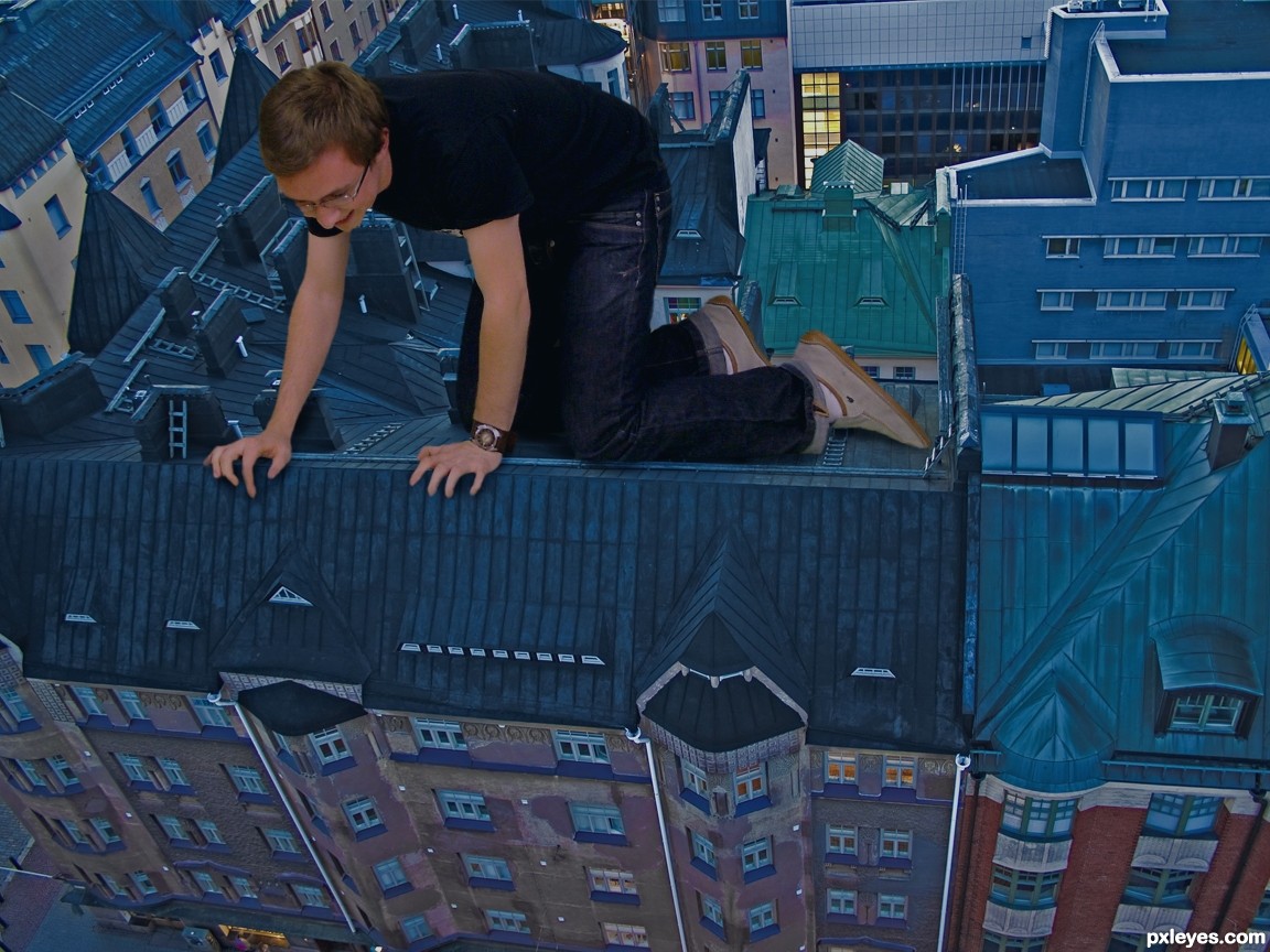
very clever...but theres still seems to be something about it that stands out...maybe if you played with the levels and saturation on the 'man' layer it might help blend him more into the background pic....Good luck!
Good Idea. Author fingers need some masking.
i don't know what it is..its a good image, but there is something that isn't exactly right about it, as migue1ito said, shadow/depth maybe?
I think if his shins looked less like they're going off to the side and more like they're going down the slope of the roof, this might appear more convincing.
I think part of the problem is the white balance of the guy. Duplicate the background go to filter/blur/average. Put that layer on top of the guy and set the blend mode to color. Now reduce the opacity and ctrl click between the two layers so it only shows on top of the guy. Maybe this will help......Good idea and execution though.
This is very cool work...i like positive vibes in your image...good luck author
a dangerous entry ................
he is a dare devil......
i like it ,it is new
cool
Howdie stranger!
If you want to rate this picture or participate in this contest, just:
LOGIN HERE or REGISTER FOR FREE