Photoshop Pictures: Lord (page 3)


results 11 - 15 of 17

Lord Buddha - created by AdhirAnimator


Lord Buddha
Favs: 1SBS: n/aHi-resRank: 16/19Score: 54.9% (0)18021 views

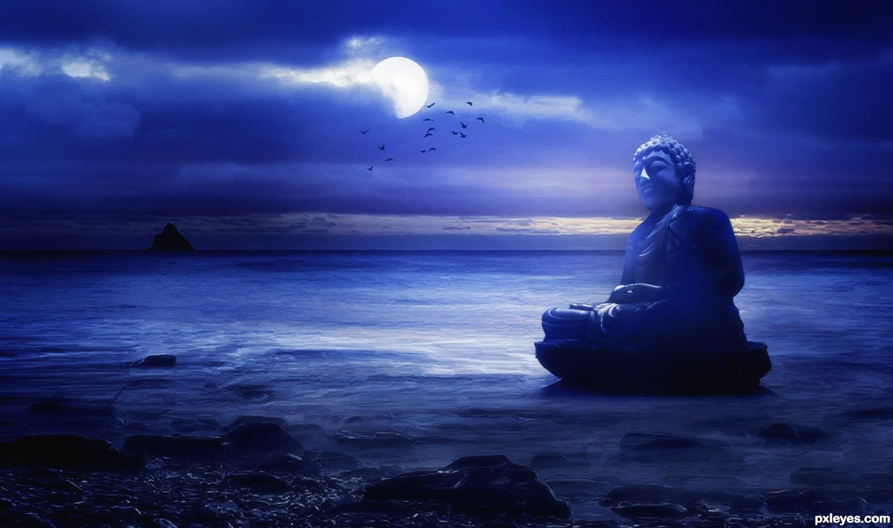
Lord Buddha's statue at unseen place.

Thanks to -

http://www.sxc.hu and http://www.photos8.com for providing the stock images! (5 years and 3059 days ago)

4 Sources:

avatar CMYK46
CMYK46 says:

Perspective on the Buddha is wrong. The source pic is an up shot, but you've placed him in an image that was shot at eye level. Good color, though.

author says:

Hay CMYK46,

Thanks for your comments you said that perspective is wrong.

Will you please help me to correct this?

I am not getting because you said that I have placed Lord Buddha's image at eye level.

Really confused

avatar Christy
Christy says:

I kinda like the perspective...Almost makes Buddha look like he has just drifted ashore and is still rocking in the waves....Best of Luck

author says:

Thanks a lot Christy!

avatar greymval
greymval says:

About your confusion regarding CMYK's comment.

Perspective is about parallel lines which meet at the horizon.
The easiest way to check if your perspective is good/bad, is to draw lines connecting the eyes, connecting the shoulders and also use the line between the lips. After that, trace them continuously, until they meet. They should all meet in the same point which will be on the horizon line ( between the sea and the sky).
If they don't meet in the same point - you traced them wrong.If they don't meet on the horizon like, the perspective is wrong.
To correct this with the Buddha i suggest you use Transform- Distort, Warp & maybe Perspective if it works. You can also try to move the statue closer to the horizon, if the above doesn't work out too well. GL.

Howdie stranger!
If you want to rate this picture or participate in this contest, just:

LOGIN HERE or REGISTER FOR FREE


Hail Lord Zeekon! - created by Geexman


Hail Lord Zeekon!
Favs: 0SBS: 5Hi-resRank: 5/19Score: 55.2% (15)12951 views

Just source (5 years and 3153 days ago)

avatar Drivenslush

love the muscle structure.. the lines are wonderful author.. GOOD LUCK!!!!

avatar CMYK46
CMYK46 says:

He could use a bit of blur on some hard edges, like the top of his head, otherwise he's great!

avatar erikuri
erikuri says:

Whoa, nice torso...

avatar Tuckinator

nice work!

avatar hereisanoop

Congrats

Howdie stranger!
If you want to rate this picture or participate in this contest, just:

LOGIN HERE or REGISTER FOR FREE


Lord Vampus - created by genuine2009


Lord Vampus
Favs: 3SBS: n/aHi-resRank: 9/19Score: 57.6% (0)5337 views

Thx to "azenor-stock" for source 2
Thx to "ravenarcana" for source 3 (5 years and 3182 days ago)

3 Sources:

avatar dekwid
dekwid says:

the most stylish vampire ever.....nice, BTW...how about repairing the cane lil bit? it looks bended,doesnt it? good luck.......

avatar Tuckinator

this is great

avatar JamesD
JamesD says:

You're better off leaving the teeth out of the image as they aren't convincing!... his mouth is closed!... fix that problem and you got a good entry for what it is...

author says:

thx all for your comm.....and james!!!!....i try to make what did you say.....maybe you rigth!!!!......

avatar DanLundberg

It seems to me that without either fangs or glowing eyes, you just have a drug addict, not a vampire. While I agree with James that the teeth are not convincing, removing them would thus necessitate adding eye glow. Also, the cane seems to be floating above (not resting on) the cushion corner. In hi-res, the hat has a white outline and appears to be floating just above the bench seat. (If floating accessories are meant to be a vampire trick, then the floating should be made more obvious.)

avatar erathion
erathion says:

O my,what a POP stylish vampire......best of luck author

avatar erikuri
erikuri says:

Omg, what a style! Well, we can't forget Dracula was a Count...
I still think that vampires must have fangs. It's only a suggestion, but try to find a half-open mouth image to add on your image.

no avatar
Widiar says:

I think with a slight warp or liquify tool you can blend the teeth to pop up from otherwise closed mouth. I don't see them as a major problem anyways. Just raise the upper lip a bit around the teeth and make a shallow dimple for them on the lower lips.

About the floating stick, you can try warping the cushion a bit too or/and remove the shadow from where it touches the corner/cushion,

author says:

i hope i fix the problems you talked about!!!

avatar hazem
hazem says:

good work and good luck

avatar jawshoewhah
jawshoewhah [banned] says:

I think the only thing he's missing is the clove cigarette. More just a goth-type image to be, but that's mainly IMO.

avatar CorneliaMladenova

I fancy this type of lords

Howdie stranger!
If you want to rate this picture or participate in this contest, just:

LOGIN HERE or REGISTER FOR FREE


LORD GANESHA..... - created by Siddhartha


LORD GANESHA.....
Favs: 0SBS: 5Hi-resRank: 18/19Score: 54% (0)9440 views

MAY THE ALMIGHTY LORD GANESHA BLESS ALL..... (5 years and 3207 days ago)

no avatar

really nice...good work author

avatar CrystleClear

work on your masking!! otherwise very creative!

author says:

THNX A LOT FRIENDS....ATLEAST YOU STOPPED BY TO LEAVE A COMMENT AND APPRECIATE IT...THTS A LOT FOR A BEGINNER LIKE ME....and Crystleclear~i l try working on what u said...thank you....

avatar RAZ0R
RAZ0R [banned] says:

avatar erikuri
erikuri says:

I know He will, author! Nice chop!

avatar akasha
akasha says:

very intricate work; looks very nice and cute for a deity

avatar akasha
akasha says:

or a lord...:P

avatar Tuckinator

lol this is awesome

Howdie stranger!
If you want to rate this picture or participate in this contest, just:

LOGIN HERE or REGISTER FOR FREE


Lord Of The Beams - created by metalhips


Lord Of The Beams
Favs: 2SBS: 6Hi-resRank: 5/19Score: 54.8% (16)10558 views

Who else can use these beams better than a dog? (5 years and 3426 days ago)

4 Sources:

avatar alexstephen

cool, really funny, I like it.

avatar CMYK46
CMYK46 says:

Nice lighting & shadow...

avatar pixelkid
pixelkid says:

I like this very much...excellent lighting...would be really cool if you had longer blades of grass covering some beams.

avatar erathion
erathion says:

Great work...fabulous dog's playground....gl author...

avatar jawshoewhah
jawshoewhah [banned] says:

In high res, it needs a little work. For one thing, the dog in front is a little green. A gausian blur would have helped your beams layer look more clean cut, since I noticed a lot of choppy edges.

avatar ponti55
ponti55 says:

Very nice shadows.. pretty much perfect! A great use of source.

avatar George55
George55 says:

Nice colors...and a good job... good luck

avatar billyboy
billyboy says:

My fav on this contest. Good idea, humour, blend, color... I love it..hope will be where it deserve...on 1st

avatar PhilNit
PhilNit says:

Nice work...I agree with Jawshoewah's comment...but overall its pretty nicely done.

author says:

Thank you everybody for your valuable comments. I'll try to avoid the errors you pointed out in future works.

avatar artgirl1935

Edges need a lot of work but, love the dogs. GL

Howdie stranger!
If you want to rate this picture or participate in this contest, just:

LOGIN HERE or REGISTER FOR FREE