(5 years and 2797 days ago)
(5 years and 2928 days ago)
The reflection is off. It looks like it's floating...
It's one good idea.
Besides what mossy said, i don't get why the bevel on PXL seems blurry, i think there's a setting there ( in layer styles) to make it look more solid, if you can't manage to find it, you might wanna solve that manually.
I see some edges are bumpy (meaning not straight) and I don't know if you did it on purpose to make it look older, or they are just masking problems. Don't give up!
thanks for suggestions
Howdie stranger!
If you want to rate this picture or participate in this contest, just:
LOGIN HERE or REGISTER FOR FREE
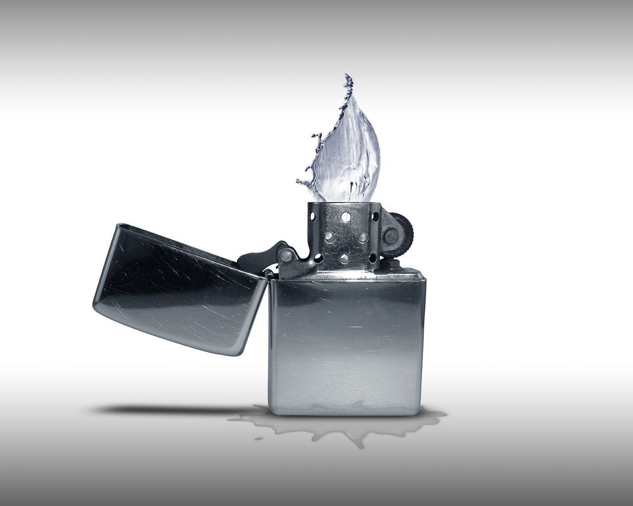
The water win.
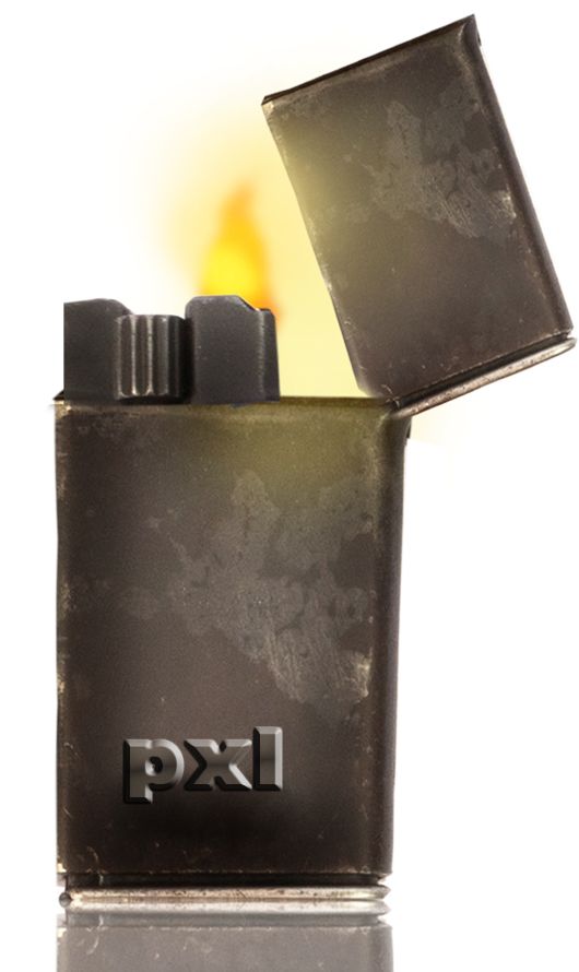
I hope this is on theme. Thanks for view and comments. (5 years and 3386 days ago)
seen before, but nice. ..wait is this the same flame as the image above? 
youll have to put more work in than simply flipping the flame and putting it on a different object! I'd pull one image as they are too similar and it's obvious they are both from the same author. Only IMO of course
A nice idea but IMHO not really on theme. You are supposed to show how fire and water are fighting each other for dominance.
hmm... jawshoewhah is right; not exactly whats been asked but the idea is good and there is room for improvement...
Howdie stranger!
If you want to rate this picture or participate in this contest, just:
LOGIN HERE or REGISTER FOR FREE
Photography and photoshop contests
We are a community of people with
a passion for photography, graphics and art in general.
Every day new photoshop
and photography contests are posted to compete in. We also have one weekly drawing contest
and one weekly 3D contest!
Participation is 100% free!
Just
register and get
started!
Good luck!
© 2015 Pxleyes.com. All rights reserved.


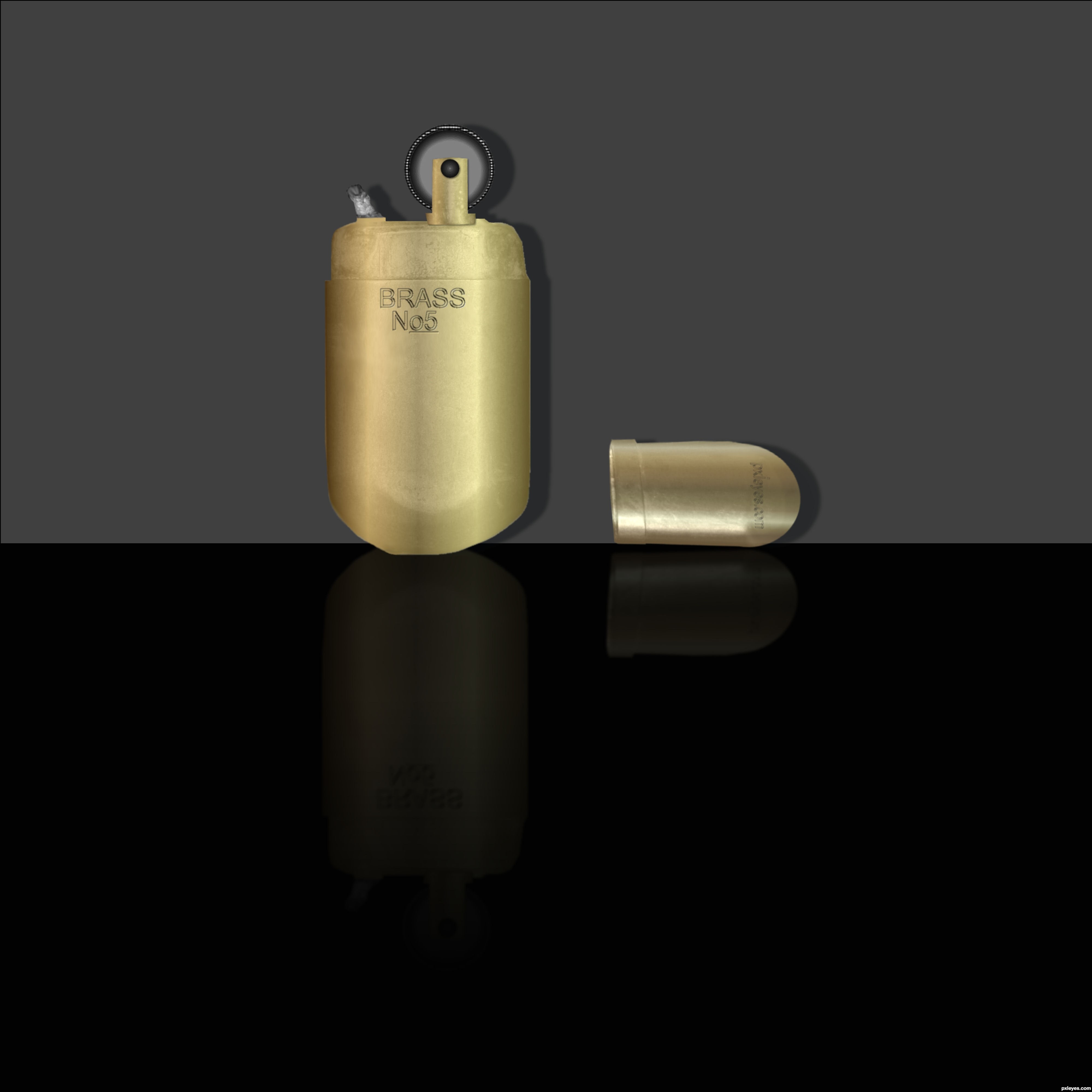
nice work but it looks new one frnd
The cap is too angular, and looks more like a lipstick case than the top of the lighter. Other than that, you've done a very good job of colorization and artifact removal, the brass looks good.
Thanks all I changed title and fixed cap.
The cap would not be standing on edge.
Thanks CMYK46 Your right its laying against the wall

Note...CMYK46 tHE SHADOWS WERE BLURED
Blur the shadows and you'll be OK.
Nice try author! Best of luck!
Howdie stranger!
If you want to rate this picture or participate in this contest, just:
LOGIN HERE or REGISTER FOR FREE