Thanks to "bytreivilo" for the image of the dancer. (5 years and 3212 days ago)
1 Source:
- 1: Dancer
many thanks to inspyretash-stock at deviantart.com for the lovely vintage ladies that inspired this chop. Background sky image is my own. and thanks to lavica-photoshop for the diamond brushes.
(5 years and 3275 days ago)
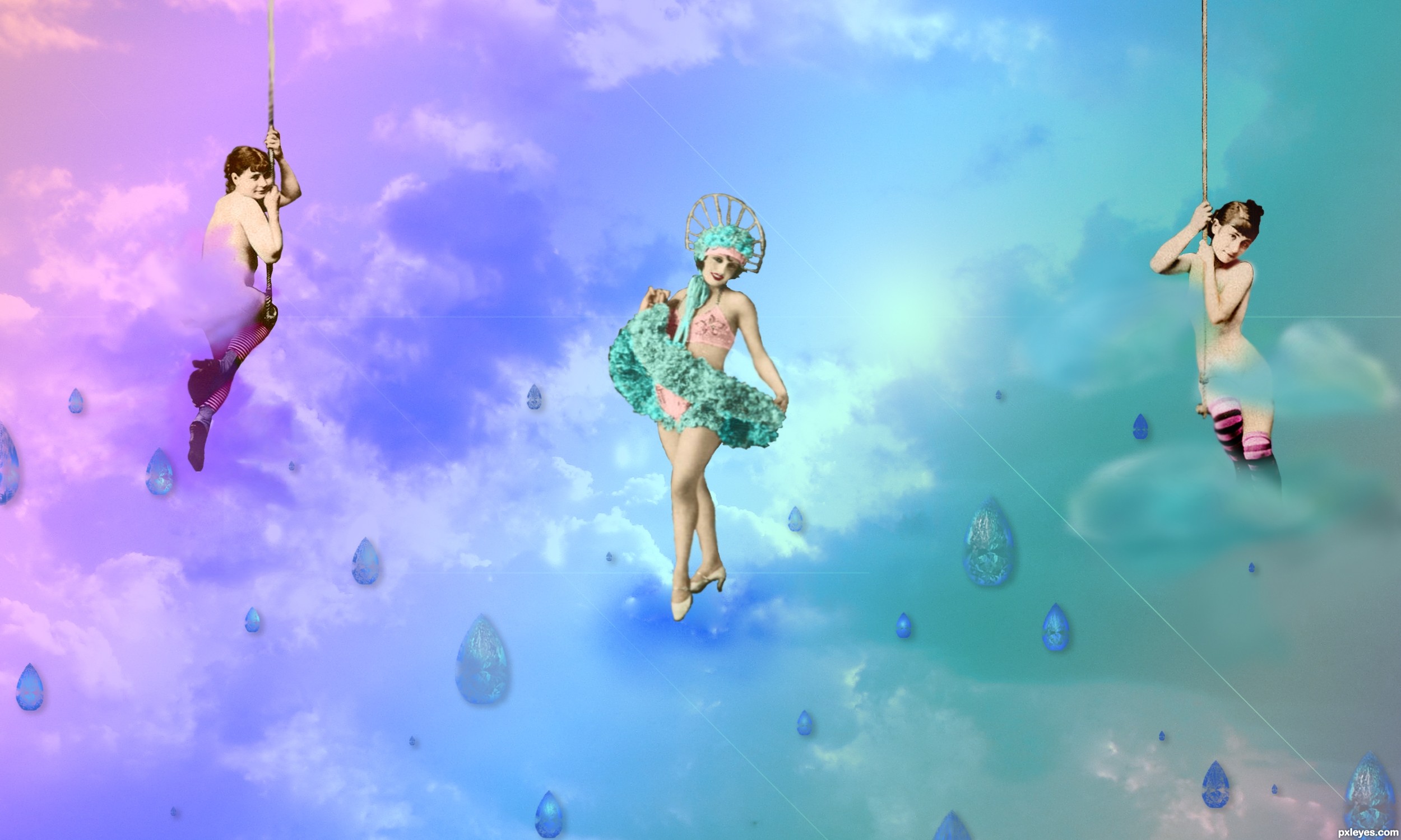
You may want to whiten the cloud on the third girl so it doesn't look like an eraser mark... just a thought.. very cute Idea and image 
i really didn't want to shock or offend with any sort of nudity, so i had to be careful about how much i let show through the clouds. She was faced in a direction that showed her lower regions, and i found this to be a little more tasteful way of covering that up.
Thank you for your comments. I took it back and did a guassion blur to that layer and it seems to have helped lighten them up without exposing too much. 
whiten.. not lighten.. hehehe.. but your vision is fine!!! (the blue cloud covering her naughty bits looks more like eraser marks) but that is IMHO!! good luck author
:lol: right right. whiten. got it. Thank you again. i whitened them a bit. seems to give more depth to the piece. always appreciate your comments!
I like the colorizing of your vintage pics. (BTW are your sources mislabeled?) Your SBS doesn't explain what the white lines are all about. Why are the diamonds only in the lower half of the image? It seems a little odd that the side girls are obviously hanging from something but the middle girl appears to be standing on something in the middle of space. [Better choice IMO: a girl on a swing.] Diamonds floating in the sky have nothing to cast a shadow on, so your drop shadows merely make it look like they're hovering just in front of a picture of clouds. The fuzzy near clouds over the naughty bits seem out of place with the in-focus near girls and far clouds. (And shouldn't your title say "Sky" singular?)
Good work.
haha. sources ARE mislabeled. i will get that fixed up when i upload the next yet again revised edition. :-P thank you for your comments and critiques. you've given me some things to work on, Dan.
Just a few answers to some of your critiques though... first off.. lucy takes center stage, and since this is all fantasy, she can be standing on a cloud. after all. this is Lucy in the sky with diamonds. nothing can be what it appears. The diamonds...well, they are supposed to be "rain" which is why i chose the shape that i did. the white lines are lens flares. i explained that in the last step.
I really like this one.. the softness is awesome....and I agree with the author on this is "Lucy in the sky with diamonds. nothing can be what it appears" I feel the lady in the middle is perfect...
cooool
Great job.....love the colors and have to love those vintage ladies.......GL
nice......... all the best.......... 
Howdie stranger!
If you want to rate this picture or participate in this contest, just:
LOGIN HERE or REGISTER FOR FREE
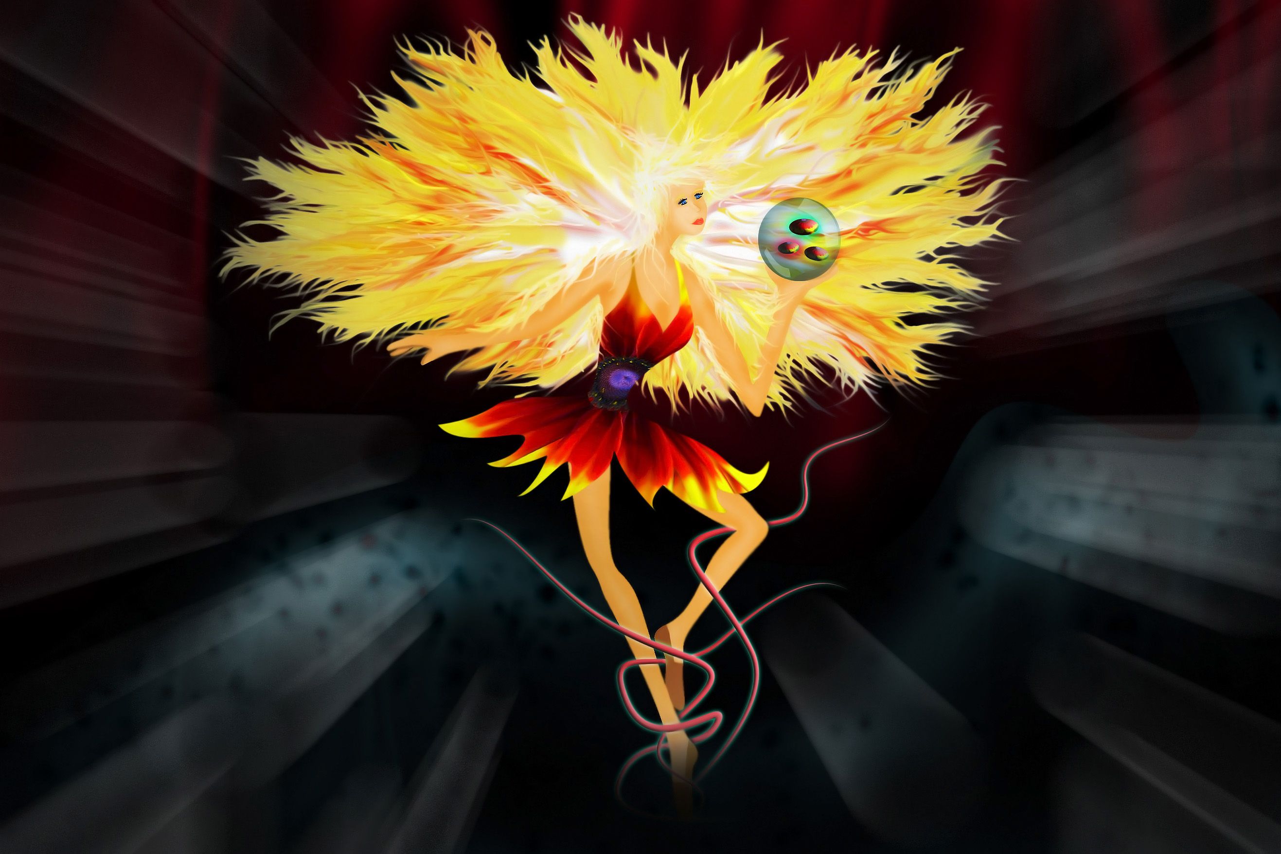
"Dancer In The Dark" is a concept that came to my mind as soon as I saw this image.
Only used the source image, took me about 3 hours to complete.
Ingredients:
Photoshop CS4, Pen Tablet and 4 cups of coffe...
;)
(5 years and 3314 days ago)
Wow! Great work!
hehehe.. mountain dew works better LOLOLOL.. hehehe.. great job
But don't drink coffee after 7 o'clock pm, it may cause insomnia... Beautiful work!
beautiful ... imo bowling ball retracts from the subtle beauty of the image ...high marks from me though
Great job...well done author
Thank you guys.. Unfortunately I DO drink coffe after 7 pm... A LOT actually... :P but I'm glad you liked my work.
You aren't the only one 
Congrats for your third place, MrLuna! Good to see you entering again
Congrats! for 3rd
Congratulations for 3rd
Congrats!
Thanx ! I didn't know I was being missed around here !!  I'll try to login more often now...


Howdie stranger!
If you want to rate this picture or participate in this contest, just:
LOGIN HERE or REGISTER FOR FREE
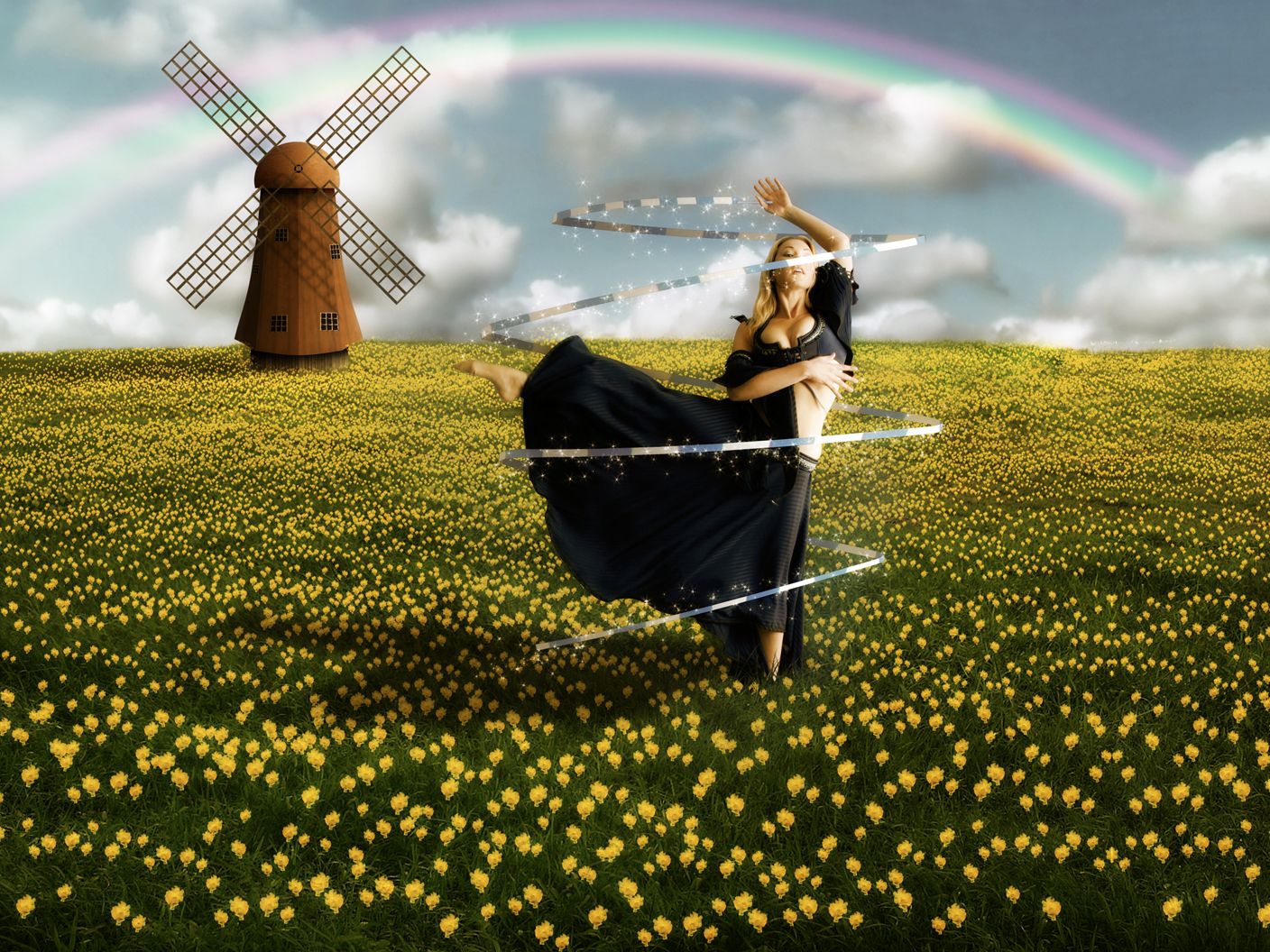
I had to make a little change to the field I had used before because i misunderstood the rules of the image.
Credits to:
Marcus Ranum - http://mjranum-stock.deviantart.com/
theflickerees-stock - http://theflickerees-stock.deviantart.com/ (5 years and 3336 days ago)
The best one in this contest so far. The use of source is very good. I like the composition and the colors. I have some suggestions, maybe they can help. The rainbow colors can be better if you compare it to the real one, this one is easy to be fixed, also it should be behind everything in this scenery, including the trees (do you know that without water in the air, we can't see the rainbow?). I prefer the ribbon to be softer and glowed a bit more, that would be nice. Wish you the best of luck!
Creative use of source author, to me the colours are a bit too bright, maybe experiment with a bit of desaturation? But that's just me. Good job otherwise.
Edit: Great work on the windmill and the flowers!! They look so real... wow!
nice work
Very nice work...good luck author
Simply beautiful!
lots of fun
Thanks to all for the comments and suggestions.
better than the others.. GL!
exellent very welldone.....
Decent job
Nice 1 GL!
Amazing!
Congrats for your third place, Fatz!
Great entry, should be proud of your place!
Congrats!!
Congrats!!
Howdie stranger!
If you want to rate this picture or participate in this contest, just:
LOGIN HERE or REGISTER FOR FREE
me likey Ps!
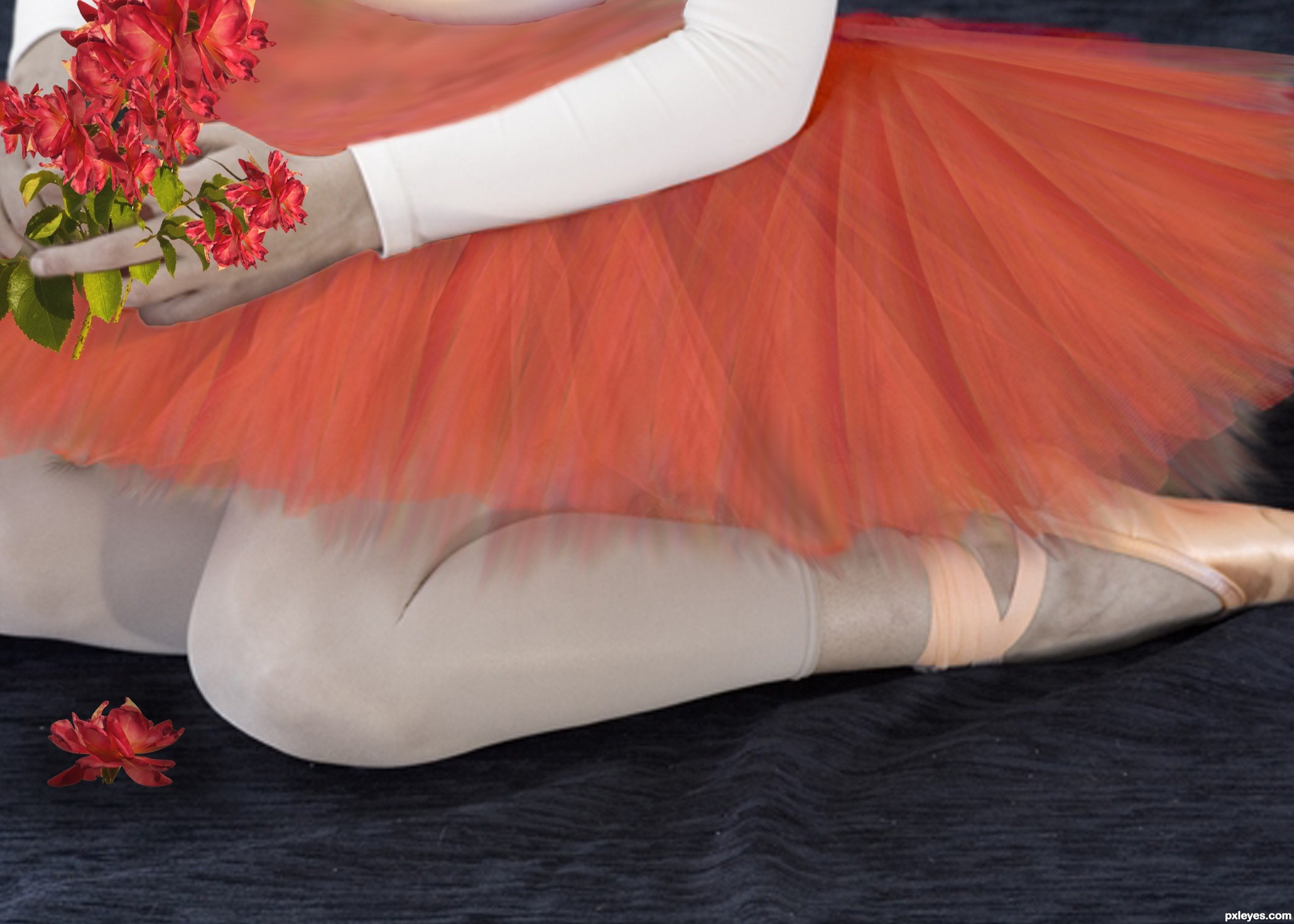
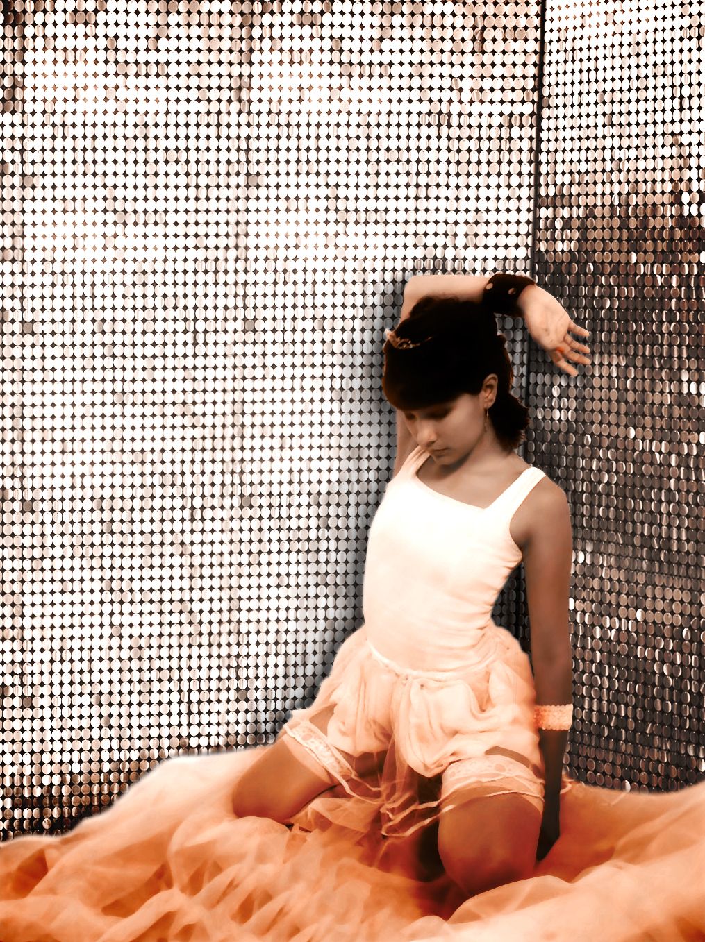
Special thanks to naraosga from sxc for use of their photo! (5 years and 3359 days ago)
White areas are pretty blown out compared to the source pic, but not bad...
You've got a corner that seems to just disappear behind her arm, rather than being a visible edge. Do you see what I mean? I'll hold my vote.
Nice...
Thanks guys, some adjustments made per suggestions in comments! jaw, hope that is what you spoke of... CMYK tried to blowout the wall some more without losing too much detail...
That's exactly what I was referring to. Much better!!! The ONLY other nitpick I have that I didn't notice until now is see how there's repetitive sequins on the left? Probably where you connected the source to make it into a wall? (see the 8 dark sequins that look like they're in a pattern?) I would try and blend those a little better. It would look more natural that way. The corner looks good though. You should do well. GL!
Author, I was referring to the lost detail on the white areas of the dancer.
ahhh i see. i dind't think of that cuz i was going for a blown out over exposed feel to it.... thought i had maybe missed the mark on the bg though.... thank you sir!
Good one....
Howdie stranger!
If you want to rate this picture or participate in this contest, just:
LOGIN HERE or REGISTER FOR FREE
Photography and photoshop contests
We are a community of people with
a passion for photography, graphics and art in general.
Every day new photoshop
and photography contests are posted to compete in. We also have one weekly drawing contest
and one weekly 3D contest!
Participation is 100% free!
Just
register and get
started!
Good luck!
© 2015 Pxleyes.com. All rights reserved.


pretty dress. the flowers however are too complicate
very nice work...gl
pretty cool
Howdie stranger!
If you want to rate this picture or participate in this contest, just:
LOGIN HERE or REGISTER FOR FREE