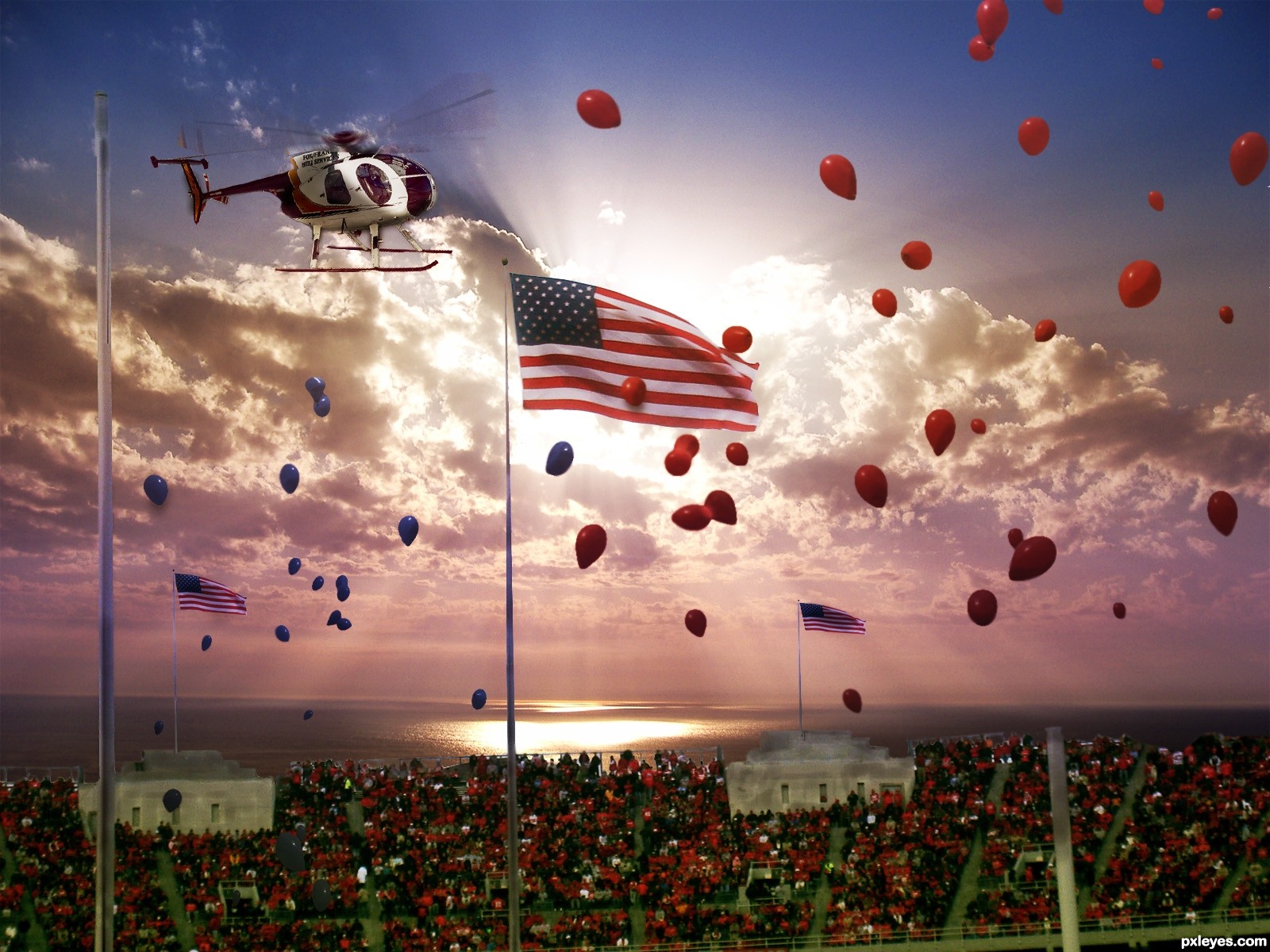
(5 years and 2486 days ago)
3 Sources:
- 1: source1
- 2: source2
- 3: WDWParksGal-Stock
(5 years and 2949 days ago)
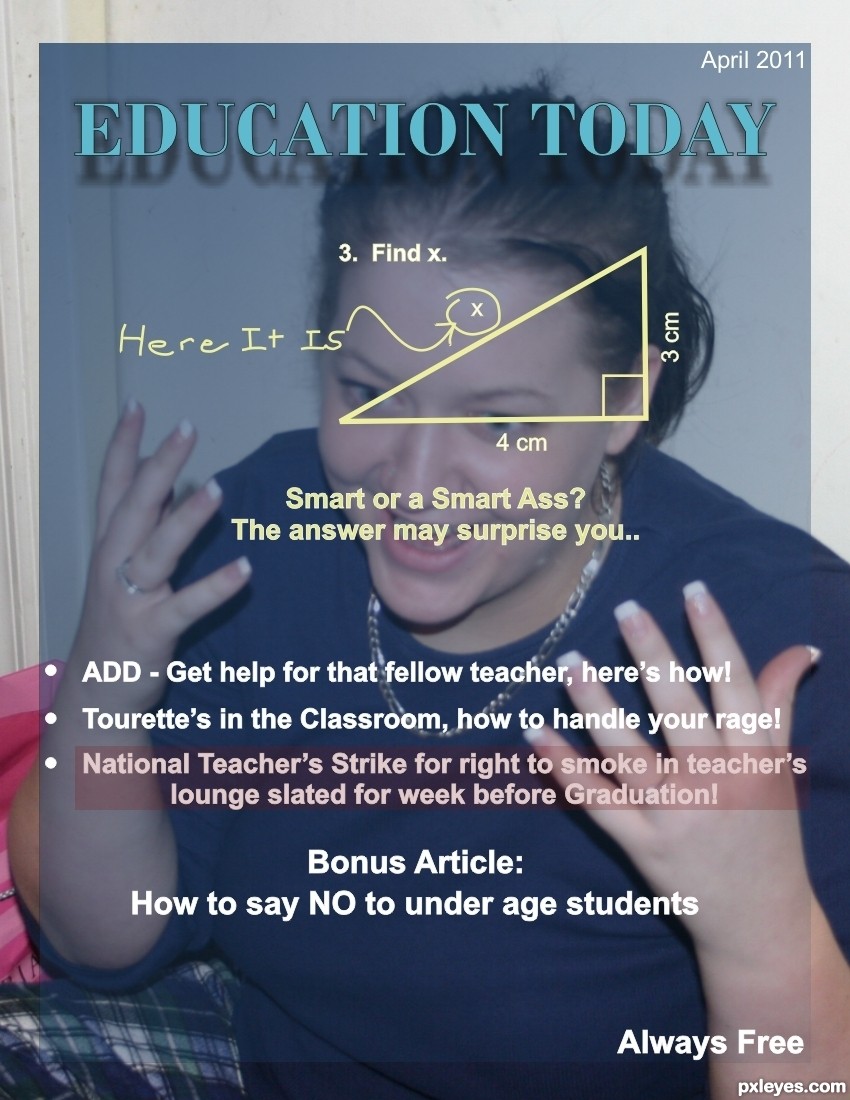
Figure is distorted...hold shift key when resizing to prevent this.
Not sure that will work with that old CorelDraw 6; but I'll try and give it some attention tonight. Thanks CMYK46!
Sorry author, I just assumed your pic was done in Photoshop. 
Recreated in PS, looks better, thanks again CMYK46
Fantastic! With the mess going on in America's schools this is very appropriate!
Thanks rbsgirl; as you can see I can have a bit of a sarcastic streak... lol. I just fear I played to much and let the National teachers strike a week before Graduation get lost in the translation
Great humor author and very cool work...gl
Howdie stranger!
If you want to rate this picture or participate in this contest, just:
LOGIN HERE or REGISTER FOR FREE
(5 years and 3122 days ago)
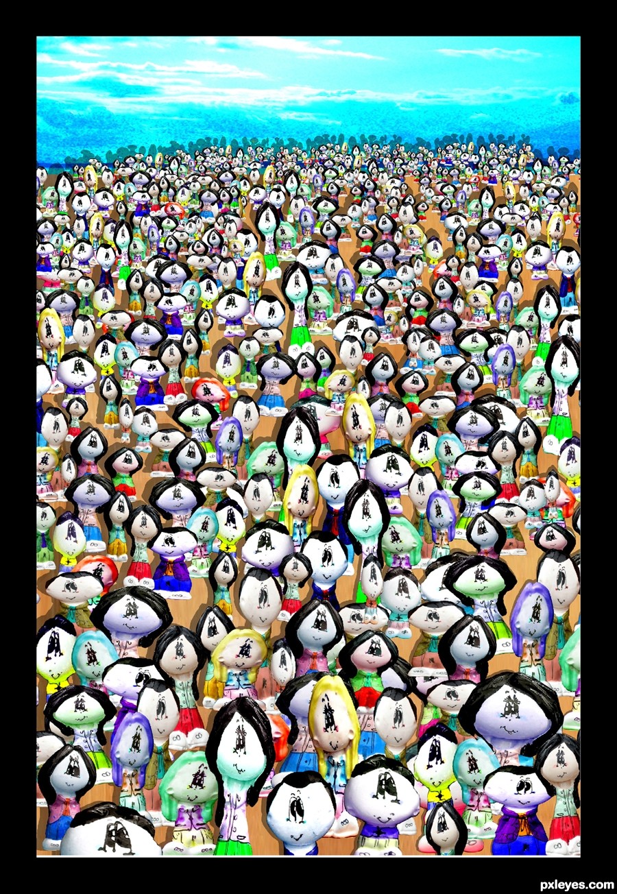
Badly pixelated.
Edit: (This edit is better...the version I first saw WAS badly pixelated).
wow, Badly commented CMYK46.
I love your artistic point of view. Great job, I knew it was you 

its a little cut, copy, paste at random & I was going to comment on the lack of shadowing, until my attention was drawn to the fact that there are lots of characters stood on other characters faces. Layer managment badly needed here I think but easy to fix.
@Geexman, please point out the "LOTS" of characters standing on each others faces, I thought I got them all when a MOD helped me fix this piece at PST, (it was my first manipulation of any merit and I wasn't really sure what I was doing) Now I do know there are a few characters with feet just on TOP of other characters heads, but that had no effect on the resulting image or the goal I was trying to create.
Due the amount of characters, repetition was unavoidable, but the Idea of the piece was to reflect the word CROWD and I KNOW I achieved that.
Also please review step 2, I made 40 new characters from the original 5, to say cut and paste is a bit of a stretch. I know they aren't the greatest creations in the universe and are not 3d, but I did stay true to the source and the over all feel. (I was using PS 5.0 limited at the time) so I had no warp tools or advanced filters so I had to work with what I had.
I kept the image exactly as it finished in the original PST contest, (I have committed this piece to print and it's been in several of my art shows, to change it now would not be right)
Other then that Geexman, thank you so much for your help...
@CMYK, if the image is BADLY PIXELATED ... offer a solution, don't just hit and run with a comment with no aid to the author, it's very bad form and does not improve the site, if you know a solution to a mistake a member has made, offer it up so the member can make the improvement, your hit and run comments with no offer of solution are severely annoying and no one really appreciates them.. they just endure them..
kinda contradictory to be annoyed if someone doesn`t offer help, yet a comment before you are telling me that the overlapping characters "didn't matter". I`d also like to point out that you HAVE improved the pixelation that CMYK pointed out so it must have been a valid & helpful observation however blunt it was.
As requested take it or leave it - http://www.pxleyes.com/picture/27136/4ca89451d6dfc.html
How did I IMPROVE the pixelation.. did I press a magical FIX PIXELATION button??? some sort of filter I don't know about? (please dear god let there be a fix pixelation filter... it would be a godsend) I wonder if it's available through flaming pear)
and err umm.. thanks for the link... I think I'll leave it... I can't make heads or tales of any of them, and 11 circles of an image of 1000s.. really? (give CMYK a big wet kiss for me in your next PM)
Thanks once again for you help, I guess (and chill out, you take this way to seriously)
lol you confuse respect for another male with homosexuality?....... interesting , sorry princess I didn't realize a little critique and advice would result in a childish strop, now I know that you`re self conscious about your flaws I promise to make my comments to you much lighter and less useful.
.... and as soon as you find a way to make a useful comment that doesn't demand an agreement... (if only you were as great as you think you are LOL) that would be amazing
Oh as to being Childish.. that's the greatest compliment in the world.. and I thank you most excellently for that.. hehehe
And yes I am a Princess... a BIG ONE
Smooch and hugs
This would make a great poster!
I like it. It's very cheerful and cartoonish.
Howdie stranger!
If you want to rate this picture or participate in this contest, just:
LOGIN HERE or REGISTER FOR FREE
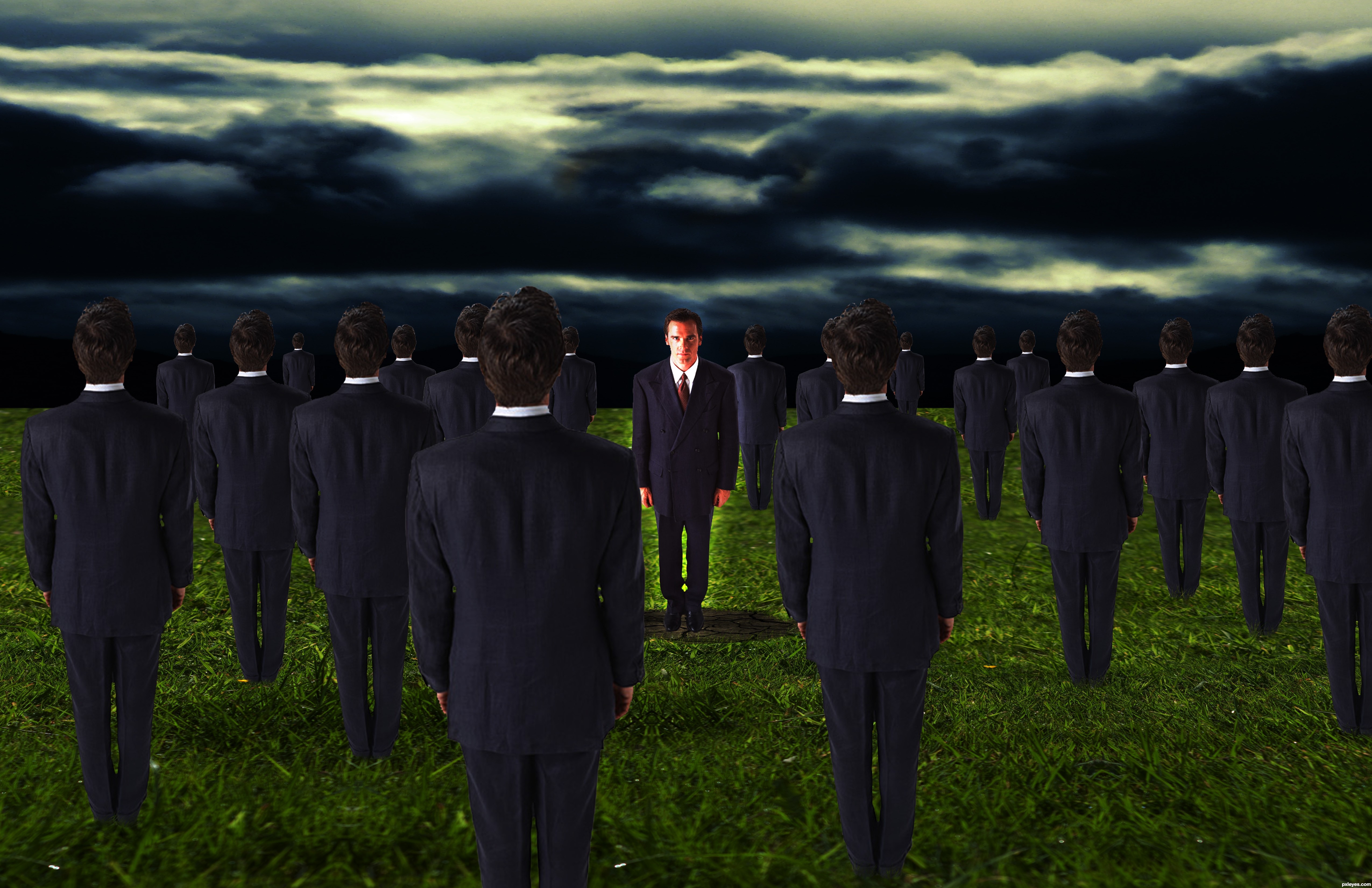
I don't know about anyone else, but I've only ever felt alone when surrounded by too many people.
Thanks to:
Photorack.net for the man's stock
EmiK for the Cloudy Sky Stock.
EmiK for the Cracked Earth Stock
Mqtrf for the Grassy Field Stock. (5 years and 3197 days ago)
i like the idea.. very oxymoronic. as for the technical side of things, the sky is too dark (especially compared to the people), the guy facing front could use less saturation, the people need to be contracted by a few pixels (you can see white outlines on the ones in front cause of the dark sky) and i personally don't like the guy's glow.
um i love the image its very cool.... not another one like it in the contest, but, theres one thing that is just bugging me like that continuous gnat that just wont leave you alone on a hot summer's day, and that little thing is the brightness of the 'alone' man. you could either lower his brightness a tad bit or maybe even make it look great and add a spotlight
it is good idea,good luck
Howdie stranger!
If you want to rate this picture or participate in this contest, just:
LOGIN HERE or REGISTER FOR FREE
Photography and photoshop contests
We are a community of people with
a passion for photography, graphics and art in general.
Every day new photoshop
and photography contests are posted to compete in. We also have one weekly drawing contest
and one weekly 3D contest!
Participation is 100% free!
Just
register and get
started!
Good luck!
© 2015 Pxleyes.com. All rights reserved.


nice like it
Thanks for comment.
Howdie stranger!
If you want to rate this picture or participate in this contest, just:
LOGIN HERE or REGISTER FOR FREE