Photoshop Pictures: Climb


results 1 - 5 of 5

Climbers Heaven - created by ltiday


Climbers Heaven
Favs: 0SBS: n/aHi-resRank: 4/8Score: 52.4% (20)11216 views

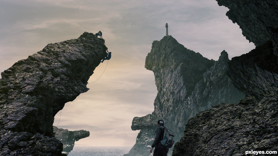
A photo composite inspired by the rocks of nova scotia. The Climber in the background is a photo I took of my brother climbing. The mountains were built from one stock photo of a rock duplicated and scaled to create the necessary shapes. (5 years and 1 days ago)

6 Sources:

avatar Zizounai
Zizounai says:

Hi! you should read this: http://www.pxleyes.com/guidelines/photoshop/
You must post the link of every photo you use.
If you have used personal photos you must upload all of them in the SBS part.
You are not allowed to give your name or mark a name on your chops, as the contests must remain anonymous until the votes are finished.

Your chop is good so you should comply to the rules before a mod takes it off

author says:

thanks, I updated the links and removed the name

(4 years and 365 days ago)


Zizounai says:

This is better but the Instagram links show names. You must post your photos in the SBS section of the final upload (profile - my entries - SBS) and the Pexels or Unsplash links in "Profile - My entries - Sources" Just have a look at what the others do (well, when it is well done )
And by the way: Welcome!

(4 years and 365 days ago)


Howdie stranger!
If you want to rate this picture or participate in this contest, just:

LOGIN HERE or REGISTER FOR FREE


solo climb - created by Circusdoggy


solo climb
Favs: 0SBS: n/aHi-resRank: 7/8Score: 58.9% (0)4793 views

(5 years and 2341 days ago)

2 Sources:

avatar Hon_Blackrod

lol lol check de lil man, Nice idea 
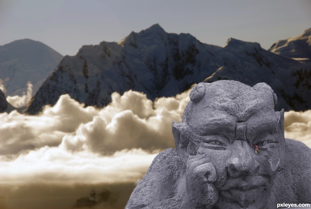
my opinion is that it would have looked better if some light was on grumpy inline with the background and his colour

Howdie stranger!
If you want to rate this picture or participate in this contest, just:

LOGIN HERE or REGISTER FOR FREE


V : vamos - created by Francky


V : vamos
Favs: 2SBS: 11Hi-resRank: 2/8Score: 70.3% (36)10807 views

(5 years and 2508 days ago)

2 Sources:

avatar rusvelt2000

Amazing light and shadow effects!
I wished to see the details in a larger high-res image.

author says:

thank you, the high res is not pretty good :/

(5 years and 2509 days ago)


avatar Drivenslush

very fun

author says:

thank you

(5 years and 2509 days ago)


avatar Akassa
Akassa says:

Very nice idea! I think the top of the uprising stone should be brighter (compared to the rest). Also the shadow seems wrong, the light source comes mostly from behind.

author says:

Thank you for your advise, I try to modify the shadow, is better ? Else how can i do ?

(5 years and 2509 days ago)


avatar Akassa
Akassa says:

Looks better now, well done ^^

author says:

thank you

(5 years and 2508 days ago)


avatar rusvelt2000

Congratulations Franchy

author says:

haha ! Well done ! Thank you Italian

(5 years and 2503 days ago)


Damn, I wrote it wrong, and I had checked it too, so congrats Francky Now it sounds better.

(5 years and 2503 days ago)


avatar spaceranger

Congrats!!

Howdie stranger!
If you want to rate this picture or participate in this contest, just:

LOGIN HERE or REGISTER FOR FREE


Climb up! - created by shaiju1974


Climb up!
Favs: 0SBS: 7Hi-resRank: 8/8Score: 57.3% (0)3390 views

Only source image and PS used.
Edit: Modified the back ground (using Filters ) (5 years and 2595 days ago)

no avatar
Keiley22 says:

looks painfull, lets hope she don't slip lol

Howdie stranger!
If you want to rate this picture or participate in this contest, just:

LOGIN HERE or REGISTER FOR FREE


Tough Climb - created by designedwright


Tough Climb
Favs: 0SBS: 9Hi-resRank: 8/8Score: 49.5% (0)5841 views

Climber edges up the branch, not realizing there is a potential problem ahead.

Thanks to David Niblack for the climber and bee images. (5 years and 3533 days ago)

1 Source:

avatar ponti55
ponti55 says:

Nice image, the shadow is completely wrong.. i myself am not the best person to ask but i'm sure someone else will comment. As for the bee, it's a bit distracting from the main point you're trying to get across. Good entry otherwise. Good luck!

avatar elficho
elficho says:

ponti's right. the bee shadow is too blurry (compared to the branch), it's not positioned right (should be directly in front of the bee) and it's not the same color as the branch shadow.

avatar CMYK46
CMYK46 says:

Would be better without the bee, and the climber's shadow needs to match the angle of the vine shadow...

avatar wazowski
wazowski says:

Funny . If there's a shadow from the vine on the wall, then I also expect a shadow from the climber on the wall. Not the whole climber, but at least some of the body. Compare it to the leaves, just above the climber. Good luck!

author says:

Ok, I think I am getting the hang of the shadows -- obviously still a weak area for me. I put the climber's shadow on the branch itself (hard to see) and overlapping on the wall. Removed the bee, since it seemed to be distracting. Thanks for the constructive criticism -- helps me learn.

avatar darkshellie23

very good editing---

avatar k5683
k5683 says:

he he cute.

Howdie stranger!
If you want to rate this picture or participate in this contest, just:

LOGIN HERE or REGISTER FOR FREE