(5 years and 2738 days ago)
4 Sources:
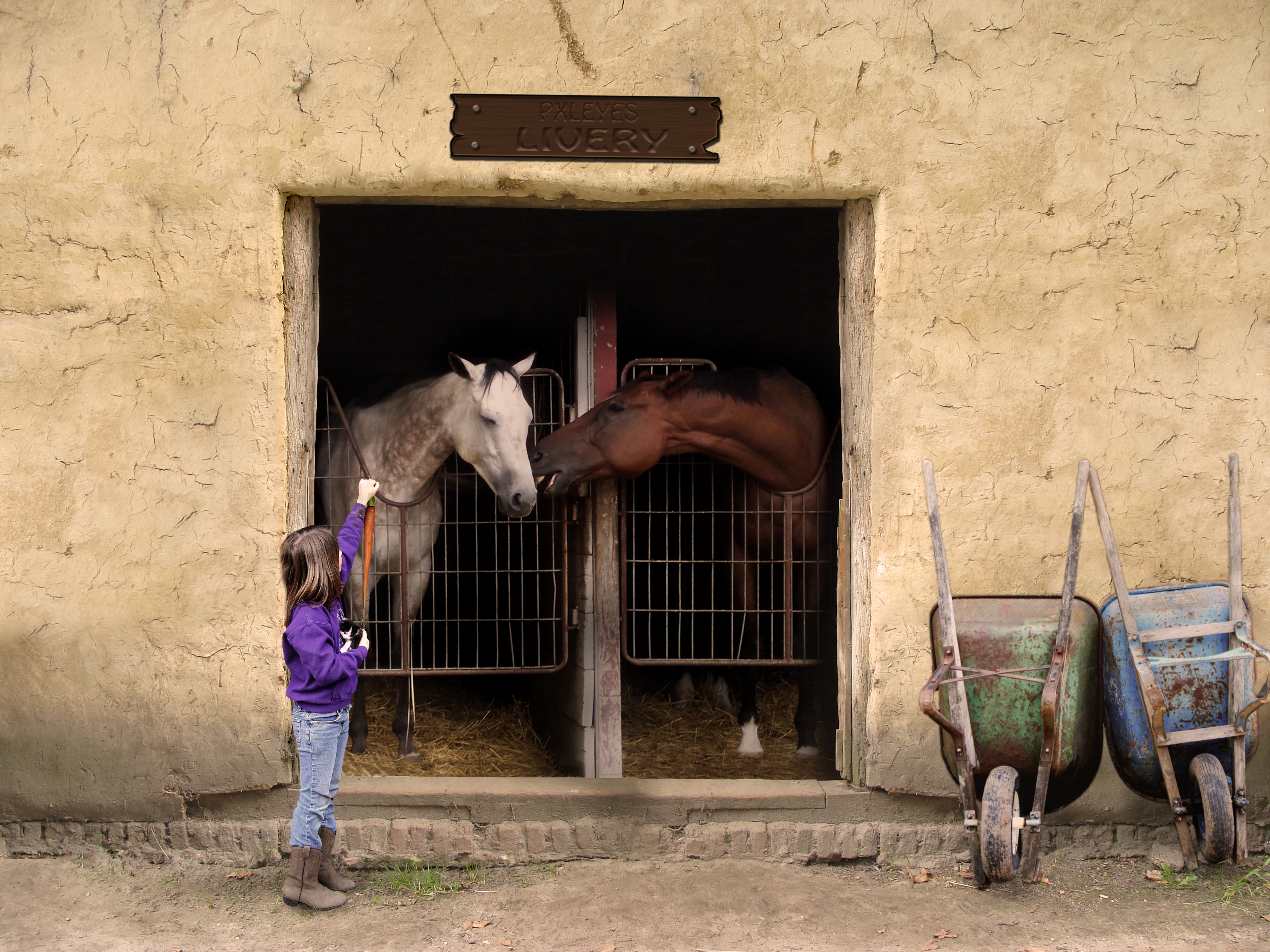
".... psssst, go for the one in the other hand - they taste like chicken!"
Constructed the Livery sign in CS3 - sbs to follow. (5 years and 3525 days ago)
horses don't eat kittens.. LOL.. good humor author
The girl is floating...otherwise this is great. 
PS: IMHO the only thing that would make this better is if we could see what the girl is holding, like maybe a carrot?
A horse is a horse of course of course....say Wilbuurrrr, Good work on this one
in high res i can see the lines where you copy pasted wall below the sign you can fix that ofcourse with the patchtool or by leaveing the top layer a lil long and with a large soft brush on like 25% or so erising the edge so the flow better into eachother.. as picky as i am.. at the doorstep the cuout is really a tat too sharp in high res use a soft blur on that edge and you will also that tiny dark cutout line there most likely... the girls feet are not on the floor and while looking there i also saw a copy paste line there that you easely can cover with patch tool
I rly like this piece.. very realistic done too 
Thanks for the improvement tips. CMYK - am considering your carrot suggestion. And to Eladine - wow. Your eyes are far better than mine - after putting in the intitial time in the construction of this piece - I said, "I'm done. Time to submit" I never looked back until the comments started to roll in. Fixed what was pointed out (girl, masking, sharp edges) keep 'em coming - this just keeps better and better from your suggestions.
xD very nice!!
Very well. One thing though, if you zoom in at the girls feet the wall behind has a very sharp edge and doesn't quite meet with the floor. You can blend that out with the eraser and clone tool. It might help if you add some shadows under the wheelbarrows aswell. Otherwise great image!
XD sorry but dont worry im even mroe pickier on my own work o.o; and i rly like what you did.. good job on the corrections by the way altho the copy paste lines above and below the door openeings are still there :P high marks from me anyway.. good job
Nice blend and good composition. I like the simplicity.
Holy hi resolution  . No worries El, appreciate your attention to detail
  . Here is a sincere request; however - please provide me with your home email. Those c&p lines were dreadful! I gave a cursory look before submission, then I really took a look last night after your review (
  ), then today I come back to check and I didn't even get most of them!
  so perhaps you'd be interested in "proofing" my entries prior to submitting them?? (for a small fee, of course!
 )
)
At any rate - I think this final correction should make you happy. I challenge you to find a single straight line anywhere on the piece lol !
And to you Thomas - if you'll review the source pic, you'll see that the "foundation" of the stable is indeed lifting there too on the left side. I tried to follow your suggestion in creating a blend at that point - and with your skills I might have been able to accomplish it - but alas, with my own I was leaving Captain Cloning Marks all over the image which Eladine would have discovered later this afternoon 
so in the interest of saving myself some more time (or just being lazy) I opted to leave it as it was. Great eye; however - good perception and even better attention to detail.
(sheesh - you guys are even better than I remembered! )
)
(little disappointed in you CMYK though - not until today did I realize I spelled PIXLEYES with an "i" in the sign - slipping in the old age, bro - or just going for the obvious oversights?
EDIT: There you go, Bob. A carrot per your request (hope it improves your  for typos and straight lines!!)


Ummm...I didn't mention anything about typos & straight lines, although I did say this is a great image. I'm glad the suggestions I DID make helped it be even better. Good luck, cranky author!
good use of source. Great to see you take on board suggestions to improve your entry. well done author.
great work..
great blending! good idea
Well done for trying Author. This entry definately deserves a high mark all the same.
I think you have improved it though haven't you? It looks better than it did.
Nice job.
aaaahhhhhh
Nice job.
Nice job.
Indeed Thomas, the image has improved greatly. The uh, carrot was an excellent suggestion.  as were the shadow enhancement below the wheel barrows.
Anything else jump out at you??
I like this one!
Congrats for your third place, MrBig
Congratulations for 3rd
Congrats on the 3rd place Amigo...well done
Congrats!
Congrats!
Howdie stranger!
If you want to rate this picture or participate in this contest, just:
LOGIN HERE or REGISTER FOR FREE
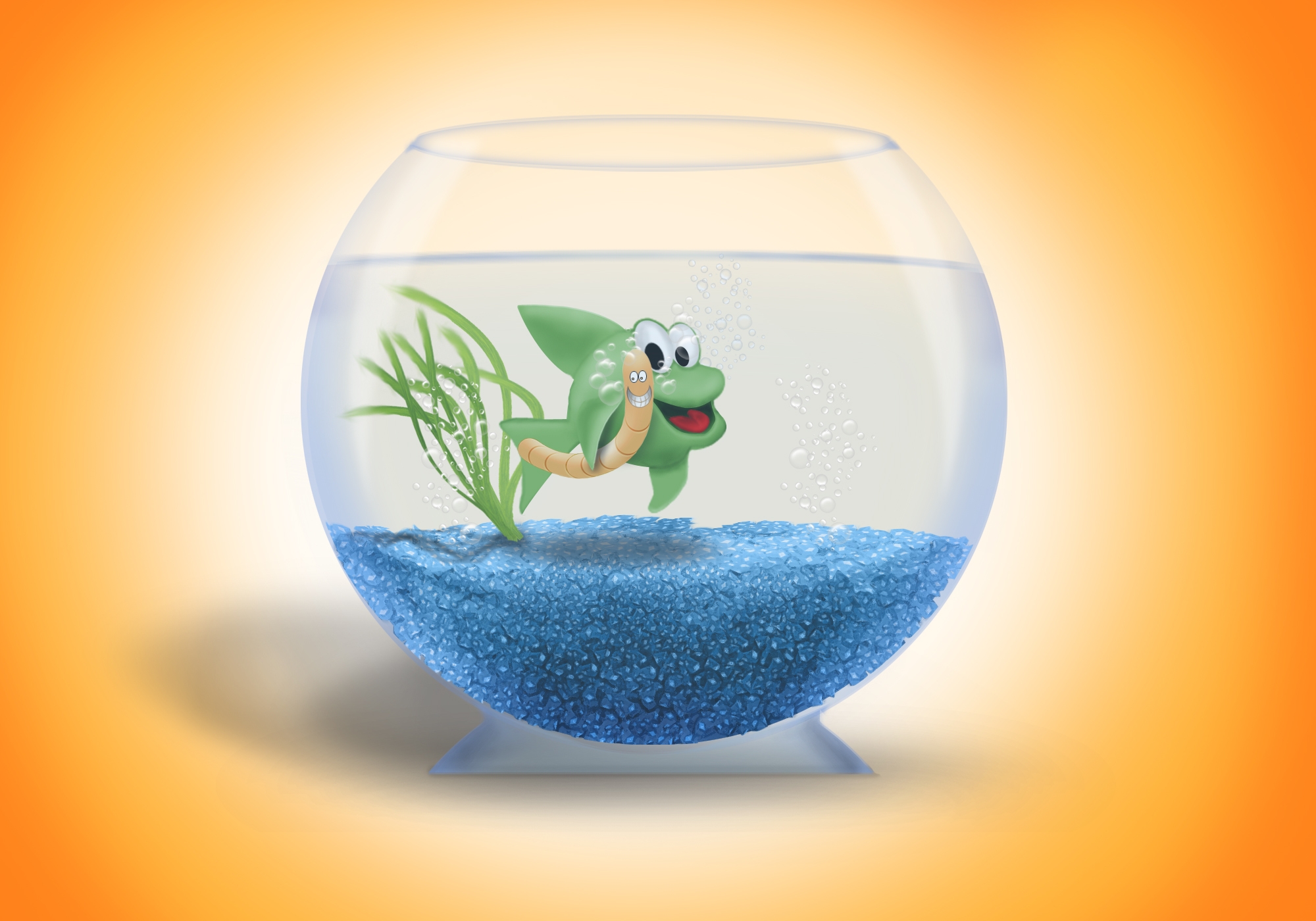
Fishes stopped eating worms, worms stopped being bait, they became friends and lived happily ever after.
This is one of my old entries i uploaded in this theme contest on old PST, i made some adjustments and uploaded it again.
Only photoshop. (5 years and 3566 days ago)
This is sooooo cute! They look very happy together... all smiles! I just wonder about the stand of the bowl. Would look a bit more stable if it was a bit round maybe... nice entry... good luck!
nice
Cool...how did u create fish,worm and sand? maybe you would like to show that in SBS...Great work
very nice
Be patient LOOPYLUV, the entry has just been uploaded 10 minutes ago
very cute
very sweet !!
Lovely work! Yuo draw really good, sweet characters :P
HeHe......excellent work.........
excellent work here author.. high scores..
Though I truly love the image and respect the work you've done on this...Contest guidelines: "Make your image as realistic and believable as possible!" This really doesn't fall into this guideline. Great job though!
wow, that was very nice of you guys, thank you so much for your nice comments and favoriting , Pixelkid, i'm glad you loved my work, and actually i believe that my work fits goal of the contest perfectly if you have seen the previous version of this contest on late PST you would know that winning entry was made by the member Philthy had a style and technique similar to mine
great job i like the sand you made ... GOOD LUCK
GREAT!! very cute!! one of my fav
this image ROCKS OUT
lol...love this!! I was wondering, perhaps we should be able to see a little of the water line at the other side of the bowl....? .)
This one is nice, but I agree with Mayechung there is no waterline. And the bowl could use a little bit more work, some shine and the edges....but great job.
thenks guys for your nice comments, thanks alot for Sander and Mayechung on their suggestions, here i added some lights reflection on the bowl for you, as for the other water line on the other side, it would ruins the perspective, try it urself, bring a cup of water, close up you head, and look at it right in the middle
Edit: LOL@Mayechung: i did not say put your face in the cup just make your face as close as if you were looking at my bowl
My eyes crossed!!! lol..lol...)
cute image. well done! but i wonder what will happen if the fish ever getting hungry great job! great SBS
wow... great works 100% from me
too cute to be true
love it
in bottom are diamonds? then it's friendship of wealth!
Brilliant idea & work top job!!
Sweet.
great sbs
Congrats!
Congratulations for 2nd
Congrats for your second place!
Congrats! for 2nd position
congrats!!
Congratulations!!!!
Congraaaats
congrats
great congrats
Howdie stranger!
If you want to rate this picture or participate in this contest, just:
LOGIN HERE or REGISTER FOR FREE
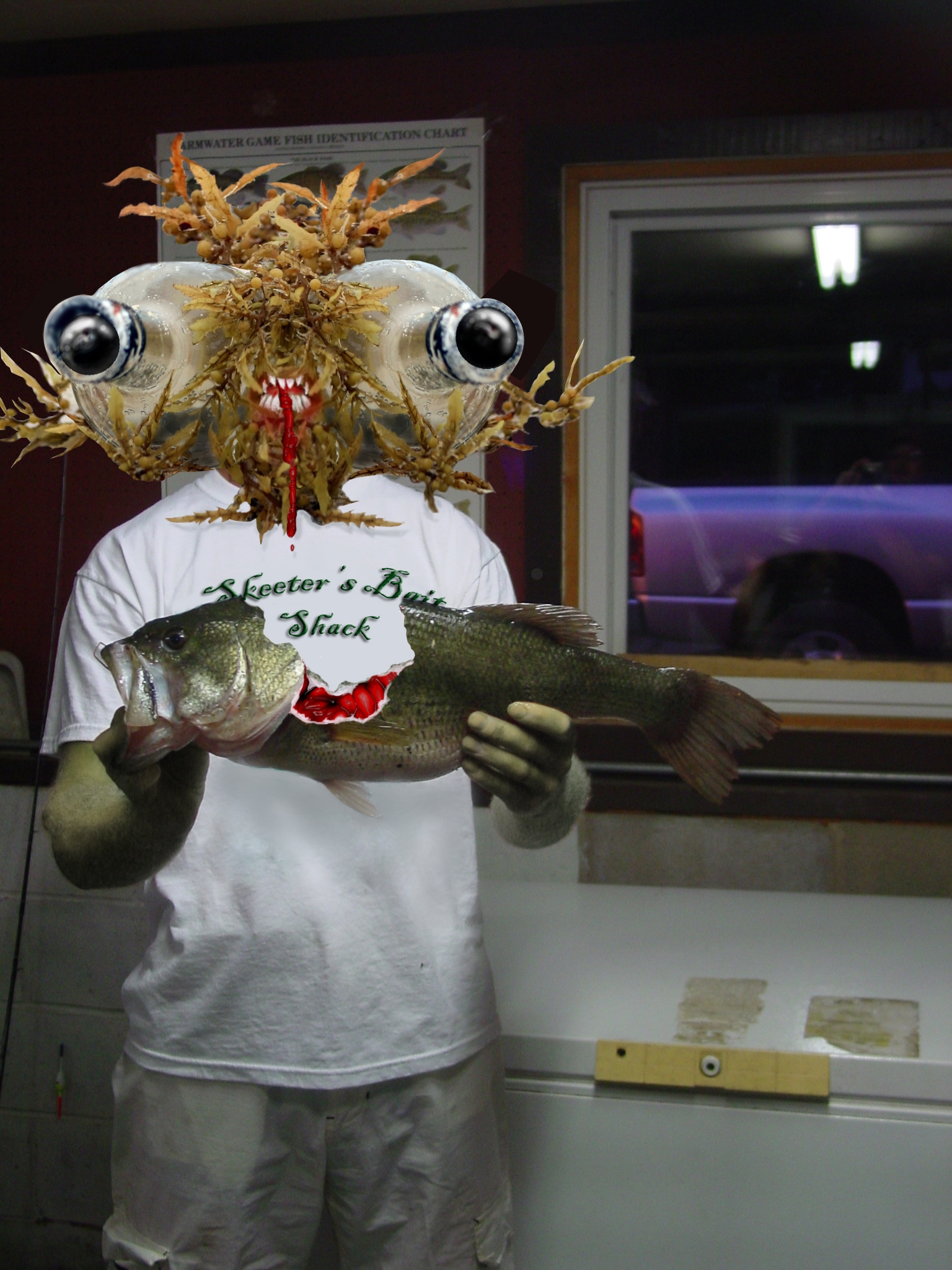
The vision of this face hit me immediately when I saw this source pic(last time the contest ran).PXLeyes pic and my own pic only ones used, with assistance from the tutorial>>>
http://www.n-sane.net/effects/organic-raw-flesh/index.php (5 years and 3592 days ago)
LOL...I love how twisted this is/was....
Ewwww! But 10 points for freaking me right out ! Good Luck
Very creative! I like how the new you seems to have lost the soul patch. Good job on changing the T-shirt message (although it seems to be floating above the shirt because of the drop shadow), but something needs to be done about the hat remnants. The arms and hands should match the head 'skin,' IMO.
ewwwwww........but nice thought....
Freaky, but most of all funny . I might have feathered the edges from the seaweed ( I guess it's that, right?) so it fits more with your own image. Another nitpick, I'd remove the dropshadow and emboss from the text on the tshirt. The text is funny, but the way it is now a bit distracting. And well, a dropshadow in a print is of course possible, but it looks a bit like it's floating in front of the tshirt. But well done for the rest! Good luck!
Cool...very cool. I love how you used the bottle.
good work
Thanks for the comments! As far as the hat goes, Dan, I don't remeber if it was intended to be left originally or not, but I removed it because it bothered me since you brought it up. As for the soul patch...not mine. I wish I was still 20-something. As for the drop shadow on the tee, I intended to give it some depth for better or worse. Thanks again for the comments . Positive critique is always welcome!
You made me smile. Good luck!
now that is cool
lool , , , nice job
hahaha cool!! gl
imagination is key here, wonderful image
This one cracked me up the first time, and still does!!
hehe creepy
Congratulations for 3rd
Congras!
congrats
Congratulations.
Howdie stranger!
If you want to rate this picture or participate in this contest, just:
LOGIN HERE or REGISTER FOR FREE
Photography and photoshop contests
We are a community of people with
a passion for photography, graphics and art in general.
Every day new photoshop
and photography contests are posted to compete in. We also have one weekly drawing contest
and one weekly 3D contest!
Participation is 100% free!
Just
register and get
started!
Good luck!
© 2015 Pxleyes.com. All rights reserved.


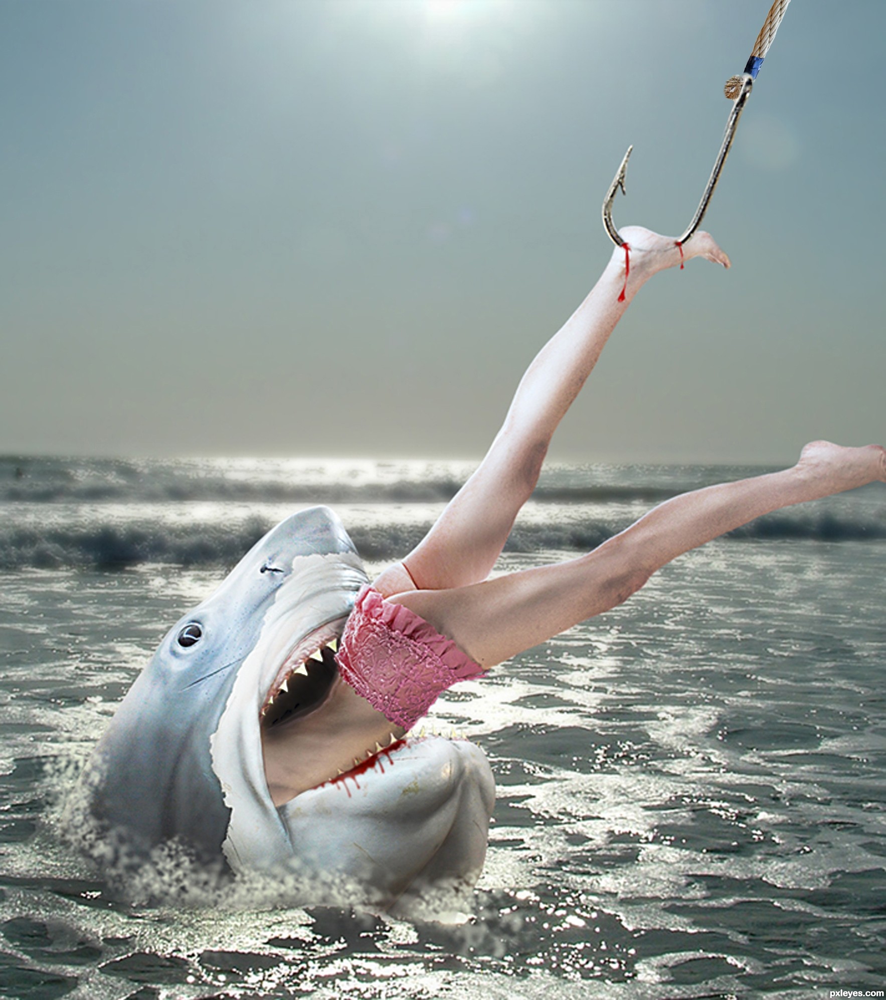
Fix the angle between hook & rope (should be straight, given the pull on it) and you've got a good image!
BTW: Great sick humor!
well done.. and ew ew ew ew ew ew ew
Since the shark is bitting her already (blood on the shark's mouth) the teeth should be on her flesh or then ehr flesh should have some markings. Good luck.
I didn't want this picture to be too bloody, i prefer the humour on it !!
tisk , tisk, tisk,, SO BAD! BUT! someone had to do it... . Just fix the line from the hook as already posted and IMO,what about a litttle shading inside the mouth and on the body to make it look more "INSIDE" ?
I fixed the shading inside the month and on the girl body and work on the hook Hope it's better now ? thanks for your comments
wow... that is imagination...humorous ok, and not too bloody. Good luck!
You "fixed" rope in the wrong direction. The rope and hook should be parallel.
whose at the other end of the line? hmmmm.... her ex?
CMYK46, i fixed the rope !
Howdie stranger!
If you want to rate this picture or participate in this contest, just:
LOGIN HERE or REGISTER FOR FREE