(5 years and 2683 days ago)
1 Source:
- 1: source
(5 years and 2686 days ago)
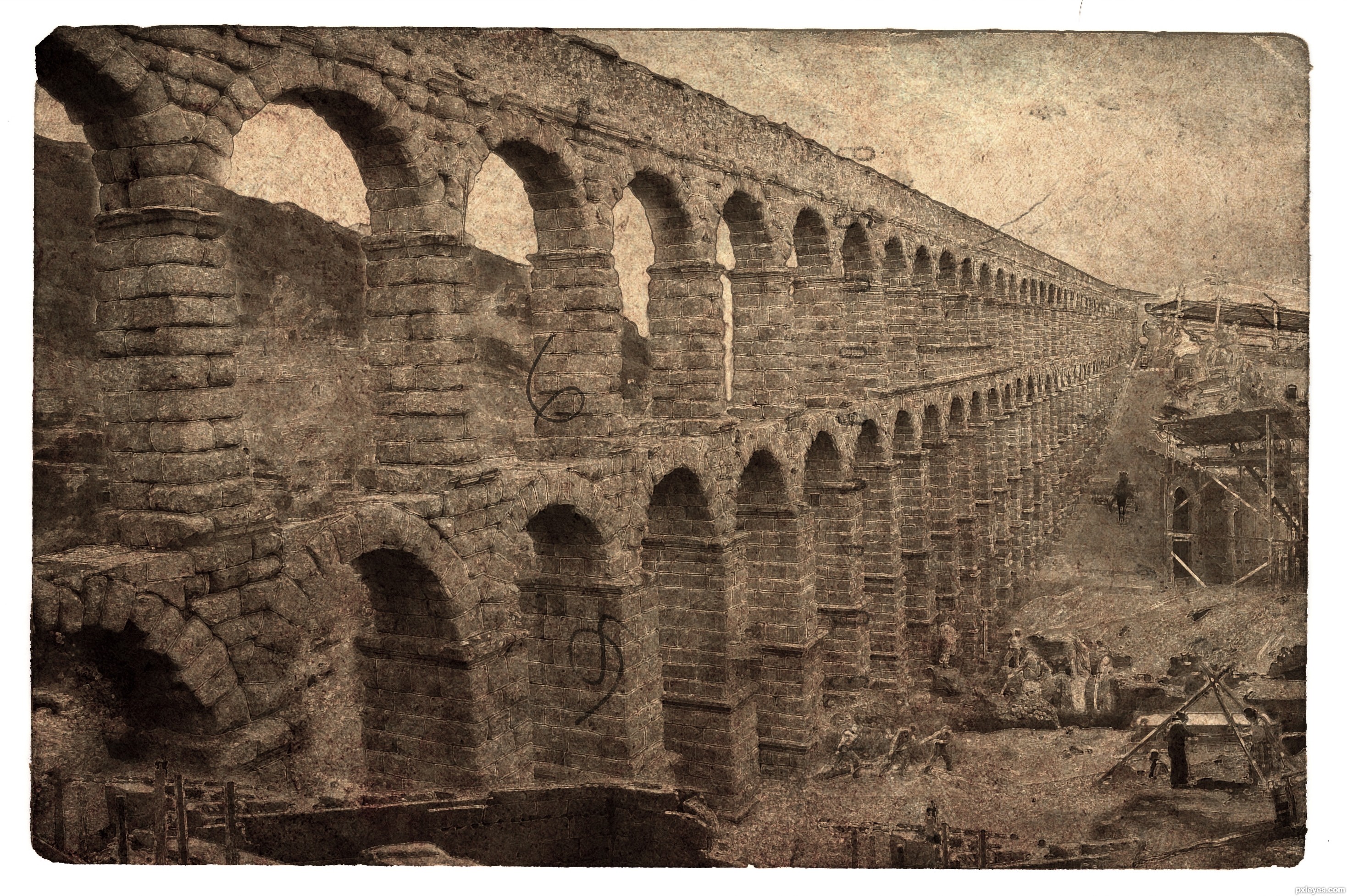
http://www.sxc.hu/browse.phtml?f=view&id=507075 old paper source
Wow Nice Job, Great Concept and creativity
Excellent work. Looks authentic.
I really like this, but I think the guys by the
tripod need to be either closer or smaller. IMO they appear to be almost on the same plane as the people on the bottom.
@pingenvy... it supposed to be on higher ground but the perspective is all wrong.... thank you
Very nice entry!!! Good luck!
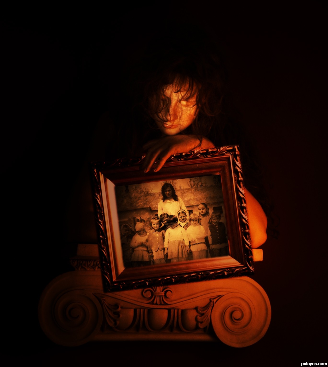
reminds me a lot of the beginning of the Exorcist.. hehehe.. love it 
Good job, looks convincing.
Looks great!
good work........!!!!!!!
yes , nice!
Very nice job, author, fairly convincing. 
Great blending!...
Really like the work you put into this! Nice old feel to it!
Howdie stranger!
If you want to rate this picture or participate in this contest, just:
LOGIN HERE or REGISTER FOR FREE

My Great Grandmother and her classmates outside her school in Warsaw. (5 years and 2689 days ago)
Great repair work! You missed a spot on the blonde girl's left shoulder. I would have colored the background too, but I'm not trying to detract from what I think is an excellent result. High vote from me...GL author.
Thanks CMYK46 - I've fixed the girl's shoulder and will give the background a try later. Thanks for your help
OK done the background now...
nice job on the coloring, you have missed a few legs tho. id color those pants too
Congratulations on the second place
Howdie stranger!
If you want to rate this picture or participate in this contest, just:
LOGIN HERE or REGISTER FOR FREE
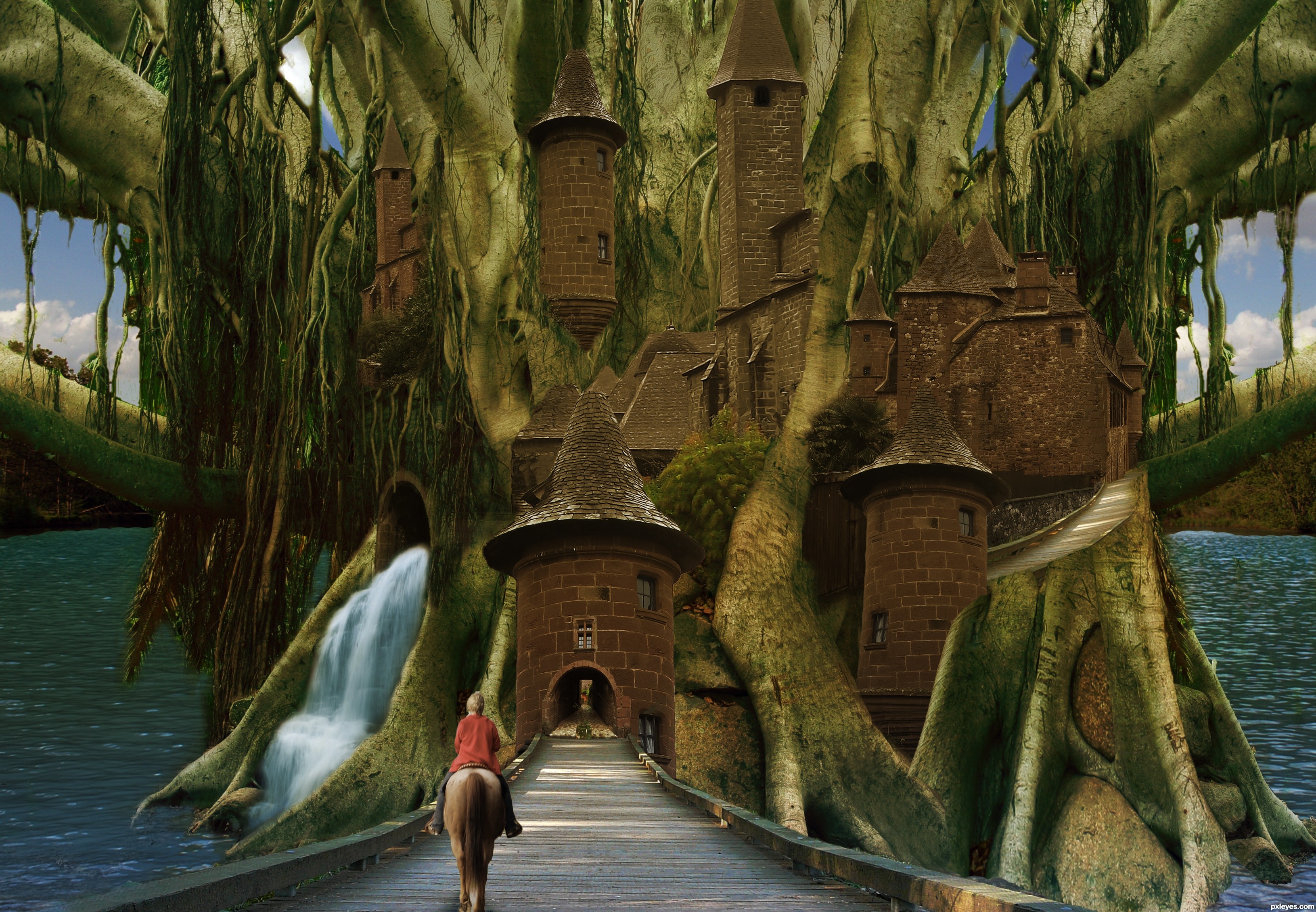
I've always been enamored with treehouses and the like thus my ideal fantasy city would be a tree city. I wanted to add more people but I couldn't find stock that suited. The horse stock and waterfall were my own images the rest are credited to various individuals from DA. (5 years and 2706 days ago)
reminds me of that old game Myst good luck author
its a great peace of art with many details...i can tell you put some efort into this...i'm just a bit doubtfull about some lighting issues and prespectives...but then again, it can just be my monitor that is distorting it a bit. good luck
Definite perspective & lighting issues, but it's a great idea.
good idea - the actual buildings look pasted on though - suggest slightly blurring edges, adding strategic shadows, and unifying the colours a bit (making the brown in the stone walls a bit greener)
Howdie stranger!
If you want to rate this picture or participate in this contest, just:
LOGIN HERE or REGISTER FOR FREE
(5 years and 2757 days ago)
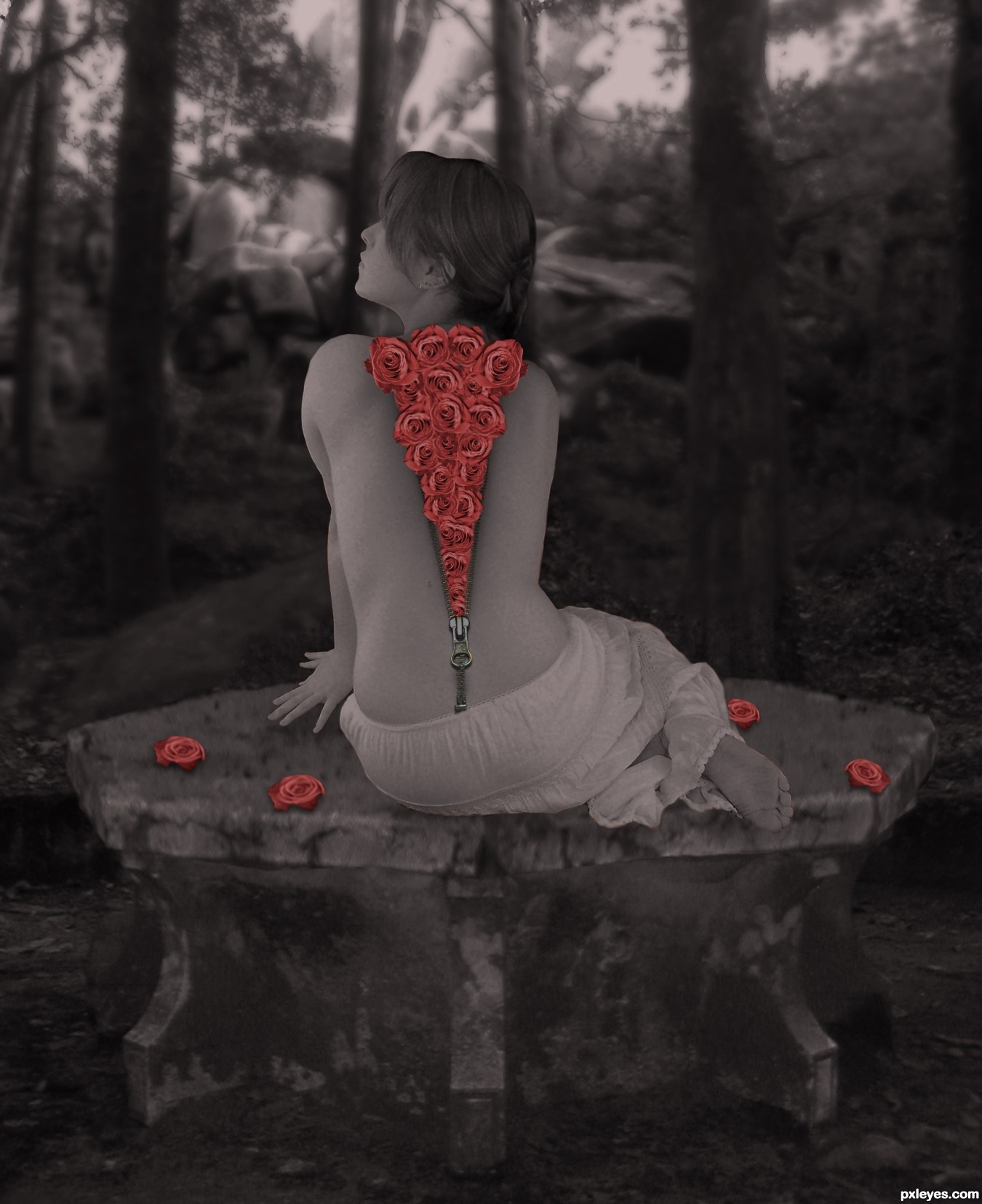
I'm not sure.. maybe if you brighten the image or dimmed the flowers? the contrast feels a bit violent and the faded girl with the super bright roses makes my eyes bounce back and forth.. (all IMHO of course).. it just seems the balance is off.. good luck though, great idea
EDIT: Much better blend author, very interesting chop
Great Idea! I've never seen sth like this My suggestion is to work more with the roses. to make them fit more with the rest of the picture.
Excellent concept, I love the zipper effect! You need to add a bit more shading to the roses coming out of her back, they are sitting above the image, rather than being part of it. Perhaps desturating the color very slightly and adding some shadows where they are over the skin will help. Very nicely done!
ok guys thx for the comments, lowered the color of the roses and added some more shadow to it, hope its bettter now 
Nice idea. surrealist?
i'd add shadow on the down part of the flowers right above the handle of the zipper with fading out of shadow in it's way upwards, good luck
Edit: also the handle of the zipper should drop some shadow on her back due to lights coming from the left side of her body.
Howdie stranger!
If you want to rate this picture or participate in this contest, just:
LOGIN HERE or REGISTER FOR FREE
Photography and photoshop contests
We are a community of people with
a passion for photography, graphics and art in general.
Every day new photoshop
and photography contests are posted to compete in. We also have one weekly drawing contest
and one weekly 3D contest!
Participation is 100% free!
Just
register and get
started!
Good luck!
© 2015 Pxleyes.com. All rights reserved.


Nice colors and mood, author.
Congrats!!!
Congrats, nice work
Howdie stranger!
If you want to rate this picture or participate in this contest, just:
LOGIN HERE or REGISTER FOR FREE