
Top 20 Logos with Hidden Meanings
Professional logo designers know that there is much behind a logo than simple text with an image or symbol thrown on it. They want to make something unique, something that is exceptional, something with a deeper meaning.
With the new age designing software, it is easier for designers to produce artistic beauty and yet have something clever at the same time. Clients often find it hard to digest the greater fee charged for an apparently simple logo, but they do not realize that often there is more behind a logo that meets the eye… A hidden meaning, or message that can make or break a company. Here is a compilation of 20 famous logos designs with a deeper meaning and an explanation to find it.

FedEx
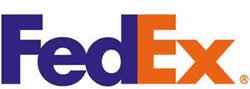 First look at the FedEx logo and you think what’s so unique about it? It is just a simple, you could say, a more or less textual symbol. But wait! Look closer. Do you notice a hidden arrow somewhere? This logo was created by Linden Leader & Landor associates in the year 1994 and on the first look comes forward to be a very simple design. But if you pay attention then you find that in between the E and the X is a right handed arrow. This hidden sign apparently signifies the precision and the speed at which this world famous courier company works.
Amazon.com
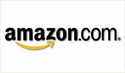 Now what’s so special about this? Just the name of the company with a normal swoosh – something which is used very often when it comes to logo designing. But wait a second, doesn’t that swoosh look like a smile? And it points from A to Z. That’s right, you got the hidden meaning. The arrow pointing from A to Z signifies what Amazon is famous for and that is selling anything and everything. The smile essentially implicates a customer’s emotion after shopping on the site and that is of happiness.
Baskin Robbins
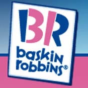 In the year 2005 this famous ice cream brand completed its sixty years. A part of the celebrations the ice cream company came out with a new logo. If one remembers the older sign had the number “31” appear on its logo with an arc which signified a scoop of ice cream. So have figured out what we are talking about or should I make it obvious. Well look closer the “31” is still there. It forms as part of the pink portion of the two initials of the company that are present in the logo.
Big Ten Conference
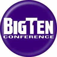 Most of you must have heard about this academic union. This union, which was founded in the year 1896, has under it the top academic universities all over the world which share a common interest in research and development on the graduate and undergraduate level. From the year 1949 up till 1990, the big ten consisted of ten universities. On 4th of June 1990 it also included the Pennsylvania State University into the conference. The name of the union remained the same but if one is observant then the person could easily make out the number “11” over the blue region next to G and T.
Toblerone
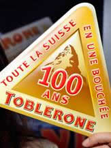 This world famous chocolate with a triangular shape was produced in the year 1908 by Theodore Tobler and Emil Baumann in the city of Berne, Switzerland. In the year 1970, the Matterhorn Mountain was included into its logo. Today the latest version of the logo consists of a bear camouflaged in the mountain. Is there anything significant about the bear? Well, YES! The bear is the symbol that signifies the city of Berne which is the birthplace of this chocolate.
NorthWest Airlines
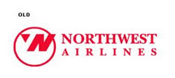 The logo shown on your left is the logo that was replaced a few years back with a new one by the airlines company. Well you must be wondering what is so special about this logo that has now been replaced with a newer one. This one is fairly easy to figure out. It is considered a piece of genius by many. The pink circle houses an N along with a W with a pointer (compass) pointing to the North West direction.
Sun Microsystems
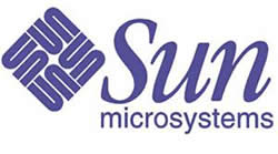 This masterpiece which was developed by Mr Vaughan Pratt – a professor at the famous Stanford University, successfully and beautifully integrates four interlocked copies of the keyword “sun”. This logo is a perfect example of an ambigram – which is defined as a typographical work of art which can be read as one or more than one word in its original form and also from other angles and viewpoints.
GoodWill Industries
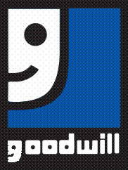 The GoodWill industries logo is a very simple combination of two bold colors, blue and black. However, one can see the intelligent designing of the logo by usage of just the lower case of the letter ‘G’- ‘g’ which is also the first initial of the company’s name. The lower case ‘g’ also represents a smiley face thus giving a very positive image to the industry. So even if you see the smiley face before the initial ‘g’, it simply means that GoodWill has goodwill.
Families and Marriage magazines
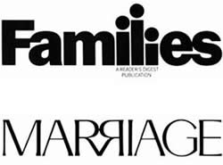 A very clear logo, it displays the special relationship between families and marriages through its letters. The lower case ‘i’s in “families” are shown in three different sizes, representing the man as the longest I followed by the woman and the child. Moving on to the second word in the logo, the upper case “R”s mirror each other with their ends sticking to each other, representing the bond of a relationship. Altogether, the logo provides a very emotional appeal.
Hartford whaler
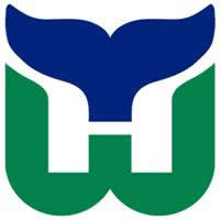 The name is very much present in the logo, with most of its important initials. On first look, you can notice the tails of a whale in blue, which connects to the name. A “W” of the Whalers is made in green, which holds an “H” inside it. The very cleverly opened logo spells out the name of the company, “Hartford Whalers”, making it a very indicative logo indeed.
Eight
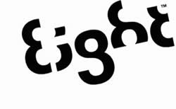 Very smartly designed, all that this logo required was the number “8” which has been very intelligently used to make the integrate the word eight in the logo itself. It also shows a very brilliant concept of how numbers can be used to write words. Very careful use of the number in only black colour gives the logo a stylish look. Anyone looking at the logo will not need a second chance to identify the brand and relate the logo to it.
Forkwire
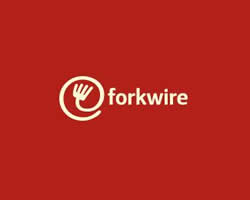 This online food delivery logo includes a combination of the internet key @ with fork in it, representing food as well as the first half of the name – fork, making the utilization of technology in food delivery very clear and obvious for the customers. Also, a white writing on a red background is catchy enough for the customer and gives an elegant look to the logo.
Body Wisdom
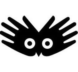 This logo comprises two hands wide open and sticking to each other, and at the same time there are two white circles in between. These circles look something like an owl’s eyes. This spa centre is represented with hands, which basically play an important role at a spa, as they do the massage. The owl eyes here represent wisdom, which relates to the name of the company itself.
Lafayette Galleries
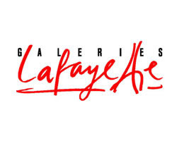 The very prominent cursive handwriting used to write “Lafayette” shows style and elegance in the brand. The two “t”s are tilted towards each other making a tower, which gives an indication of the origin of the brand. The “t”s represent the Eiffel tower, thus making Paris the home of the brand. Decent use of red and black leaves a stylish look with the logo, which goes hand in hand with the brand.
Yoga Australia
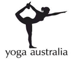 At first, the logo appears to be of a girl doing yoga, but on careful observation, one can see the map of Australia where she holds her leg in the air. A very beautiful concept has been displayed in the logo, where an attempt of holding the nationality of the brand along with the logo is made. The posture of the girl has imbibed in it the map of the country the company belongs to. From what we can see, the attempt has been successful.
Heartbeats
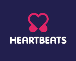 This brand holds a very obvious but cute logo, made out of musical notes joined at their ends making them look like a heart and headphones at the same time. This creates a strong link of the logo with the music as well as represents the love of music lovers. Use of soft colours like pink and purple gives a feeling of happiness and joy on seeing this logo, just like the one you get on listening to good music. The logo designed is simple but very relevant to the brand.
ZIP logo
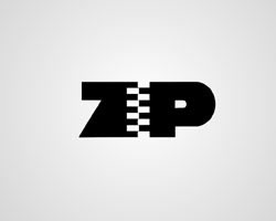 This logo is very simple and clear in reference to the brand name. The drawing of a zip in place of an “i” shows very obvious display of the company’s name. The designer Mark Erickson uses the zip in the “i” to connect Z and P. Raw use of black and white adds to the seriousness of the brand. The logo is very precise, simple and to the point.
Pakuy
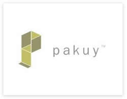 Designed by Maumer, the logo of this company consists of a simple “p” made of unfolded carton cover or a broken box, thus representing the work of the brand which is packaging. The letter ‘p’ is also the initial of the company’s name and it thus suits the name as well.
Fuga
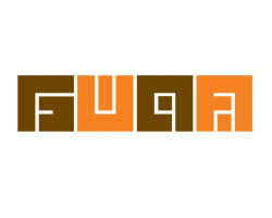 This is a logo for an architectural organization. The logo looks more like a maze in alternative colors of peach and brown. But if looked at carefully, the white stripes in the middle that look like the paths of the maze are the lines that form the name “fuga”. The font styling and use of colors does the work for this logo, thus making it interesting to look at.
Mosleep
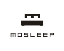 Mosleep as the name suggests is an organization of doctors that deals with people having sleeping disorders. The logo, for this company is an “M” that represents the initials of the company’s name. Along with representing the company’s name, the “m” also looks like a bed, which is very much in relation to the idea of sleeping, thus explaining the core concept of the organisation’s work, which is to deal with sleeping problems.
Author: admin
Howdie stranger!
If you want to participate in our photoshop and photography contests, just:
LOGIN HERE or REGISTER FOR FREE
-
says:
-
says:
Excellent work… I am going to reference this page to my media students. Any more like this ….???
( 2 years and 4661 days ago ) -
says:
Interesting Collection., amazed with the ideas behind almost all of them (except one or Two, whoz meaning r quite clear from the logo itself).
( 2 years and 4661 days ago )
Definitely this will help the designers to think reasonably and make Logos in future.,
Excellent work., 😉 would like to see more logos ., including Google and twitter too.. 🙂 -
says:
I think the pxleyes logo is the best one on this page. Its playful but yet elegant. I love it!
( 2 years and 4653 days ago ) -
says:
One logo that many don’t know about is the Chase logo….which is a cross section of an old NYC wooden water pipe….did you know that one of the precursor companies was a water supply company
( 2 years and 4632 days ago ) -
says:
The SUN logo is brilliant!! I will certainly pay more attention to logs now just to see if I can pick up on the meanings or symbolism.
Great site!! Thanks for sharing.
( 2 years and 4632 days ago ) -
says:
what about te orange county choppers logo???
( 2 years and 4632 days ago ) -
says:
Excellent! Very informative. Thanks for a inside link into the mind of a logo designer. More….I want to see more. Very interesting.
( 2 years and 4632 days ago )
Miherah -
says:
The logos are quite ordinary upon first glance, but as aptly explained, there are a great number of meanings and symbols within them. They show the lengths to which designers go in order to incorporate things more meaningful than just the logo itself.
I would like to make one suggestion, however. The grammar and context of the explanations sometimes need interpretation. There are repetitive phrases & words that are unnecessary or could be made much more plain.
Excellent article!
( 2 years and 4619 days ago ) -
says:
I’ve been struggling with conceptualising on a logo design.this came to be of great help.thank you.. You’ve opened my third eye.
( 2 years and 4607 days ago ) -
says:
PLSS…PUBLISH MORE LOGOS FOR US.
( 2 years and 4341 days ago ) -
says:
I was so amused with the Def Ex logo I didn’t know there was an arrow in it. Killer arrow !
( 2 years and 4327 days ago ) -
says:
I saw recently that the LG logo was very close to PacMan. Not sure it was made on purpose though.
( 2 years and 4327 days ago ) -
says:
Very interesting and knowledge full.
( 2 years and 4327 days ago ) -
says:
Excellent and interesting article. The 1980’s Milwaukee Brewers logo would also work well in this category. It’s by far my favorite logo ever, being from Wisconsin , of course.
( 2 years and 4327 days ago ) -
says:
This is a nice collection of interesting logo designs.
I love the Mosleep logo because of its simplicity and because it is a logo that would be hard to misinterpret.
Like a lot of good logos it is good to look at while at the same time it quickly and clearly visually represents what the business is about.
( 2 years and 4326 days ago ) -
says:
Awesome collection! It is great for inspiration for my companny new logo design.
Greetings from Brazil!
( 2 years and 4326 days ago ) -
says:
these are really awesome assortments! I would like to find the secret story behind logos of Airtel, Phillips, Sony, and even Google.
( 2 years and 4326 days ago ) -
says:
Awesome roundup!!
I really like how they make SUN logo. Very creative.
( 2 years and 4326 days ago ) -
says:
Positive feedback.
( 2 years and 4326 days ago ) -
says:
Great post. These are indeed very clever logo designs serving with a hidden messages
( 2 years and 4317 days ago ) -
says:
These logo designs are superb and clever.
( 2 years and 4317 days ago ) -
says:
Really amazing and very good collectioin
( 2 years and 4256 days ago ) -
says:
niceeeeeeeeeeeeeeee……………..
( 2 years and 4233 days ago ) -
says:
Very cleaver designs really beautiful
( 2 years and 4179 days ago ) -
says:
wooow excellent ..!!!!!!!!!!!! i really very good and was the best best designs.
( 2 years and 4134 days ago )
it as really beauty and amazing logo was creativity..!!!!! :)… -
says:
Logo of Yoga is amazing its simple and establishing one.
( 2 years and 4059 days ago ) -
says:
Great and True Marvelous People who made this logos. absolutely amazing
( 2 years and 3896 days ago ) -
says:
great logos with great impact,apart from this logos looking beautiful their also come out with meaning.
love from nigeria
( 2 years and 3868 days ago ) -
thank you! very helpful and interesting! keep it up!
( 2 years and 3685 days ago ) -
says:
wow it is very interesting!!
( 2 years and 3506 days ago ) -
says:
mo fou !!
( 2 years and 3506 days ago )
It Is VeRy InTeReStInG
ThNx a LoT 🙂 -
says:
it very nice
( 2 years and 3497 days ago ) -
good
( 2 years and 3362 days ago ) -
says:
thanks
( 2 years and 3168 days ago ) -
says:
that was great hehehe love the fedex
( 2 years and 3138 days ago )
Pxleyes
Photography and photoshop contests
We are a community of people with
a passion for photography, graphics and art in general.
Every day new photoshop
and photography contests are posted to compete in. We also have one weekly drawing contest
and one weekly 3D contest!
Participation is 100% free!
Just
register and get
started!
Good luck!
Follow us:


© 2015 Pxleyes.com. All rights reserved.
Wow, I’ve gotta say this post is excellent.
( 2 years and 4662 days ago )Had no idea FedEx or Amazon had anything so satisfying hidden in their logos. =)
Very productive. Great work on the post 😉