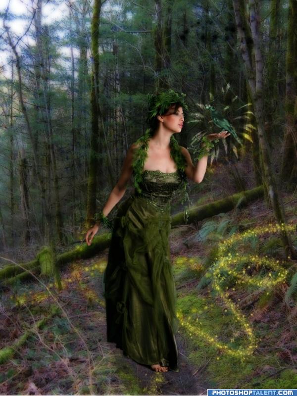
Wow! Nice feel! I love the desolated forest and the contrast between the laced dressed girl and the naked trees. Good choice to make it in black and white. Reply »
(2 years and 332 days ago)
(I think I got the shadows right this time). I also made the girl a little smaller to fit the bench better. (2 years and 332 days ago)
Nice composition and mood, but light source and lighting on the lady is not matching Reply »
Very nice idea, but like gopankarichal said the lighting and shadows are off. To me ik looks like the bench and the girl are floating. If you're able to fix that you'd have a better image.
GL Reply »
Great idea choosing bw. The girl is lit from the front, which doesn't match the trees and bench. And the girl is a little to big for the bench to be sitting convincingly. If those things were adjusted, I think you'd take a great image to a stunning one. Good luck! Reply »
The way the economy is going, it won't be long before THIS is all a million will buy! (2 years and 333 days ago)
Chocolate (2 years and 337 days ago)
Fixed the wing under her arm.. and a few other things I found that were wrong. (2 years and 336 days ago)
Beautiful... a part of the wing is missing under her arm or the bottom of the wing is too flat... I hope this makes sense... good luck Reply »
Nice Tinkerbell feel. Wings are weird (as BlueSparkle noted): Too parallel to shoulder blades and there's no bottom to them; too narrow or needs second set of wings. Stars appearing through the shadowed part of the moon is physically impossible (but that may be a quibble since Tinkerbell herself is fantasy). I don't get the white streak just below her knees. Reply »
Christy: I used a brush for the stars around her, as well as the glitter on her dress. Reply »
I tried to show that the grandparent's time is past, while the parent's time is present. The child, who is the future, is in the forefront. It's in an oil painting format because that was the medium of choice for the grandma's generation, showing that the influence of the past still affects the present and the future. (2 years and 332 days ago)
wow author..this is a totally new piece and you've jumped forward ten time in finish work.. congrats on the improvement.. I'm very impressed.. good luck!!
(You may want to red flag the entry you want to get rid of.. the mods will delete one of the entries if they feel they are too similar, and if you don't red flag it yourself, it will be up to their discretion) Reply »
as a grant parent she is living her present, as a mother the lady in the middle also living her present............my point is this is showing only present Reply »
(2 years and 337 days ago)
worked well but that it appears that nowhere, it's a little confusing! water made with any plugin? for a better result working more to background (maybe some stars!) good luck! Reply »
CMYK46: I took the source picture of the water, and change the perspective a lot. The little white thing in the lower left corner of the entry is just a little to the lower left of center in the source image. (It's misshapen due to the perspective change). Reply »
| Votes: 247 | Favs: 0 | SBS: n/a | Hi: n/a | Rank: 20/21 | Score: 50.9% | 9354 views |
Thank you to MJ Ranum for the model. I was going to leave the bikini top off, but I wasn't sure about the nudity rules here.
(2 years and 331 days ago)
lmao that aint gravities fault.... that mould must have been broken from the beginning lol Reply »
Gravity is such a perv... Acting on that particular place only rofl... Reply »
oh dear.. hehehe.. you really should have inclluded a humor bar LOLOLOLOL
(I was a tad upset about the bikini but when I realized you did that to spare the children it didn't bother me... but I think it would behoove you to remove the bikini entirely and just add a black censor bar over the naughty bits,(which there are NO naughty bits, we all got them) it would show off the work better and make your point .. IMHO) Reply »
Excellent idea. Breasts look very good, especially considering how small the model really is. However, I would like to see a neater bikini top, with straight straps and more centered bra cups. I think it detracts from your good body work to have the bra look so rawly liquified. Good luck! Reply »
A little late for Easter, but that's okay! LOL!! (2 years and 336 days ago)
Kaleidoscoped toes. (2 years and 337 days ago)
Seems more like "Mutant-Baby Toes" to me when each freaky foot has at least nine toes. I also think it's all too pink. A funky-foot frame in a contrasting color for the baby photo (source?) would be more effective IMO. Reply »
Honestly I like step 4 toes better then the ones you got up there that's just me ,but nice kliediscope idea. Good luck Reply »
go to prairiekittin's profile
The nr. 1 graphics community on the web!
If you have a passion for graphics or photography, you came to the right place! Pxleyes is THE place to be for graphical artists and photographers. We have a large community of like-minded people.
We run over 20 new contests each week. We have something for everyone... Photoshop contests, photography contests, drawing contests and 3D contests.
Participation is 100% free and you can win great prizes!
On top of all that, we offer you the possibility to upload and categorize all your artwork and photography!
What are you waiting for? Signup now for free to start your pxleyes journey!
© 2012 Pxleyes.com. All rights reserved.


Good interpretation!
Couple of things: First, your source link doesn't seem to work. It says the photo is private. Second, the background seems a bit blotchy. I understand using a glow to make the environment seems otherworldy, but it feels like a tad much IMO. Other than that, I really like what you've done here. Good job!
Edit: Source 1 link now works. Do you have the source for the woman as well? Reply »
(2 years and 334 days ago)
vvv nice image the glow is great but shadow from foot is not much coompaiirable to thhe darkk side of the dress iif u will work on it then there will be no iimperfectiion good luck Reply »
(2 years and 334 days ago)
good work Reply »
(2 years and 334 days ago)
Nice idea, perhaps for Spring I'd make the colors a bit more bright & fresh (but that's personal). As for the shadow, agreed with Nav777singh. Looking at the dress, the light seems to come from the right side, so the shadow would go more to the left direction. And perhaps I'd give the bird a little bit other color or try something else, so it'll be a bit more visible compared to the background. Good luck! Reply »
(2 years and 334 days ago)
very good image.. does need some spring, but that's only because of who she is... if we didn't know which god she was, we wouldn't have noticed..
.. good luck and good entry Reply »
(2 years and 334 days ago)
Excellent idea.. nice work author ! Reply »
(2 years and 334 days ago)
Nice scene love all them wonderful greens top job! Reply »
(2 years and 334 days ago)
baeautiful image and i like green and spring
! the woman here is maybe a bit too mature by form and color, but you fit the sources wonderfully! good luck!
Reply »
(2 years and 334 days ago)
Is there a source link for the forest? Or is it your image? Reply »
(2 years and 334 days ago)
great work..... Reply »
(2 years and 334 days ago)
nice mood Reply »
(2 years and 334 days ago)
great! very good!
Reply »
(2 years and 333 days ago)
animmax: The background is my own picture. Reply »
(2 years and 333 days ago)
The girl is an image from Devient Art, you need to post a link for her and thank the author of the picture. very nice idea, good luck Reply »
(2 years and 333 days ago)
beautiful
Reply »
(2 years and 333 days ago)
tapiona: There is a link, as well as directions on how to view the picture if you don't have a DA account. It's listed in the SBS. Reply »
(2 years and 333 days ago)
Would look great without the glitter... Reply »
(2 years and 333 days ago)
This looks great!!
I would maybe give the glitter a little bit of a glow.
GL Reply »
(2 years and 332 days ago)